Getting Started
About
Welcome to the documentation for the FlowFuse Dashboard (also known as Node-RED Dashboard 2.0), the modern successor to the deprecated, but very popular, Node-RED Dashboard.
This project was formed by FlowFuse, as part of efforts to upgrade the original Dashboard to steer away from Angular v1.0 which has been officially deprecated. You can read our full statement about why we're building FlowFuse Dashboard here.
Recommended Tutorials


FlowFuse Dashboard Blueprints
The quickest way to get up and running with FlowFuse Dashboard is to sign up to FlowFuse Cloud, and select one of the existing FlowFuse Dashboard Blueprints, for example the Getting Started with FlowFuse Dashboard blueprint show below:
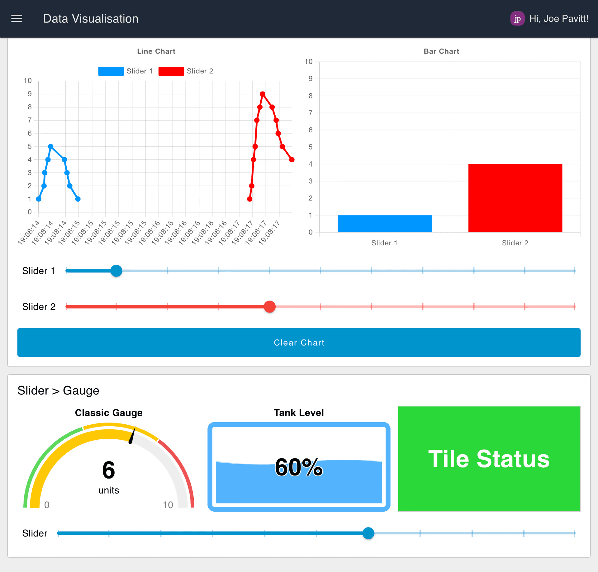 Screenshot of the "Getting Started with FlowFuse Dashboard" blueprint from FlowFuse Cloud
FlowFuse offers a complete solution to help you host, secure, manage and scale your Node-RED deployments, whether that's for your own home hobby project, or you're running thousands of Node-RED instances at the Edge. It also comes in offerings for Cloud, Self-Hosted and Dedicated solutions.
Installation
FlowFuse Dashboard is available in the Node-RED Palette Manager. To install it:
- Open the menu in the top-right of Node-RED
- Click "Manage Palette"
- Switch to the "Install" tab
- Search
node-red-dashboard - Install the
@flowfuse/node-red-dashboardpackage (notnode-red/node-red-dashboard)
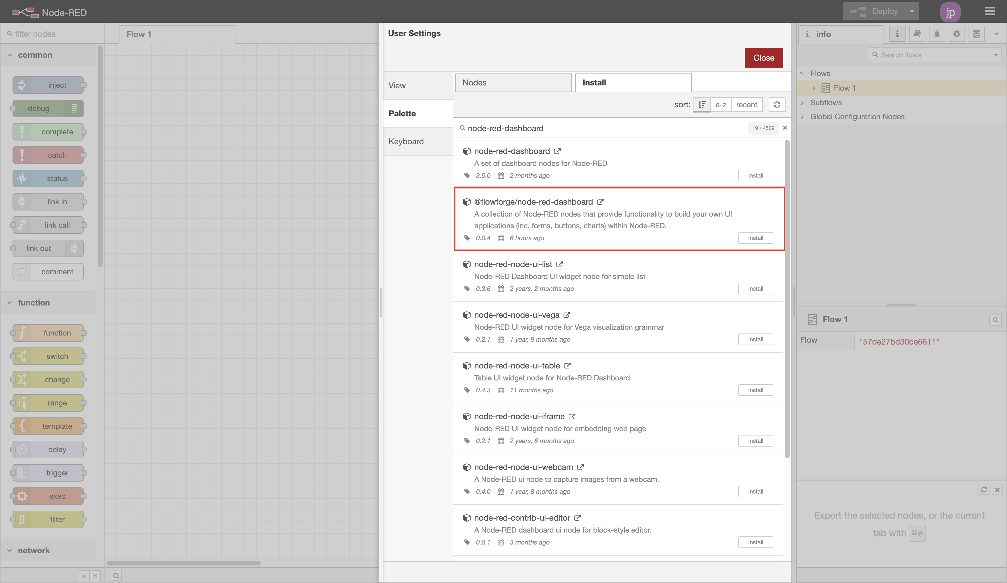 Screenshot showing the nodes available in the Node-RED Palette Manager
The nodes will then be available in your editor for you to get started.
If you want to use npm to install your nodes, you can instead follow these instructions
Hosting Node-RED
If you're looking to host Node-RED, we recommend using FlowFuse to get started. FlowFuse can either be self-hosted on your own infrastructure, or to get up and running in 30 seconds, you can use FlowFuse Cloud, which comes with a collection of FlowFuse Dashboard Blueprints to help you get started.
Dashboard Hierarchy
Each Dashboard is a collection of widgets (e.g. charts, buttons, forms) that can be configured and arranged in our own User Interface. The hierarchy of a Dashboard is as follows:
- Base - Defines the base URL (e.g.
/dashboard) for your Dashboard. - Page - A given page that a visitor can navigate to, URL will extend the base, e.g.
/dashboard/page1. Each page can also have a defined, unique, Theme which controls the styling of all groups/widgets on the page. - Group - A collection of widgets. Rendered onto a page.
- Widget - A single widget (e.g. chart, button, form) created in Dashboard.
Adding your first widgets
With the nodes installed, getting started is as easy as choosing a node from the Palette (the left-hand side list of nodes) in Node-RED, and dropping it onto your canvas.
 Screen recording to show how easy it is to deploy your first FlowFuse Dashboard application.
In this case, we drop in a ui-button, click "Deploy" and then can see the button running live in our user interface.
Notice too that Dashboard will automatically create a new group, page, theme and base Dashboard for you.
Configuring your layout
FlowFuse Dashboard adds a corresponding "Dashboard 2.0" sidebar to the Node-RED editor . This sidebar provides an interface by which to view of your pages, themes, groups and widgets. From here you can add new pages and groups, modify existing settings, and re-order content to your liking.
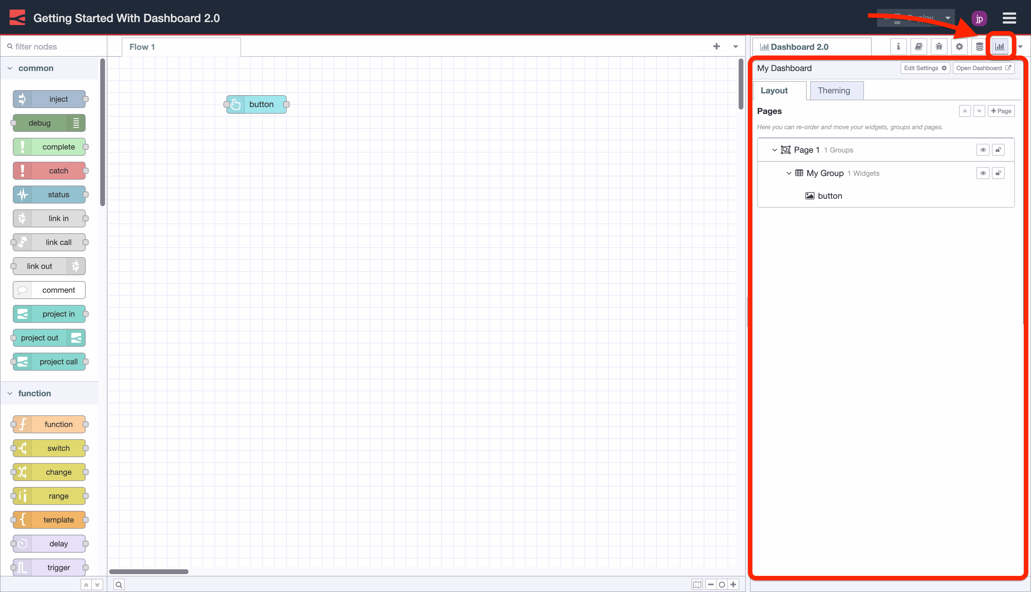 Screenshot showing the Dashboard 2.0 sidebar in the Node-RED Editor.
Layout options in a Dashboard 2.0 user interface are controlled by two main settings:
- Page Layout: Controls how the
ui-groups's are presented on a given page in your application. - Navigation Sidebar: Defines the left-side navigation style, defined at the
ui-baselevel.
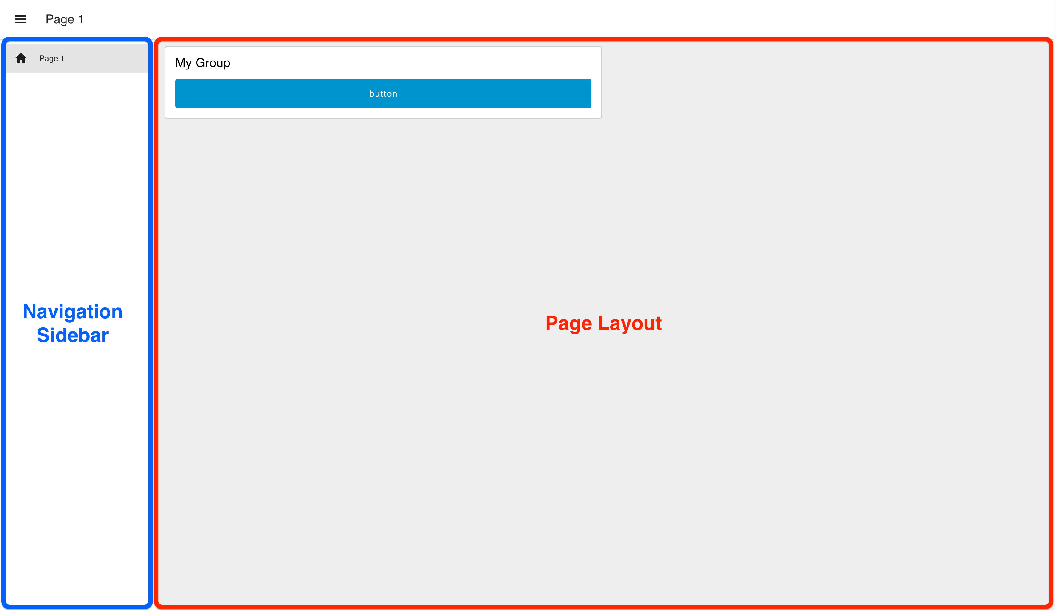 Example of the "Grid" page layout, with a "Collapsing" sidebar navigation.
Default Page
Each page in FlowFuse Dashboard has a unique URL. If a user navigates to an unrecognised path, underneath the /dashboard/ path, then a default page is used to fall back to.
Currently, in FlowFuse Dashboard, the default page is chosen as the page ordered first in the list of pages in the side navigation:
 Screenshot of the pages list in the FlowFuse Dashboard side panel
In this example, the "Third Party Widgets" page is the default page.
Layout Options
Currently, we have three different options for a page's layout:
- Grid: (docs) The default layout for a page. It uses a 12-column grid structure to layout the groups. The widths of each group or widget defines the number of columns they will render in. So, a "width" of 6" would render to 50% of the screen. Grid layouts are entirely responsive, and will adjust to the size of the screen.
- Fixed: (docs) Each component will render at a fixed width, no matter what the screen size is. The "width" property is converted a fixed pixel value (multiples of 48px by default).
- Notebook: (docs) This layout will stretch to 100% width, up to a maximum width of 1024px, and will centrally align. It's particularly useful for storytelling (e.g. articles/blogs) or analysis type user interfaces (e.g. Jupyter Notebooks), where you want the user to digest content in a particular order through scrolling.
- Tabs: (docs) This layout organizes content into separate tabbed sections, allowing users to switch between different views or content categories without leaving the page. Each tab can contain multiple groups and widgets, and it’s specially useful for organizing large amounts of information into easily digestible segments. The "Tabs" layout ensures better navigation and a cleaner UI when multiple content categories need to be displayed in a single view.
Navigation Sidebar
Built into the framework of the UI is a side navigation bar, along with the top, page-wide "app bar". Configuration options exist such that the side navigation behaviour can be controlled. Options include:
- Collapsing: When the sidebar is opened the page content will adjust with the width of the sidebar.
- Fixed: The full sidebar will always be visible, and the page content will adjust to the width of the sidebar.
- Collapse to Icons: When minimized, users can still navigate between pages by clicking on the icons representing each page in the sidebar.
- Appear over Content: When the sidebar is opened, the page is given an overlay, and the sidebar sits on top.
- Always Hide: The sidebar will never show, and navigation between pages can instead be driven by
ui-control.
Design Patterns
There are two core Design Patterns that are possible when building with FlowFuse Dashboard:
- Single Source of Truth: All users of your Dashboard will see the same data. This is useful for industrial IoT or Home Automation applications.
- Multi Tenancy: Data shown in a particular widget is unique to a given client/session/user. This represents a more traditional web application, where each user has their own session and associated data.
It's worth noting that these two patterns can be mixed and matched within a single FlowFuse Dashboard application, shown later.
Single Source of Truth
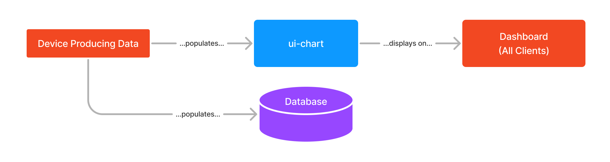 Example workflow to demonstrate the "Single Source of Truth" design pattern.
This is the pattern that the original Node-RED Dashboard utilized. In this pattern, all users of the Dashboard will see the same data. Data that populates a widget is generally driven by a piece of hardware or general-purpose API call.
When a user goes to visit a Dashboard, the widgets will load their respective state, and will display it to every user.
An example of this is that if you have interactive elements, e.g. a slider linked to a chart, then one user moving the slider will draw data to the chart of every other user's Dashboards too.
Multi Tenancy
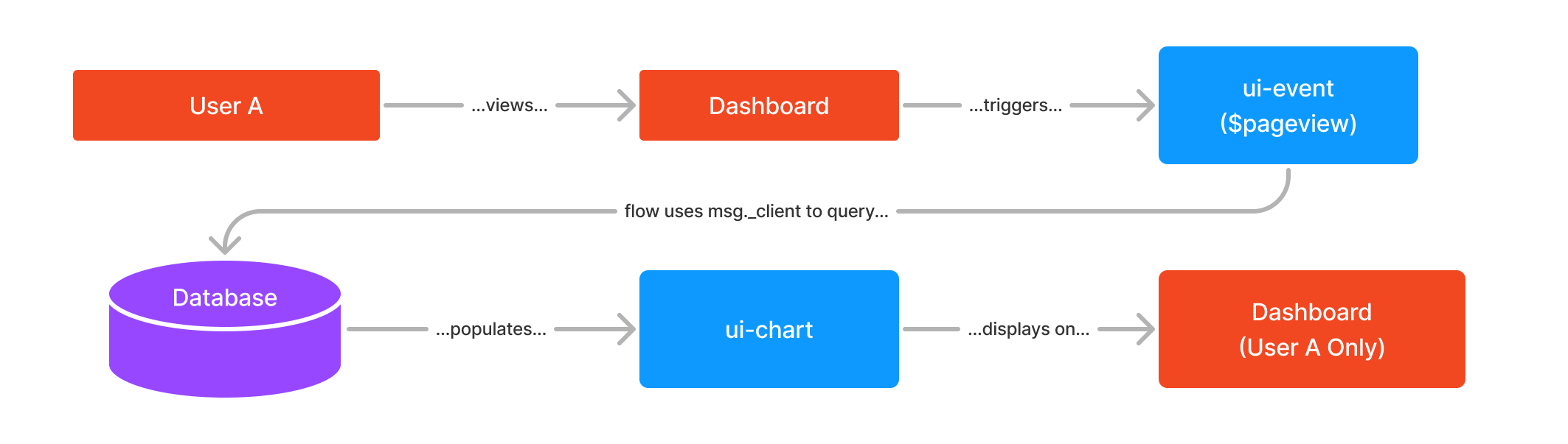 Example workflow to demonstrate the "Multi Tenancy" design pattern.
In FlowFuse Dashboard we can configure a given node type to "Accept Client Data" from the sidebar:
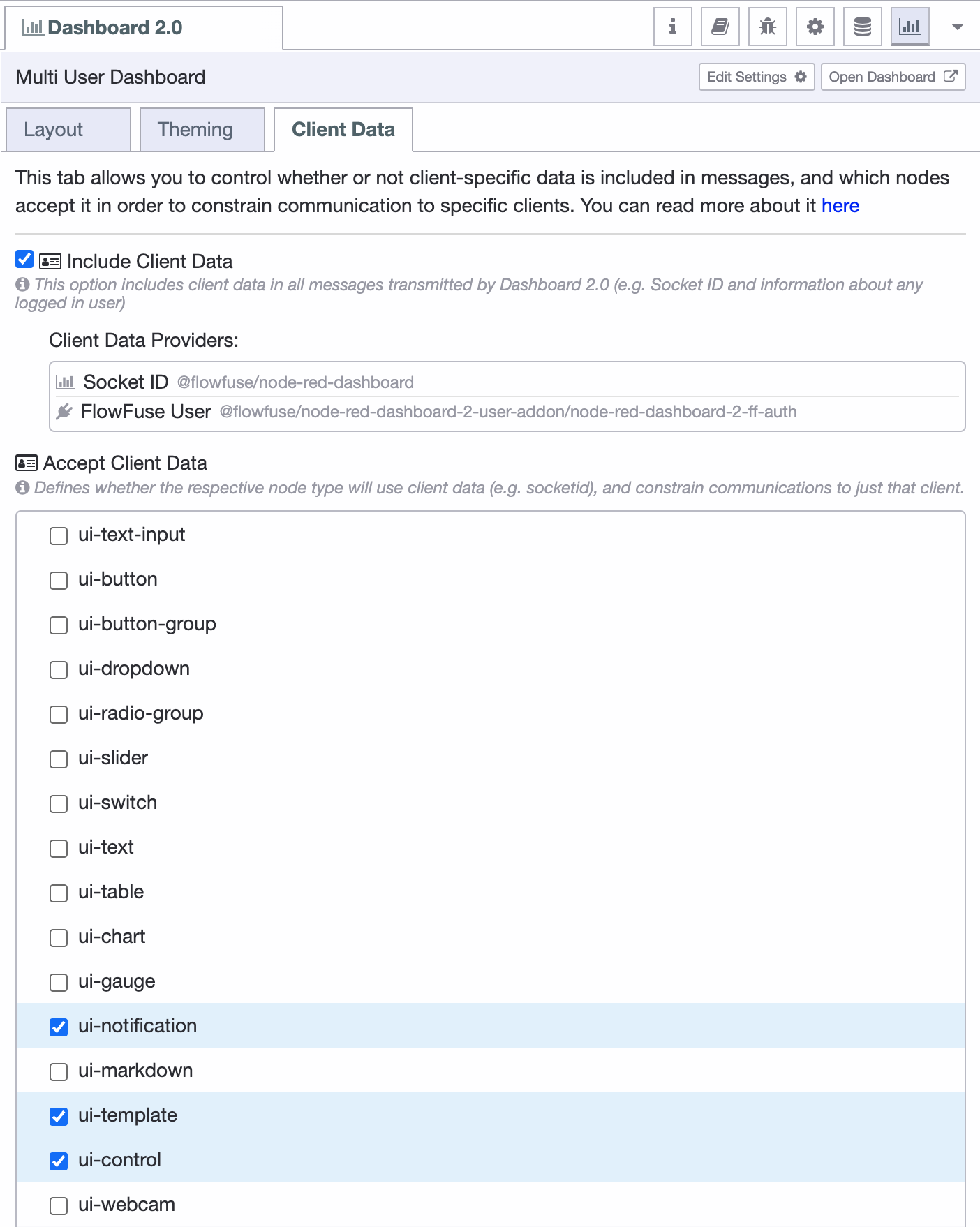 Screenshot of an example "Client Data" tab
If "Include Client Data" is toggled on, then all msg objects emitted from all nodes will contain a msg._client object, which will at a minimum detail the socketId for the connected client. It is possible to add on more data to this object, such as a username, email address, or other unique identifier with Dashboard plugins, e.g. the FlowFuse User Plugin.
The "Accept Client Data" table allow configuration over which node types will pay attention to any provided msg._client information. Any msg sent to one of these nodes can include a msg._client value to specify a particular connection (e.g. username, socket ID) that the data should be sent to, rather than to all clients.
For users familiar with the original Node-RED Dashboard, you'll recognise this pattern from what you could do with ui-notification and ui-control, now, in FlowFuse Dashboard, it's possible for all widgets.
The key here is that data is generally injected into a node as a consequence of a user action, e.g. clicking a button, viewing a page, or submitting a form, and the responding data is sent only back to that user.
An easy example of this design pattern in FlowFuse Dashboard is to utilise the UI Event node. The ui-event node emits a msg when a user loads a page. Within the msg is a full msg._client data object available for that client's connection. If this message is then sent onto another node that accept client data, then that full msg will only be sent to that specified client.
Example
Here we have a flow that will produce some client-defined data, and some shared data. When importing, be sure to check that in the Dashboard 2.0 sidebar, both ui-text and ui-template are checked in the "Accepts Client Data" table.
In the video above we see that in some cases, data is sent to just the client that triggered it (e.g. button clicks), and in others, the data is shared across all client sessions (e.g. the visualisation of slider value on the chart).
If you'd like to play with this example, the flow is as follows:
To cover a little more detail about the flow itself:
Client-Driven Data
For this use-case we've set ui-text and ui-template configured in the sidebar to "Accept Client Constraints".
In the top-half, the ui-event node will emit a message when a user loads the page. This message will contain a msg._client object, which is unique to that user's connection. This message is then sent to a ui-template node, which will display the socket ID of the specific user.
Similarly, we also have a button, which will also emit msg._client data (as all nodes will do), but this time it will be sent to a ui-text node. The ui-text will show the timestamp of the last time that the given client/user clicked that button.
Shared Data (All Clients)
This section of the flow demonstrates how a slider can be used to control a chart, note that we wire the slider straight into the chart because the ui-chart has not been configured to "Accept Client Data".
We also connect the ui-slider to two ui-template nodes. Given that ui-template nodes are configured to "Accept Client Data", we can demonstrate both shared and client-specific data in the same flow by deleting msg._client data on the way to the lower ui-template node. By removing this, any slider data sent here will be sent to all connections, because the msg doesn't specify a _client. The top ui-template will only update for the client that moved the slider.
Contributing
If you would like to run this set of nodes locally, and specifically to help contribute to the development efforts, you can read the Contributing documentation.
If you'd like to build your own standalone nodes & widgets that integrate seamlessly with FlowFuse Dashboard, you can read our guide on that here.