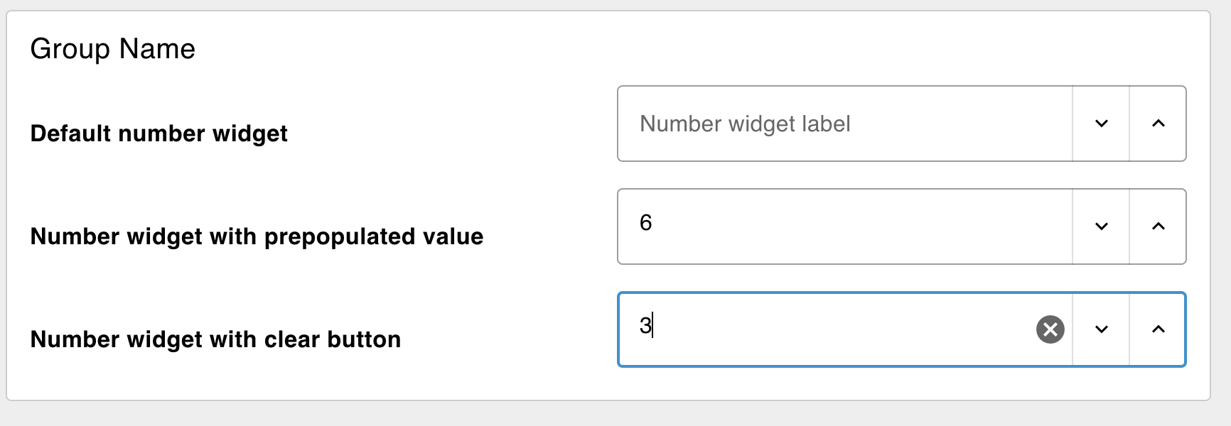
Adds a single number input row to your dashboard.
Properties
| Prop | Dynamic | Description |
|---|---|---|
| Group | Defines which group of the UI Dashboard this widget will render in. | |
| Size | Controls the width of the number input field with respect to the parent group. Maximum value is the width of the group. | |
| Icon | ✓ | Renders a Material Design icon within the Number Input. There is no need to include the "mdi-" prefix. |
| Icon Position | ✓ | If "Icon" is defined, this property controls which side of the "Label" the icon will render on. |
| Icon Inner Position | ✓ | If "Icon" is defined, this property controls if icon is render inside or outside the number input box. |
| Label | ✓ | The number shown within the number input field. Html content is allowed. |
| Min | ✓ | Defines the minimum allowable value for the number input field. |
| Max | ✓ | Defines the maximum allowable value for the number input field. |
| Step | ✓ | Sets the increment/decrement step for adjusting the number value in the input field. |
| Spinner | ✓ | Sets the layout of the spinners either as inline or stacked. |
| Tooltip | The number shown when hovering over the number input field. | |
| Passthrough | If this node receives a msg in Node-RED, should it be passed through to the output as if a new value was inserted to the input? | |
| Clear selection with button | ✓ | If true, a clear icon/button appears on the right side to clear the number input. |
| Send On "Clear Button" | Send a msg when the user clear the number input using the clear button, the "Clear Selection" button must be enabled. |
Dynamic Properties
Dynamic properties are those that can be overriden at runtime by sending a particular msg to the node.
Where appropriate, the underlying values set within Node-RED will be overriden by the values set in the received messages.
| Prop | Payload | Structures | Example Values |
|---|---|---|---|
| Class | msg.class | String | |
| Label | msg.ui_update.label | String | |
| Clearable | msg.ui_update.clearable | Boolean | |
| Icon | msg.ui_update.icon | String | |
| Icon Position | msg.ui_update.iconPosition | String | left|right |
| Icon Inner Position | msg.ui_update.iconInnerPosition | String | inside|outside |
| Min | msg.ui_update.min | Number | |
| Max | msg.ui_update.max | Number | |
| Step | msg.ui_update.step | Number | |
| Spinner | msg.ui_update.spinner | String |
Controls
| msg. | Example | Description |
|---|---|---|
| enabled | true | false | Allow control over whether or not the number-input is enabled |
Example
 Example of several Number Inputs Types rendered in a Dashboard.
