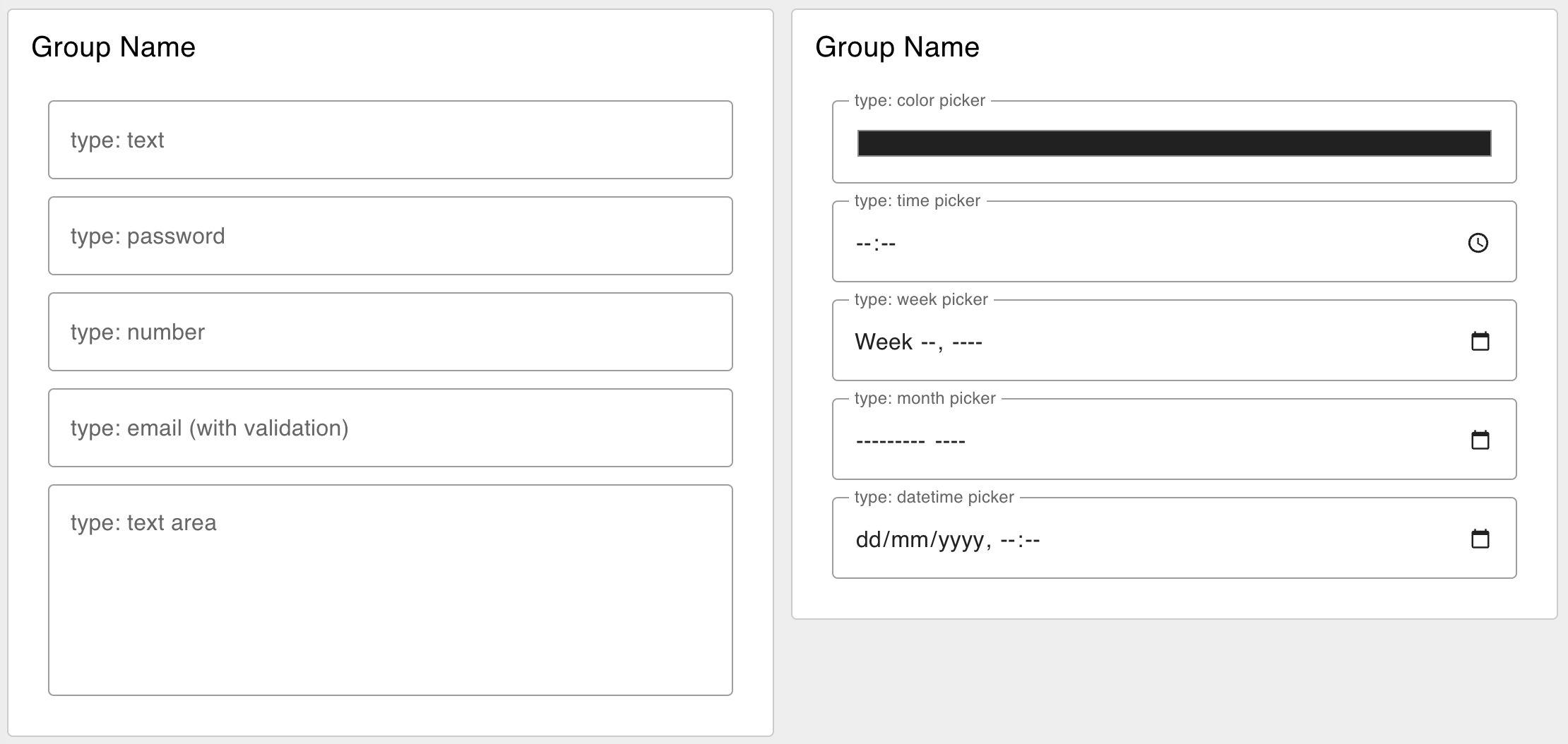
Adds a single text input row to your dashboard, with a configurable "type" (text, password, etc).
Properties
| Prop | Dynamic | Description |
|---|---|---|
| Group | Defines which group of the UI Dashboard this widget will render in. | |
| Size | Controls the width of the text input field with respect to the parent group. Maximum value is the width of the group. | |
| Icon | ✓ | Renders a Material Design icon within the Text Input. There is no need to include the "mdi-" prefix. |
| Icon Position | ✓ | If "Icon" is defined, this property controls which side of the "Label" the icon will render on. |
| Icon Inner Position | ✓ | If "Icon" is defined, this property controls if icon is render inside or outside the text input box. |
| Label | ✓ | The text shown within the text input field. Html content is allowed. |
| Tooltip | The text shown when hovering over the text input field. | |
| Mode | ✓ | The type of HTML input to display. Options - text | password | email | number | tel | color | date | time | week | month | datetime-local |
| Passthrough | If this node receives a msg in Node-RED, should it be passed through to the output as if a new value was inserted to the input? | |
| Send On "Delay" | If true, then a msg will be emitted will be sent after the delay specified in "Delay (ms)". | |
| Delay | If "Send on Delay" is true, then the value in the text input will be send after this (ms) delay. | |
| Clear selection with button | ✓ | If true, a clear icon/button appears on the right side to clear the text input |
| Send On "Focus Leave" | Sends a msg when the text input loses focus. Will always send, even if the value has not changed. | |
| Send On "Press Enter" | Sends a msg when the user presses the enter key. Will always send, even if the value has not changed. | |
| Send On "Clear Button" | Send a msg when the user clear the text input using the clear button, the "Clear Selection" button must be enabled. |
Dynamic Properties
Dynamic properties are those that can be overriden at runtime by sending a particular msg to the node.
Where appropriate, the underlying values set within Node-RED will be overriden by the values set in the received messages.
| Prop | Payload | Structures | Example Values |
|---|---|---|---|
| Class | msg.class | String | |
| Mode | msg.ui_update.mode | String | |
| Label | msg.ui_update.label | String | |
| Icon | msg.ui_update.icon | String | |
| Icon Position | msg.ui_update.iconPosition | String | left|right |
| Icon Inner Position | msg.ui_update.iconInnerPosition | String | inside|outside |
| Clearable | msg.ui_update.clearable | Boolean |
Controls
| msg. | Example | Description |
|---|---|---|
| enabled | true | false | Allow control over whether or not the text-input is enabled |
Example
 Example of several Text Inputs Types rendered in a Dashboard.
