Adds a clickable button to your dashboard.
Properties
| Prop | Dynamic | Description |
|---|---|---|
| Group | Defines which group of the UI Dashboard this widget will render in. | |
| Size | Controls the width of the button with respect to the parent group. Maximum value is the width of the group. | |
| Icon | ✓ | Renders a Material Design icon within the button. There is no need to include the "mdi-" prefix. |
| Icon Position | ✓ | If "Icon" is defined, this property controls which side of the "Label" the icon will render on. |
| Label | ✓ | The text shown within the button. If not provided, then the button will only render the icon. |
| Button Color | ✓ | Button Color. If not provided, default theme color will be used. |
| Text Color | ✓ | Text (Label) color. If not provided calculated automatically based on Button color to be Black or White. |
| Icon Color | ✓ | Icon color. If not provided, will have the same color as text / label. |
| Enable pointerup event | Enables the capturing of pointerup events on the button. The output will contain msg._event which details the type of interaction causing the event. | |
| Enable pointerdown event | Enables the capturing of pointerdown events on the button. The output will contain msg._event which details the type of interaction causing the event. | |
| Enable click event | Enables the capturing of click events on the button, i.e.g when both the pointerdown and pointerup events occur whilst the mouse stays inside the button. The output will contain msg._event which details the type of interaction causing the event. | |
| Emulate Button Click | If enabled, any received message will trigger a button click, emitting the relevant payload and topic. |
Dynamic Properties
Dynamic properties are those that can be overriden at runtime by sending a particular msg to the node.
Where appropriate, the underlying values set within Node-RED will be overriden by the values set in the received messages.
| Prop | Payload | Structures | Example Values |
|---|---|---|---|
| Icon | msg.ui_update.icon | String | |
| Icon Position | msg.ui_update.iconPosition | String | |
| Label | msg.ui_update.label | String | |
| Button Color | msg.ui_update.buttonColor | String | |
| Text Color | msg.ui_update.textColor | String | |
| Icon Color | msg.ui_update.iconColor | String | |
| Class | msg.ui_update.class | String |
Controls
| msg. | Example | Description |
|---|---|---|
| enabled | true | false | Allow control over whether or not the button is clickable. |
Example
Simple Button
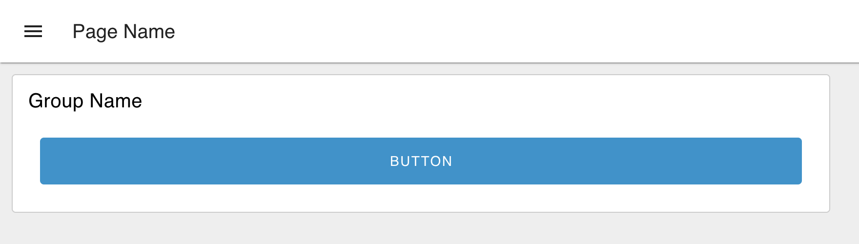 Example of a rendered button in a Dashboard.
Measuring Hold Duration
It's possible to configure a button to emit pointerdown and pointerup events. With this, it's possible to measure how long a button is held down for.
The flow to achieve this demo is as follows: