
Layout: Grid
Similar to Bootstrap's Grid System, this provides 12 (by default) columns, within which content can be scaled. It is built as a CSS Grid layout.
Each group's width represents the number of columns that it will populate in the overall Page's Grid layout, e.g. a Group, with width 12, will be full width of the screen, even when that screen width is changed.
The layout will automatically move widgets to the next row if they don't fit within a given row. The height of each row is determined by the tallest widget in that row.
Breakpoints
Depending on the screen size, the number of default columns rendered can change. Here you can see examples of the columns rendered at three breakpoints:
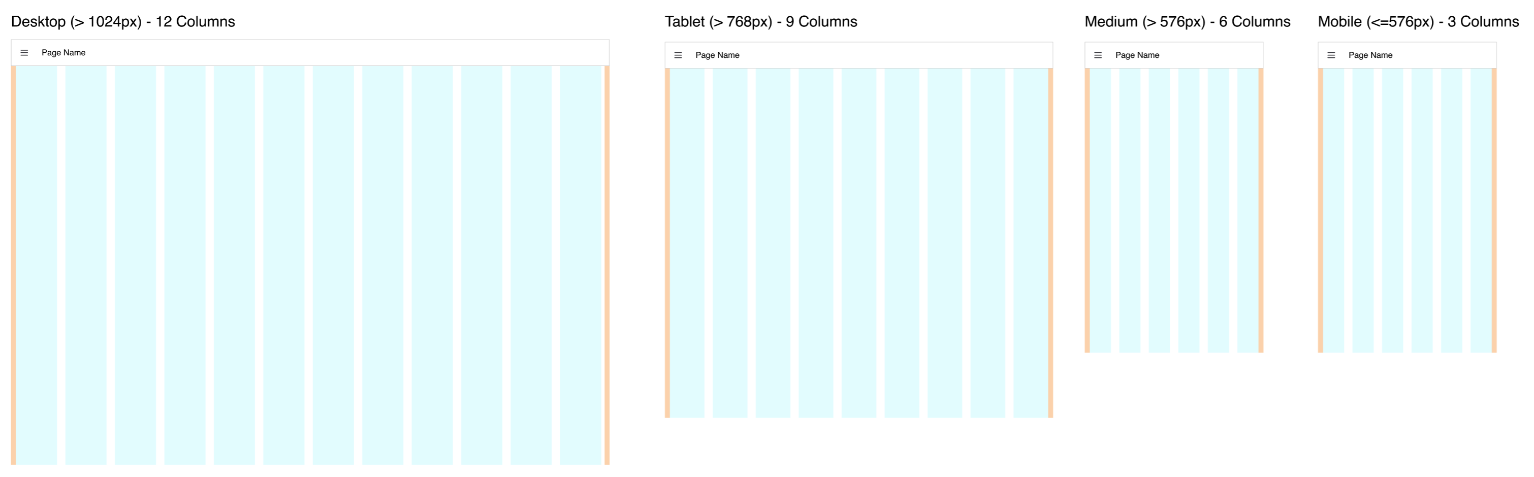 Guidelines demonstrating the columns rendered in the "Grid" Layout at different screen sizes
The exact breakpoints used can be configured in the page's settings.
Controlling Width
Groups will populate the width as defined, and then they create their own grid layout internally where the number of columns in that group is equal to the width of the group. The groups can have their own internal paddings and pages that can be customized.
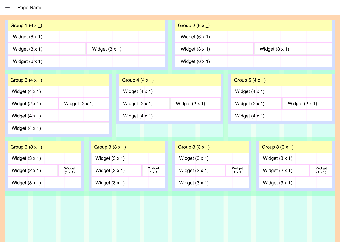 Guidelines demonstrating the columns rendered in the "Grid" Layout at different screen sizes
You can read more about these customizations to the theme and layout here.
Making widget widths uniform
A group insets its widgets with a small side padding, and because that padding is shared across the group's columns, a 1×1 widget is a touch narrower in a narrow group than in a wide one. To make widths match across all group sizes, set that padding equal to (Widget Gap − Group Gap) / 2 using a ui-template CSS override.
For example, with the default 12px gaps, set Group Gap to 0 and add:
.nrdb-ui-group .v-card-text {
    padding: 6px;
}
Widgets are then the same width at every group size. Groups sit flush against each other with this setting; raise Group Gap and Widget Gap together to keep a visible gap between groups. The exact padding depends on your group border and gaps, so adjust it to taste.
Controlling Empty Space
Controlling empty space can be tricky with a Grid Layout. We do not have a smart masonry layout (example) currently, instead we are utilizing CSS's Grid Layout Module.
As such, the height of a given "row" of widgets is determined by the tallest widget in that row.
Most widgets will strictly abide by their widget and height specified, however, some (e.g. ui-template or ui-markdown) will grow with their content, even if that means surpassing the height specified in the widget's config.
Here, we can see an example of a rendered Grid layout in FlowFuse Dashboard:
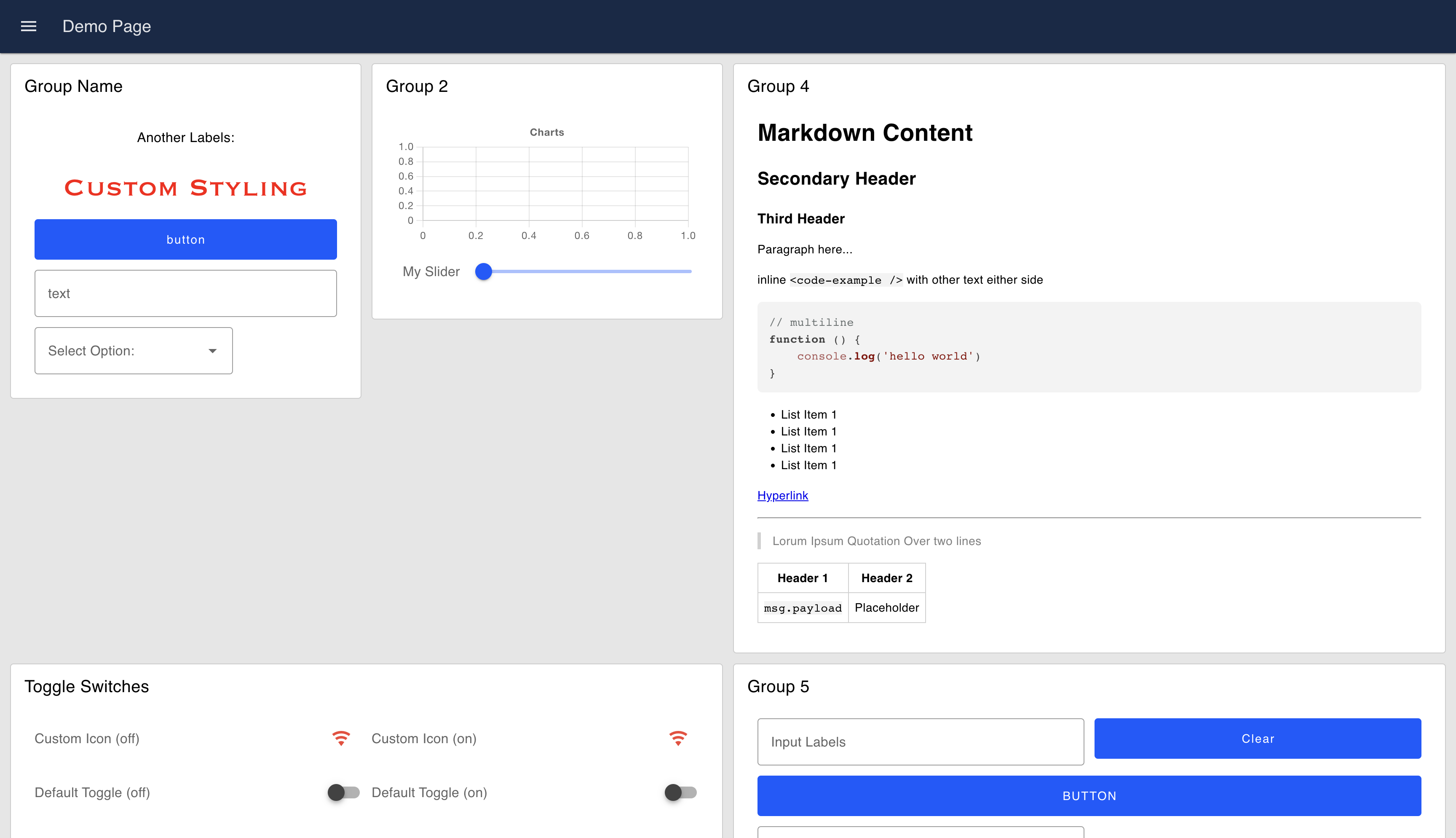 An example UI rendered using the "Grid" Layout