Layout: Notebook Added In: v0.4.0
This layout mimics a traditional Jupyter Notebook, where the layout will stretch to 100% width, up to a maximum width of 1024px, and will centrally align.
A common use case for this type of layout would be to inject dynamic Markdown, data tables and data visualisations.
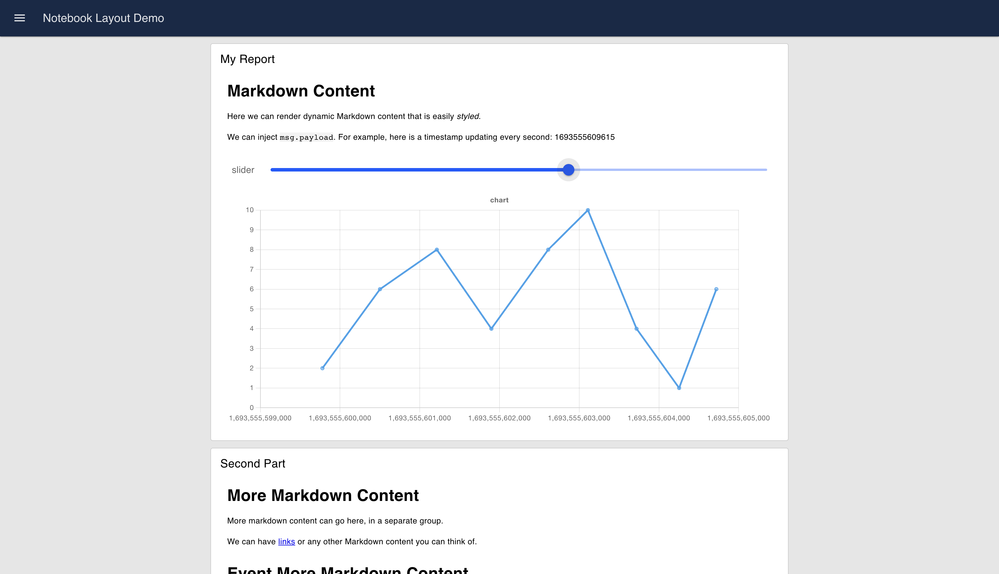
 An example UI rendered using the "Notebook" Layout
Controlling Width & Columns
Within the Notebook itself, the "width" property follows the same columns principles of the Grid layout, which you can read more about here, but with a full default width of "6".
By increasing the "width" of a group, you're actually increasing the number of columns that group will represent, within which the widgets will render. This provides the means to add finer grain control over the layout of your UI, allowing you to put more widgets side-by-side in a single row, and helps with responsiveness of your dashboard.
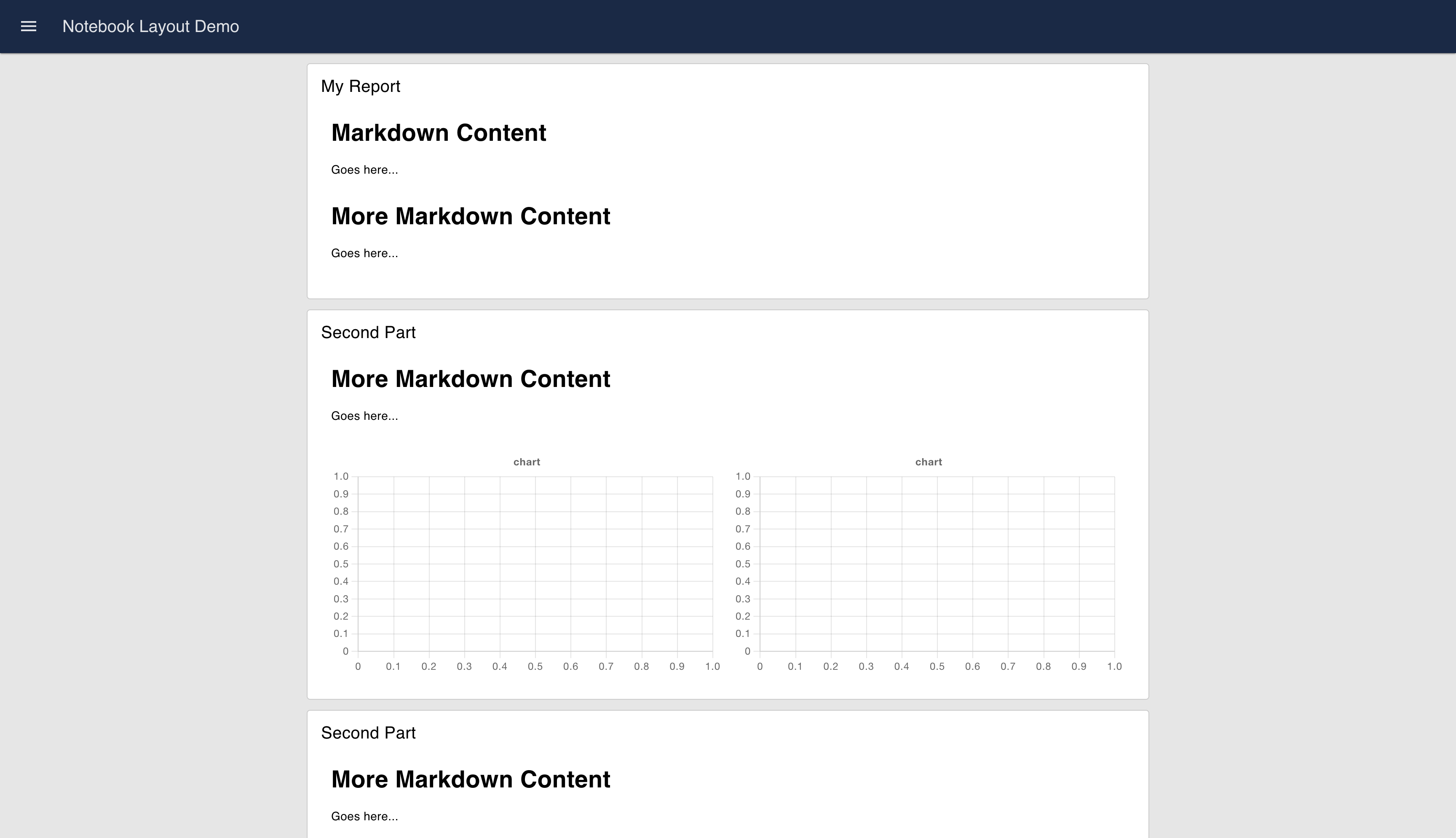
A group has a default width of "6" columns, with the full Notebook also a width of "6". Here, we can see two charts, rendered side-by-side, with each chart having a width of "3" columns.
 An example UI rendered using the "Notebook" Layout
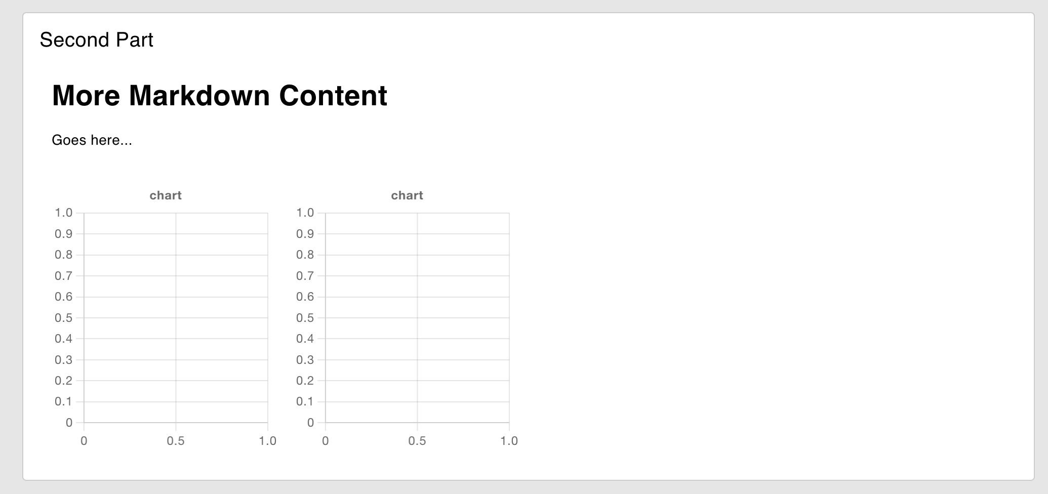
We can get finer grain width control within a group by increasing its width. The Notebook itself will not render the group any wider, but the group itself will render with 12 columns internally. So, if we increase the "width" (number of columns) of the group to 12, then the two charts are then setup to only take up half of the width of the group (3 columns each).
 An example UI rendered using the "Notebook" Layout
Breakpoints
Depending on the screen size, the number of default columns rendered can change. Here you can see examples of the columns rendered at three breakpoints:
 Guidelines demonstrating the columns rendered in the "Grid" Layout at different screen sizes
The exact breakpoints used can be configured in the page's settings.
Also, because Notebook layouts render groups at the full width, the number of columns within the group is generally driven by the minimum of the group's columns/width and the page's columns. So, in a case where a Group has 9 columns, if the page layout enforces 6 columns due to the breakpoint, it will render with 6. If however, the group's width is 6, and the page breakpoint defines 12 columns, the group will still render at 6.
