Template ui-template Added In: v0.10.0
Try Demo Provide custom JS and HTML (including any Vuetify components) to render in the Dashboard.
- Define your own Vue components
- Load external JS dependencies
- Write raw JavaScript
- Use Vuetify components
Properties
| Prop | Dynamic | Description |
|---|---|---|
| Group | Defines which group of the UI Dashboard this widget will render in. | |
| Scope | Template nodes can be used for 3 purposes/scopes:
| |
| Class | Appends CSS classes to the widget | |
| Template | The content of the widget or CSS <style>. If using this for CSS, you do not need to include any <style> tags, as these will be automatically added. |
Dynamic Properties
Dynamic properties are those that can be overriden at runtime by sending a particular msg to the node.
Where appropriate, the underlying values set within Node-RED will be overriden by the values set in the received messages.
| Prop | Payload | Structures | Example Values |
|---|---|---|---|
| Format | msg.ui_update.format | String |
Writing Custom Widgets
UI Template will parse different tags and render them into Dashboard. The available tags are:
<template>- Any HTML code in here will be rendered into the Dashboard.<script>- Any JavaScript code in here will be executed when the widget is loaded. You can also define a full VueJS component here.<style>- Any CSS code in here will be injected into the Dashboard.
Working with Variables
Any variables that you want to render into your <template /> are done so in one of two ways:
- Attribute Binding - Use
:to bind a variable to an attribute. Anything inside the""here is treated as JavaScript, for example:
<p :class="msg.payload">Hello World</p>or, if you want to use msg.payload as part of the value, you can do this:
<!-- Change color based on msg.payload. Expects payload to be either "error", "warning" or "info" -->`
<p :class="'text-' + msg.payload">Hello World</p>
<!-- or with string literals: -->
<p :class="`text-${msg.payload}`">Hello World</p>
or even use msg.payload as a condition:
<!--
  Change color based on the value of msg.payload:
  * When msg.payload equals "error", set text to the predefined `text-error` color.
  * Otherwise, set text to the predefined `text-info` color.
-->
<p :class="msg.payload === 'error' ? 'text-error' : 'text-info'">Hello World</p>- Text Interpolation - Use
{{ }}to interpolate a variable into the text of an element. Anything inside the curly brackets is treated as JavaScript. For example:
<p>Hello {{ msg.payload }}</p><p>Percentage {{ msg.payload * 100 }}%</p>Built-in Variables
You have access to a number of built-in variables in your ui-template node:
id- The ID of theui-templatenode, assigned by Node-RED.msg- The last message received by theui-templatenode.$socket- The socket.io connection that is used to communicate with the Node-RED backend.
When accessing the msg variable inside a <script /> tag, you need to prefix the variable name with this. (e.g. this.msg.payload) so that it knows you're accessing the component-bound msg variable.
Important Note: On first load, msg.payload may be null or undefined, and trying to access a nested property will throw an error. Using the optional chaining (?.) operator, e.g. msg.payload?.nested?.property will prevent these errors occurring.
Accessing Node-RED Global/Flow Context
The flow/global context stores are not available in the Dashboard UI, as such, the best practice here is to use a "Change" node prior to the ui-template node to assign a msg.<property> to the relevant value from the flow. or global. store:
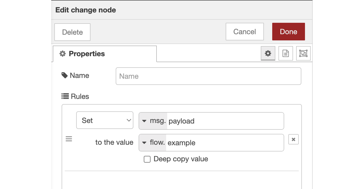 Example of using a Change node to assign a value to
 msg.payload.
Built-in Functions
We also offer some helper functions for the Node-RED integration too:
Sending Data
this.send(msg)- Send a message to the Node-RED flow. If a non-Object value is sent, then Dashboard will automatically wrap that into amsg.payloadobject.
Receiving Data
There are two ways of responding to messages received by your ui-template node:
Option 1:
In VueJS, we can watch a variable for any changes, and react accordingly.
As mentioned in the Built-in Variables section above, we have access to the msg variable in our ui-template node. We can watch this variable for any changes, and react accordingly:
watch: {
    msg: function () {
        // do stuff with this.msg
        // runs onLoad and onInput
    }
}
It's worth noting though, that whilst this will update when new messages are received, it also updates when a widget first loads, and the latest msg is loaded to the widget.
Option 2:
We can alternatively add a custom socket listener to the msg-input:<id> event. This is useful if you want to listen to messages only when they are received, and not when the widget first loads.
this.$socket.on('msg-input:' + this.id, (msg) => {
    // do stuff with msg
    // runs only when messages are received
})
This can be added into the widget's mounted () { } handler
Example (Raw JavaScript)
Putting this together, here is a simple starter widget that will alert the user when they click the button, and send a message into Node-RED.
<template>
    <!-- Any HTML can go here -->
    <button class="my-class" onclick="onClick()">My Button</button>
</template>

<script>
    /* Write any JavaScript here */
    // add our onClick function to the window object to make it accessible by the HTML <button>
    window.onClick = function () {
        alert('Button has been clicked')
    }

    // Use send() function to pass on data back into Node-RED:
    this.send('Component has loaded')

    // Subscribe to the incoming msg's
    this.$socket.on('msg-input:' + this.id, function(msg) {
        // do stuff with the message
        alert('message received: ' + msg.payload)
    })
</script>

<style>
    /* define any styles here - supports raw CSS */
    .my-class {
        color: red;
    }
</style>
Loading External Dependencies
It is possible to load external dependencies into your ui-template node. This is useful if you want to use a library that isn't included in the core FlowFuse Dashboard nodes.
To do this, you'll need to load the dependency in the <script> section of your template. For example, to load the Babylon.js library, you would do the following:
<script src="https://cdn.babylonjs.com/babylon.js"></script>You can then have another <script /> tag in the same ui-template that utilises this library.
An important caveat here is that, whilst this does get injected into the <head /> of the Dashboard, because our widgets are loaded after the initial page load, the library isn't always available straight away as your Widget and HTML loads.
If you need access to the library as soon as it's available, the trick to this is to run a setInterval() and watch the window object for the library to be loaded.
For example:
<template>
    <!-- Template Content Here -->
</template>

<script src="https://cdn.babylonjs.com/babylon.js"></script>

<script>
function init () {
    alert('Babylon.js is loaded')
}

// run this code when the widget is built
let interval = setInterval(() => {
    if (window.BABYLON) {
        // call an init() to use BABYLON
        init();
        // Babylon.js is loaded, so we can now use it
        clearInterval(interval);
    }
}, 100);
</script>
Building Full Vue Components
You can build full Vue components in the ui-template node, using VueJS's Options API. This allows you to build your own bespoke behaviour, and gives you more control over the UI.
A full list of the VueJS Options API properties that we currently support are:
name- The name of your componentdata- A function that returns data you want available across your component (in both<template>and<script>sections)watch- Run a function anytime a particular component variable changescomputed- Calculate a variable based on other variables in your componentmethods- Define functions that can be called from your<template>or<script>sectionsmounted- Run code when the component is first loadedunmounted- Run code when the component is removed from the Dashboard
Example (Full Vue Component)
Here we define a counter widget, and utilise Vue's data, watch, computed and methods properties. This widget will automatically update the formattedCount variable whenever the count variable changes and will send a message to Node-RED whenever the count variable reaches a multiple of 5.
<template>
    <div>
        <h2>Counter - loaded: {{ loaded }}</h2>
        <p>Current Count: {{ count }}</p>
        <p class="my-class">Formatted Count: {{ formattedCount }}</p>
        <v-btn @click="increase()">Increment</v-btn>
    </div>
</template>

<script>
    export default {
        data() {
            // define variables available component-wide
            // (in <template> and component functions)
            return {
                loaded: false,
                count: 0
            }
        },
        watch: {
            // watch for any changes of "count"
            count: function () {
                if (this.count % 5 === 0) {
                    this.send({payload: 'Multiple of 5'})
                }
            }
        },
        computed: {
            // automatically compute this variable
            // whenever VueJS deems appropriate
            formattedCount: function () {
                return `${this.count} Apples`
            }
        },
        methods: {
            // expose a method to our <template> and Vue Application
            increase: function () {
                this.count++
            }
        },
        mounted() {
            // code here when the component is first loaded
            this.loaded = true
        },
        unmounted() {
            // code here when the component is removed from the Dashboard
            // i.e. when the user navigates away from the page
        }
    }
</script>
<style>
    /* define any styles here - supports raw CSS */
    .my-class {
        color: red;
    }
</style>
Anything returned from the data function is automatically made available to the <template>. This means that we can use the count variable in our template, and it will automatically update as the variable changes.
We can also watch any of these data variables, and react accordingly. For example, above, we send a message to Node-RED whenever the count variable reaches a multiple of 5.
We use a computed variable which will automatically update whenever the count variable changes. This allows us to format the count variable in a way that is more useful to us to display, without affecting the underlying count variable.
Teleports
You can use Vue's Teleport feature to render content to a specific location in the DOM.
The code can be written into a ui-template node, and the scope set to "group", "page" or "UI" depending on when you want this <Teleport> to be active.
We provide some pre-defined locations that you can use:
Page Name (#app-bar-title)
Add content to the left-side of the header of the Dashboard. <Teleport> can be used as follows:
<template>
    <Teleport v-if="mounted" to="#app-bar-title">
        <v-btn>Button 1</v-btn>
        <v-btn>Button 2</v-btn>
    </Teleport>
</template>
<script>
    export default {
        data() {
            return {
                mounted: false
            }
        },
        mounted() {
            this.mounted = true
        }
    }
</script>
This would result in:
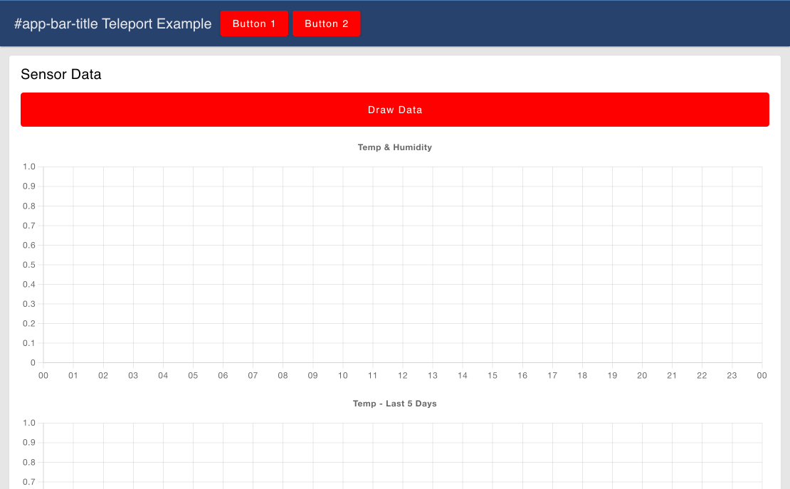 Example of Teleporting content to the App Bar Title, adding to the existing page name
We can also turn off the rendering of the page name under the Dashboard's main settings, so, when using the teleport, this would be the only content rendered in the top-left.
Here, we can render an image (injected via msg.payload) instead of the page name:
<template>
    <Teleport v-if="mounted" to="#app-bar-title">
        <img height="32px" :src="msg.payload"></img>
    </Teleport>
</template>
<script>
    export default {
        data() {
            return {
                mounted: false
            }
        },
        mounted() {
            this.mounted = true
        }
    }
</script>
This would result in:
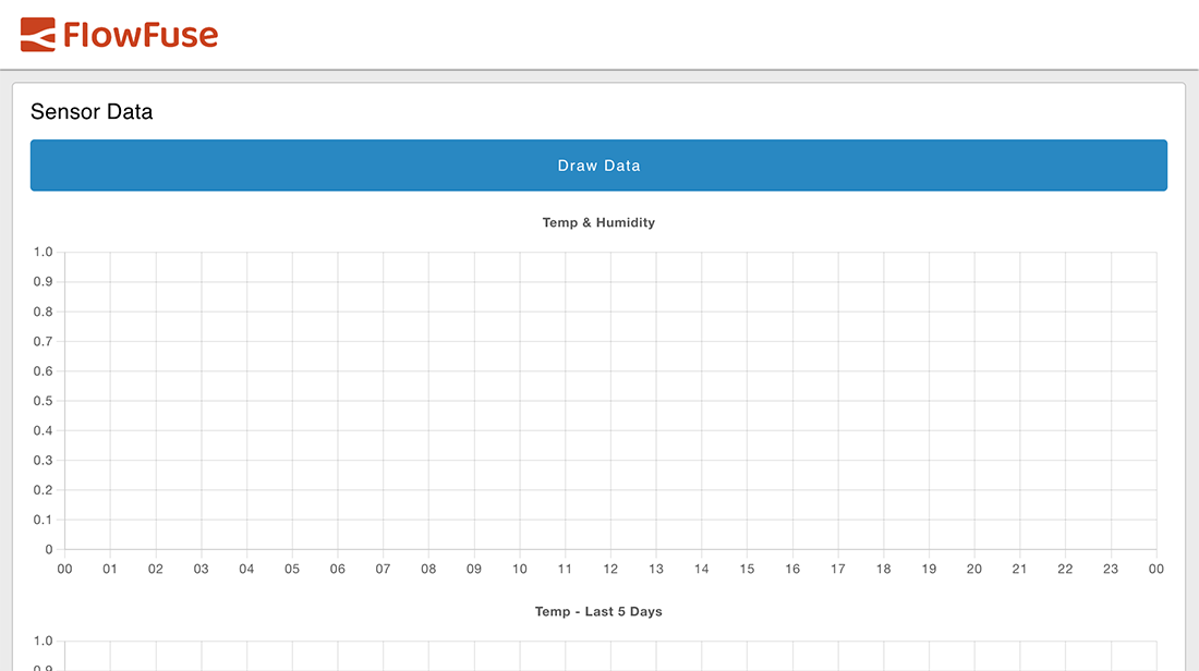 Example of Teleporting content to the App Bar Title, and hiding hte page name
App Bar - Actions (#app-bar-actions)
Renders content to the right-hand side of the Dashboard's App Bar. To use this teleport, you can use the following syntax:
<template>
    <Teleport v-if="mounted" to="#app-bar-actions">
        <v-btn>My Action</v-btn>
    </Teleport>
</template>
<script>
    export default {
        data() {
            return {
                mounted: false
            }
        },
        mounted() {
            this.mounted = true
        }
    }
</script>
This would result in:
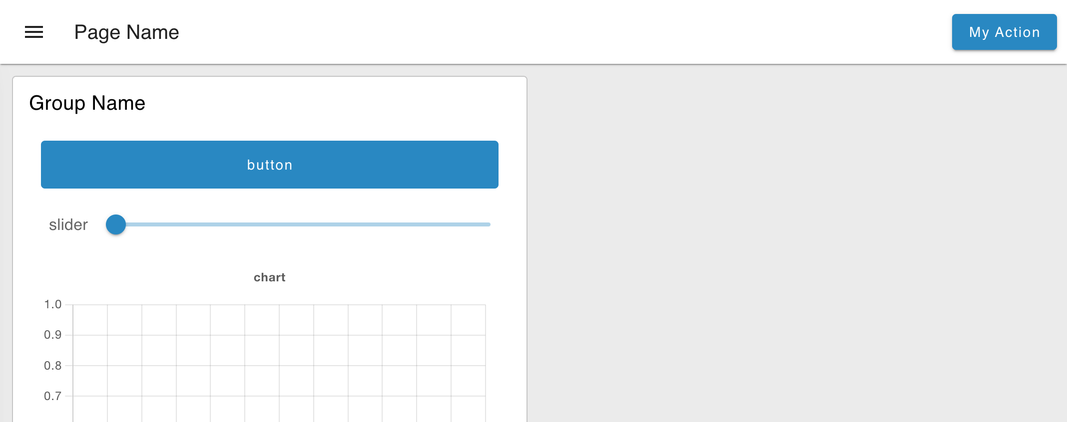
Note the use of v-if="mounted" in the <Teleport /> tag. For some reason, Vue complains when trying to render a Teleport inside our ui-template, before the component has fully mounted, Including this v-if statement prevents this error.
URL Parameters
Vue has a built-in this.$route object which details the information about the active route. This includes any query parameters included in the URL (e.g. /dashboard/my-page?query=param), which can be defined when using a UI Control or when navigating to a page directly.
An example of how to access these parameters is as follows:
<template>
    <div>
        <p>Query Parameter: {{ $route.query }}</p>
    </div>
</template>
Additional Examples
Any Vue Components that you define in ui-template extend the underlying ui-template Vue component. This includes a collection of builtin methods, data and supported Widgets. You can also render dynamic content using any VueJS data-binding expressions, (e.g. v-if, v-for).
Reading Node-RED Input
Whenever a ui-template receives a msg in Node-RED, that is automatically assigned to the msg variable in the template. Such an example would be:
<template>
    <div>
        <h2>Latest <code>msg</code> received:</h2>
        <pre>{{ msg }}</pre>
    </div>
</template>
Sending Messages to Node-RED
Two exposed methods, send and submit, allow you to send messages from the Dashboard to the Node-RED flow.
send- Outputs a message (defined by the input to this function call) from this node in the Node-RED flow.submit- Send aFormDataobject when attached to a<form>element. The created object will consist of thenameattributes for each form element, corresponding to their respectivevalueattributes.
Sending on Click
Here, we call it when someone clicks our "Send Hello World" button:
<v-btn @click="send({payload: 'Hello World'})">Send Hello World</v-btn>Sending on Change
Or another example, where the payload is automatically sent any time the v-model is changed:

<v-rating hover :length="5" :size="32" v-model="value"
    active-color="primary" @update:model-value="send({payload: value})"/>
v-model in Vue is a way of two-way binding a variable to a widget. Here, we bind the value variable to the v-rating widget. Then we watch for changes on that value with @update:model-value and send the value variable to the Node-RED flow via msg.payload.
When changed, if wired to a "Debug" node, then we can see the resulting outcome is as follows:

Vuetify Widgets
The ui-template node also has access to the Vuetify component library by default. The library provides a large number of pre-built widgets that you can use in your Dashboard.
These are particularly useful as they provide easy access to a large number of pre-built widgets that aren't necessarily included in the core nodes of FlowFuse Dashboard.
Some example widgets that you may find useful are:
- File Input - Allows for the selection of a file from the user's local filesystem.
- Star Rating Widget - A star rating widget, where users can select a rating from 1-n stars.
- Progress Linear - A horizontal bar to show progress of a task or single bar-graph type visualisations.
