UI Template Examples
The UI Template node allows you to create custom widgets for your dashboard, as well as define custom CSS to style your dashboard in anyway you like.
To help get you started on these, we've collected a few useful examples that you can use or modify to suit your own needs.
Widgets
Custom Charts
You can find a collection of example of how to use Chart.js within the ui-template node in the Building Custom Charts section of the UI Chart documentation.
Custom Data Tables
Whilst we do offer the ui-table widget out of the box, it's fairly basic in its functionality, and doesn't allow for much customization of cells and styling.
In Node-RED Dashboard, there was a popular third-party ui-table widget, which offered wider customisation, but for FlowFuse Dashboard, we've taken a slightly different approach. Rather than defining a spec that you must put your data into, in order to utilise a set number of features in a library, with FlowFuse Dashboard, you can use the ui-template to customise a data table in anyway you like, and with any data format.
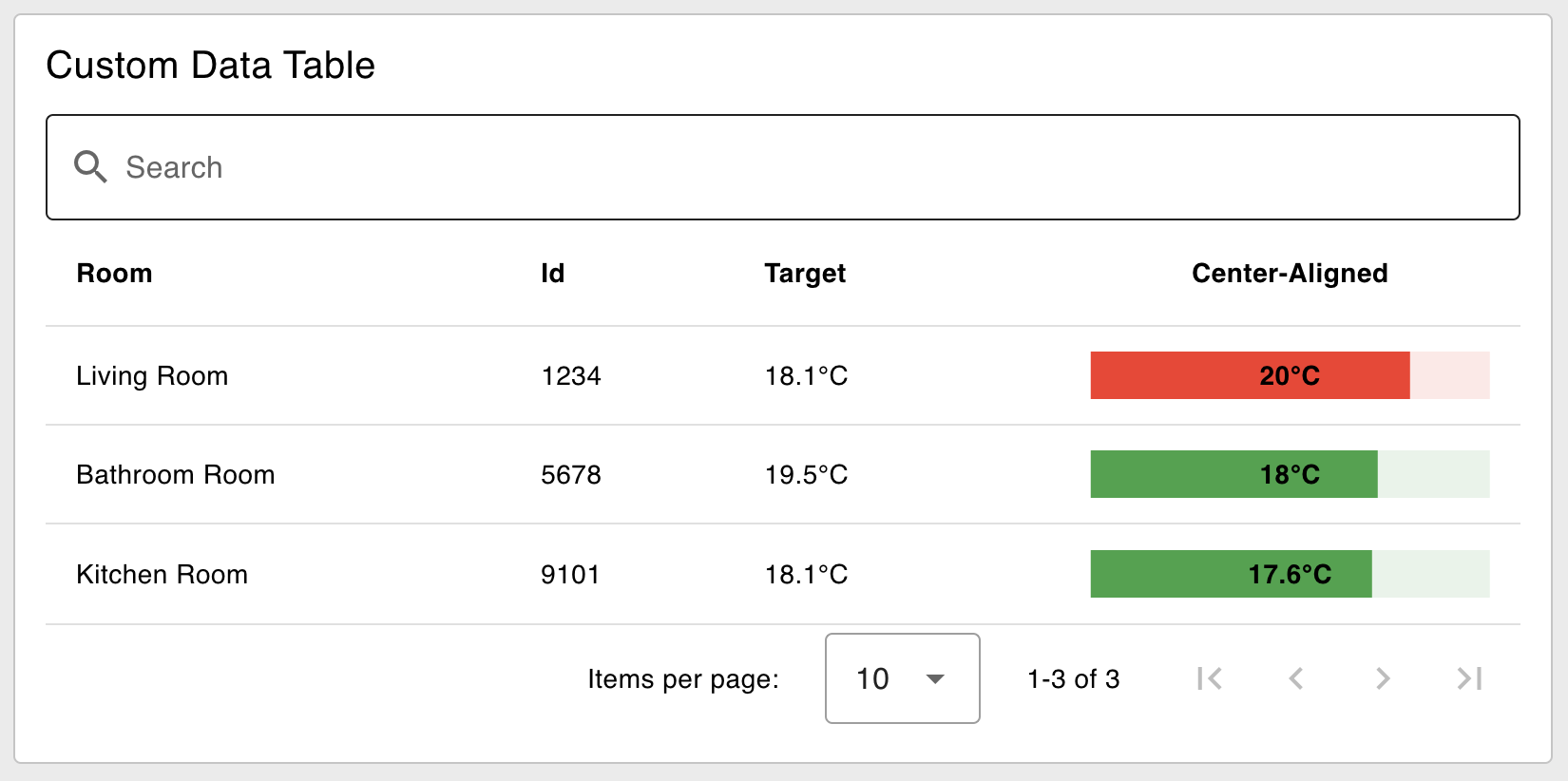 Example of a custom header and cell content using ui-template and Vuetify's Data Table
Here we take a look at how you can use the UI Template node, and Vuetify's Data Table (which is what we use under the covers in ui-table anyway), to make data tables with unlimited customisations:
<template>
    <!-- Provide an input text box to search the content -->
    <v-text-field v-model="search" label="Search" prepend-inner-icon="mdi-magnify" single-line variant="outlined"
    hide-details></v-text-field>
    <v-data-table v-model:search="search" :items="msg?.payload">
      <template v-slot:header.current>
        <!-- Override how we render the header for the "current" column -->
        <div class="text-center">Center-Aligned</div>
      </template>

      <template v-slot:item.target="{ item }">
        <!-- Add a custom suffix to the value for the "target" column -->
        {{ item.target }}°C
      </template>

      <template v-slot:item.current="{ item }">
        <!-- Render a Linear Progress Bar for the "current" column -->
        <v-progress-linear v-model="item.current" min="15" max="25" height="25" :color="getColor(item)">
          <template v-slot:default="{ value }">
            <strong>{{ item.current }}°C</strong>
          </template>
        </v-progress-linear>
      </template>

    </v-data-table>
</template>

<script>
    export default {
    data () {
      return {
        search: ''
      }
    },
    methods: {
        // add a function to determine the color of the progress bar given the row's item
      getColor: function (item) {
        if (item.current > item.target) {
          return 'red'
        } else {
          return 'green'
        }
      }
    }
  }
</script>
Where we pass in data such as:
[
    {
        "room": "Living Room",
        "id": "1234",
        "target": 18.1,
        "current": 20
    },
    {
        "room": "Bathroom Room",
        "id": "5678",
        "target": 19.5,
        "current": 18
    },
    {
        "room": "Kitchen Room",
        "id": "9101",
        "target": 18.1,
        "current": 17.6
    }
]
Vuetify's Data Table will automatically render a column for each item in the data provided, by default it will just render it as text (as we do in ui-table). However, we can also use the <template v-slot:item.property /> syntax to override how we render a particular cell.
Important Note: Case Sensitivity
This is only relevant if you wish to use <template> overrides in your v-data-table to customize the appearance of a cell or header.
Due to a limitation in the way that HTML renders, you cannot use capital letters in DOM templates. This means that if you have a property in your data called myProperty or My_Property, then we need to transform it to an HTML-friendly format, before we can include it in <template v-slot:item.property="{ item }">.
This transformation can be achieved using the v-data-table's headers option which allows us to map values and keys.
<template>
    <div id="app">
        <v-text-field v-model="search" label="Search" prepend-inner-icon="mdi-magnify" single-line variant="outlined"
            hide-details></v-text-field>
        <v-data-table v-model:search="search" :headers="headers" :items="msg?.payload" class="elevation-1" :items-per-page="20">
            <template v-slot:header.lowercase>
                <div>custom <b>html</b> title</div>
            </template>
            <template v-slot:item.snake_case="{ item }">
                ${{ 3 * item.snake_case }}
            </template>
        </v-data-table>
    </div>
</template>

<script>
    export default {
    data () {
      return {
        search: '',
        headers: [
            // a basic header definition
            { title: 'kebab-case', key: 'kebab-case' },
            { title: 'slithering', key: 'snake_case'},
            // we can also skip defining a title here,
            // and use v-slot (see in HTML above) instead
            { key: 'lowercase' },
            // if we need to transform due to case sensitivity, we can do so like this:
            { title: 'Date & Time', key: 'camel-case', value: item => item['camelCase']},
            // we can also add JS transformation to our values too
            { title: 'All Caps', key: 'macro-case', value: item => item['MACRO_CASE'].toUpperCase()}
        ],
      }
    },
  }
</script>
In summary, the different ways to handle case sensitivity are:
| Type | Transform Required |
|---|---|
kebab-case | No |
snake_case | No |
lowercase | No |
camelCase | Yes |
MACRO_CASE | Yes |
You can try out the above example with this flow:
File Upload
Update: Whilst this example will continue to work, and can be used for more customized use cases with file uploads, as of v1.12.0, we do also now offer a native File Input widget.
When building applications with Node-RED, there's often a need to process files for analysis. In such cases, we require a file upload widget which is not currently available. Fortunately, we can achieve this easily using the ui-template widget and Vuetify JS components.
To do that we will use the v-file-input component which provides the interface for uploading files.
<template>
    <!-- Card for uploading binary file -->
    <v-card raised color="white">
        <!-- Card Title -->
        <v-card-title>Upload binary file to Node-Red</v-card-title>
        <br>
        <v-card-text>
            <!-- File Input -->
            <v-file-input label="Click here to select a file" show-size v-model="uploadFile">
            </v-file-input>
            <!-- Progress Indicator -->
            <div>Progress: {{ progress }} bytes loaded</div>
        </v-card-text>
        <v-card-actions>
            <v-spacer></v-spacer>
            <!-- Upload Button -->
            <v-btn right @click="startUpload">Upload File</v-btn>
        </v-card-actions>
    </v-card>
</template>

<script>
    export default {
        data() {
            return {
                uploadFile: null, // Holds the selected file
                progress: 0 // Progress indicator for file upload
            }
        },
        methods: {
            // Method triggered when Upload File button is clicked
            startUpload() {
                // Check if a file is selected
                if (!this.uploadFile) {
                    console.warn('No file selected');
                    return;
                }

                // Log the selected file information to console
                console.log('File selected:');
                console.log(this.uploadFile);

                // Create a FileReader instance to read the file
                const reader = new FileReader();

                // When the file is read, send it to Node-RED
                reader.onload = () => {
                    // Prepare the payload to send
                    const payload = {
                        topic: 'upload', // Topic for Node-RED
                        payload: this.uploadFile, // File content
                        file: {
                            name: this.uploadFile.name, // File name
                            size: this.uploadFile.size, // File size
                            type: this.uploadFile.type // File type
                        }
                    };

                    // Send the payload to Node-RED (assuming 'send' method is defined)
                    this.send(payload);
                };

                // Track progress of file reading
                reader.onprogress = (event) => {
                    this.progress = event.loaded; // Update progress
                };

                // Read the file as an ArrayBuffer
                reader.readAsArrayBuffer(this.uploadFile);
            }
        },
    }
</script>
To add a file upload component to your dashboard, insert the above Vue snippet into the ui-template widget. This snippet allows importing the file, and after clicking the upload button, it first tracks the progress of the file reading process and shows how much of the file is read. Once the file is fully loaded, it sends the message object to the subsequent node containing the file and related information for further processing. However, it's important to note that this sends the buffer arrays, which we are converting into strings using the change node in the following example.
Additionally, please be aware that when using this example with Node-RED default settings, it will only accept files up to 1MB. The dashboard uses socket.io for communication, which has a default limit of 1MB. You can increase this limit by changing the following value in the settings.js file. For more information, refer to the Settings.
dashboard: {
    maxHttpBufferSize: 1e8 // size in bytes, example: 100 MB
}
World Map
Node-RED has a very popular worldmap node which allows for intricate plotting of data on a globe. The node creates a new endpoint onto your web server at /worldmap (or whichever path you override the default with).
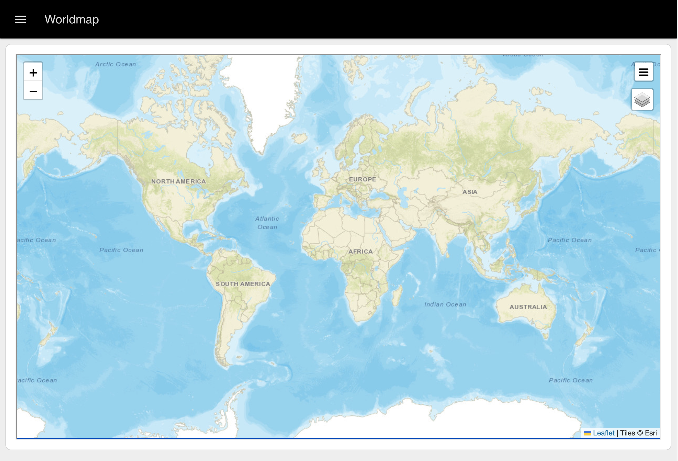 Example of a World Map rendered in FlowFuse Dashboard
In order to display a worldmap into FlowFuse Dashboard, currently, the best way to do this is with a ui-template node:
<template>
    <iframe src="/worldmap" class="worldmap"></iframe>
</template>
<style>
  .worldmap {
    width: 100%;
    height: 100%;
  }
</style>
Example Flow
Custom Styling
A lot of the styling for FlowFuse Dashboard is driven by the underlying Vuetify library, which we use to render many of the widgets. This often means that, when defining your own CSS, we need to override the underlying Vuetify classes.
To add your own CSS you can add a ui-template node and select one of the following "Type" options:
- CSS (Single Page) - This will add the CSS to the
<style>tag of a single page, and only that page. - CSS (All Pages) - This will add the CSS to the
<style>tag of all pages in your Dashboard.
Here are a few examples we've put together based on common requests we've seen in the forums.
Font
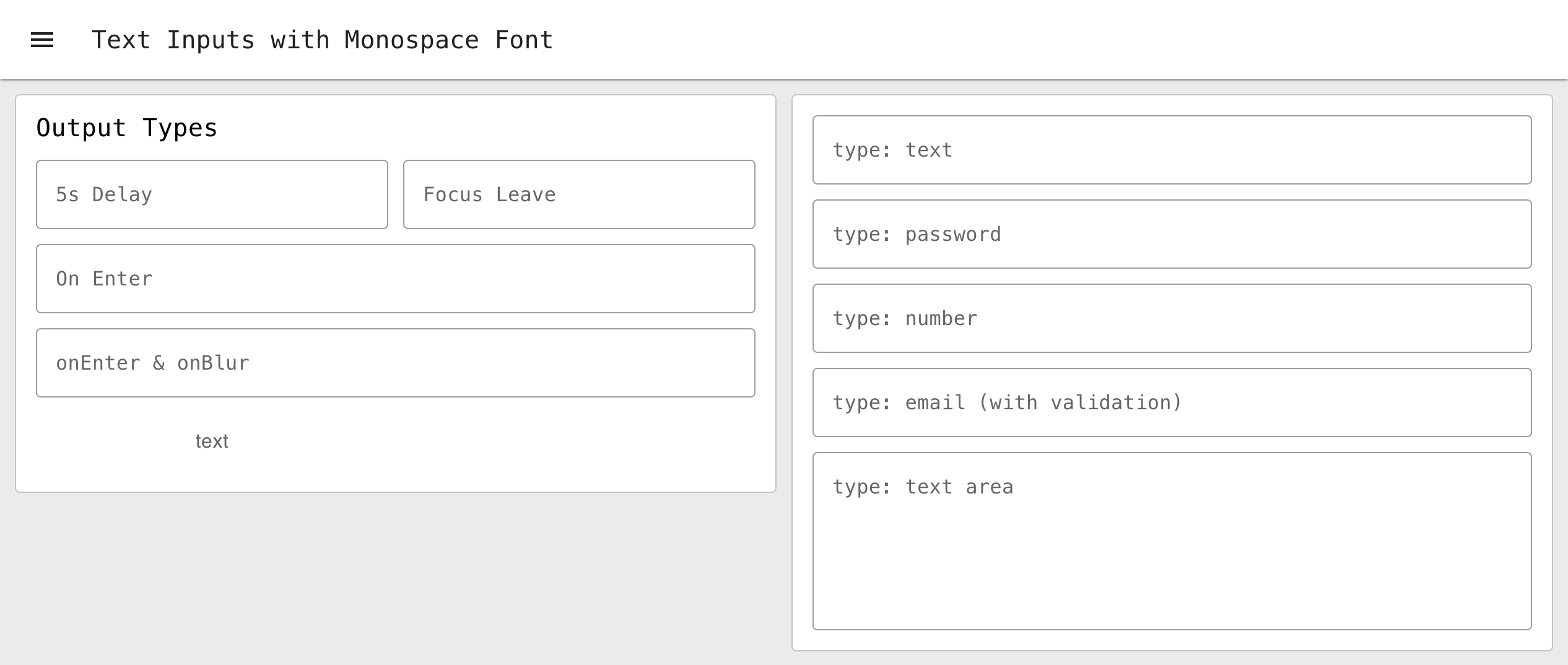 Example of a custom header and cell content using ui-template and Vuetify's Data Table
To modify the default font used in your Dashboard, you can override the font-family field at the body level, which would ensure it's covered across all elements in your Dashboard:
body {
    font-family: monospace;
}
Background Image
If you'd like to have a custom texture or background image such as:
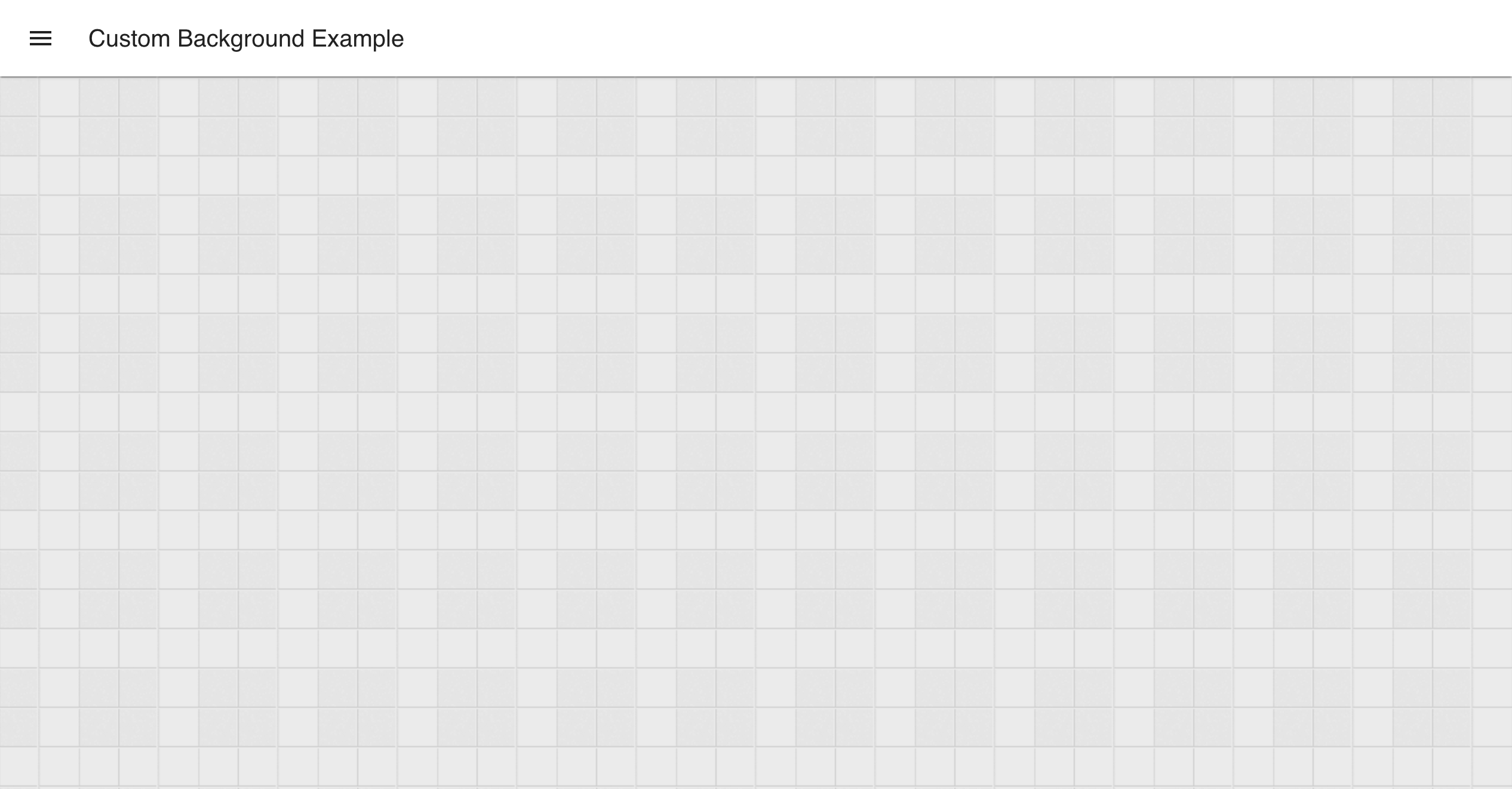 Example of a custom header and cell content using ui-template and Vuetify's Data Table
You can use the following CSS:
.v-main {
    background-image: url("	https://www.transparenttextures.com/patterns/batthern.png");
    background-repeat: repeat;
}
Group Styling
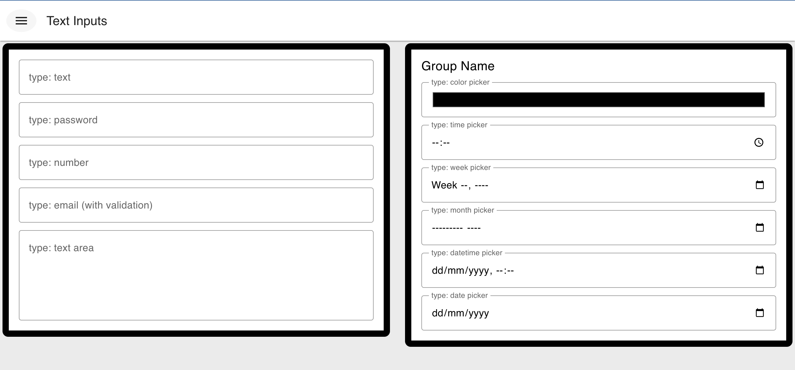 Example of styling applied to the Groups rendered in FlowFuse Dashboard
Groups in Node-RED Dashboard are made of a wrapping container with a class of nrdb-ui-group, and then a block within that which you see visually as the group, which is a Vuetify Card widget, and so has the class v-card.
We can use these classes to style the groups in our Dashboard, for example, to make the border's thicker we could define:
/* All .v-card's inside a group */
.nrdb-ui-group .v-card {
    border-width: 10px;
}
Navigation Styling
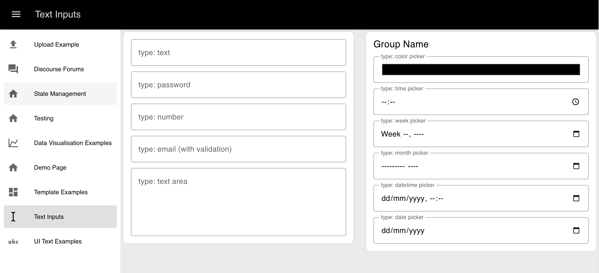 Example of how to override the "navigation drawer" styling in FlowFuse Dashboard
By default, the side navigation drawer that lists all of the pages in your Dashboard is styled in accordance with the "Header" colour in your Theme. This means that its background-color will match the header of the Dashboard too. If you'd like to override this, you can do so by using the .v-navigation-drawer class:
.v-navigation-drawer {
    background-color: white;
    color: black;
}
Icon Styling
It is possible to change various features of the icons in the Dashboard, such as their size, color, and animations using the collection of utility classes provided by the underlying Material Design Icons library (detailed here).
Size
mdi-18px mdi-24px mdi-36px mdi-48pxColor
mdi-light mdi-light mdi-inactive mdi-dark mdi-dark mdi-inactiveRotate
mdi-rotate-45 mdi-rotate-90 mdi-rotate-135 mdi-rotate-180 mdi-rotate-225 mdi-rotate-270 mdi-rotate-315Flip
mdi-flip-h mdi-flip-vNote that mdi-flip-* and mdi-rotate-* can't be used at the same time.
Spin
mdi-spin