Data Table ui-table Added In: v0.4.0
Try Demo Sending Data
Renders a set of data in a tabular format. Expects an input (msg.payload) in the format of:
[{
    "colA": "A",
    "colB": "Hello",
    "colC": 3
}, {
    "colA": "B",
    "colB": "World",
    "colC": 5
}]
The table will be rendered with columns colA, colB and colC, unless "Columns" are explicitly defined on the node, with "Auto Columns" toggled off.
You can also send a single piece of data to append to the existing table, in this case, the ui-table expects an input (msg.payload) in the format of:
{
    "colA": "A",
    "colB": "Hello",
    "colC": 3
}
Clear Data
You can send an empty array to clear the table.
[]Properties
| Prop | Dynamic | Description |
|---|---|---|
| Group | Defines which group of the UI Dashboard this widget will render in. | |
| Size | Controls the width of the button with respect to the parent group. Maximum value is the width of the group. | |
| Label | The text shown above the table, labelling what the table is showing. | |
| Max Rows | Defines the maximum number of data-rows to render in the table. Excess rows will be available through pagination control. Set to "0" for no pagination. | |
| Breakpoint | Controls when a table will render, instead, as a card, with each column from a row rendering as a row in a larger, contain a row, for a single entry.The breakpoint is measured based on the width of the table, not the width of the screen. | |
| Selection | Provides three options for table interaction - "None", "Click" and "Checkbox" | |
| Show Search | Defines whether or not to show a search bar above the table. Will permit searching and filtering across all columns. | |
| Auto Columns | If checked, then the columns are calculated automatically based on the contents of received messages. | |
| Deselect | If checked, then the selected rows will be deselected automatically when the rows are replaced by other rows. | |
| Columns | If "Auto Columns" is false, then these columns are used when rendering the table instead. |
Selection
- None: No selection is allowed. The table will just display the data.
- Click: The full row becomes a clickable entity, and the
ui-tablenode will output the full object associated to a row when clicked. - Checkbox: Each row has a checkbox, and the
ui-tablenode will output an array of objects associated to the checked rows when a checkbox is selected.
The respective events will output the following:
{
    "payload": <full row object>,
    "action": "row_click" | "multiselect"
}
You can also add a Button cell type and have events emitted that way too.
Responsiveness Added In: v1.15.0
The "Breakpoint" property for UI table gives you control over when a table will switch to "mobile" mode, and render reach row of data as a card. This is useful when you have a lot of columns, and the table is too wide to fit on a mobile screen. The breakpoint is measured based on the width of the table, not the width of the screen.
 Desktop View of a UI Table example
 Mobile View of the same UI Table
The breakpoint can be defined in one of three ways:
- defaults: Select from one of the predefined breakpoints (xs, sm, md, lg).
- px: Manually define a
pxvalue that the table will switch to mobile mode at once it breaches that width. - none: Always render as rows of data in a table, never switch to "Mobile" view.
Configuring Columns
 Screenshot of the configuration options available for column types in Node-RED
If you toggle "off" the "Auto Columns" option, you will have more control to define the columns for your table. For each column, you can define the following:
- Value: The value to use for rendering the control. Typically, you would provide a key to the value in the data row object but it can be changed to provide a fixed string value.
- Label: The text to display in the column header.
- Width: The width of the column, can be in
px,%, or any other valid CSS sizing. - Align: The alignment of the text in the column. Can be
Left,Center, orRight. Note that some columns do look odd with "Center" alignment as the header does also contain space for the sorting icon. - Type: Defines the cell's type and controls how your data will be rendered for this column.
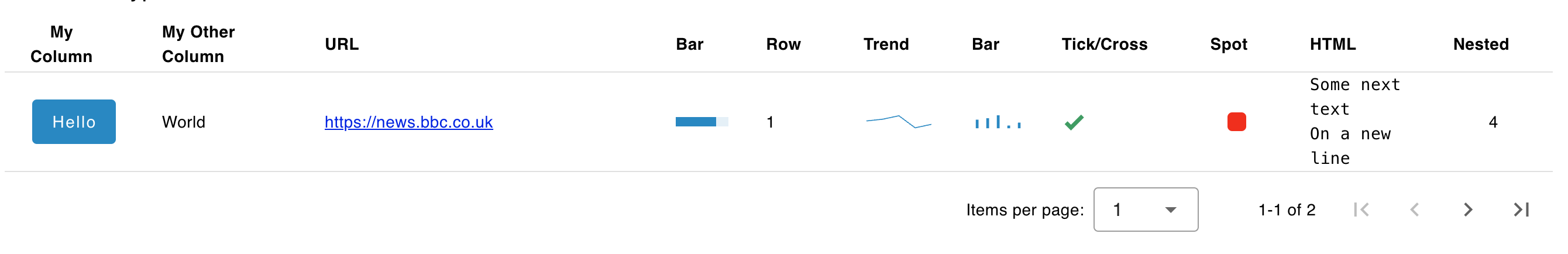
Cell Types Added In: v1.10.0
 An example of a ui-table displaying various of the cell types available
- Text: Renders the cell as plain text.
- HTML: Will respect new line breaks (e.g.
\n) and basic HTML tags. - Link: Renders the cell as a hyperlink. The
Linkfield should contain the URL to link to. - Color: Renders the cell as a colored box. The
Colorfield should contain a valid CSS color. - Tick/Cross: Renders the cell as a tick or cross. The
Valuefield should contain a boolean (true/false) value. - Progress: Renders the cell as a progress bar. The
Valuefield should contain a number between 0 and 100. - Sparkline - Trend: Renders the cell as a small line chart without axes. The
Valuefield should contain an array of numbers to be plotted. - Sparkline - Bar: Renders the cell as a small bar chart without axes. The
Valuefield should contain an array of numbers to be plotted. - Button: Renders a clickable button in the cell. The label of the button will be either the
row[key]or the fixed string entered on the manual column configuration. - Row Number: Renders the row number into the cell.
- Image: Renders the cell as an image. The "Image" value provided should be a valid URL. A data url is also supported for base64 encoded images. When an invalid url is specified, an empty space will appear.
Interaction: Buttons
The Button cell type will render a clickable button in the cell. The label of the button will be the corresponding value in your row for the provided key. When the button is clicked, the ui-table node will output:
{
    "payload": <full row object>
    "column": <column key>
    "action": "button_click"
}
Given the action and column keys, you can determine which button was clicked and use the payload to determine which row it was associated with.
Example
Dynamic Properties
Dynamic properties are those that can be overriden at runtime by sending a particular msg to the node.
Where appropriate, the underlying values set within Node-RED will be overriden by the values set in the received messages.
| Prop | Payload | Structures | Example Values |
|---|---|---|---|
| Class | msg.class | String |
Table Configuration
Search & Filter
The ui-table node can be configured to include a search bar above the table. This will allow users to search and filter across all columns, and automatically search across all columns when you type.
Example
 Example of a Data Table with Search & Filter" enabled.
Interaction
Example that show how a table will appear with different selection types chosen.
Default - No Selection Events
 Example of a rendered data table in a Dashboard.
Multi-Selection
 Example of a table that has "Multi Selection" enabled.
Single Row Selection
 Example of a data table that enables a row to be selected/clicked.
Pagination
 Example of a paginated table which has 10 rows of data, but with "Max Rows" set to 5.
If you want to hide the pagination ("Items per page") options, then you can set "Max Rows" to 0.
Custom Styling & Content
If you're looking to add more customisation to how your data is rendered, you can do so by building your own data table inside a ui-template. Check out this example for more details.