Gauge ui-gauge Added In: v1.1.0
Try Demo Adds a Gauge Chart to your Dashboard. This can be configured with custom types (half, 3/4), styles (rounded, needle) and segmentation with examples detailed below.
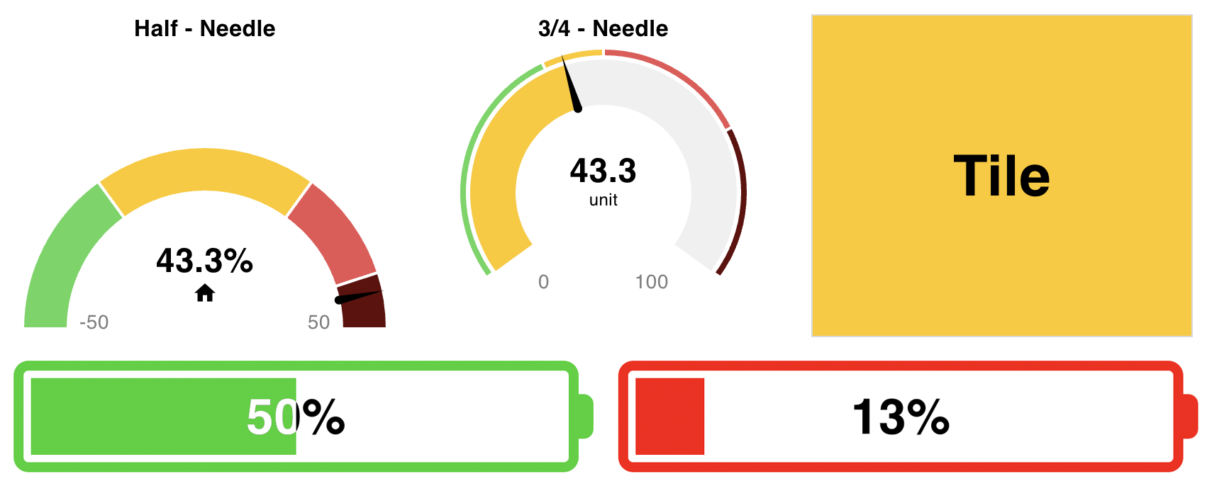 Screenshot showing each gauge type side-by-side
Input
Values for the gauges can be set by sending a numerical value in msg.payload. The gauge will then update to reflect this value.
Properties
| Prop | Dynamic | Description |
|---|---|---|
| Group | Defines which group of the UI Dashboard this widget will render in. | |
| Size | Controls the width of the dropdown with respect to the parent group. Maximum value is the width of the group. | |
| Type | ✓ | Defines the shape of the gauge, "Tile", "Battery", "Water Tank", "Half Gauge" or "3/4 Gauge" |
| Style | ✓ | Defines the style of arc rendered, "Needle" or "Rounded". (only applicable to for 3/4 and Half gauges) |
| Value | ✓ | The value to be shown on the gauge. Can be a property of the message, e.g. `msg.payload` or `msg.myProperty`, a flow/global context variable, or a static value. You can also use the type "JSONata" to evaluate a JSONata expression and perform computations on the value, e.g. $round(payload, 1) to round to 1 decimal place. |
| Range (min) | ✓ | The smallest value that can be shown on the gauge |
| Range (max) | ✓ | The largest value that can be shown on the gauge |
| Segments | ✓ | Defines the barriers by which the arc is color coded. These segments can also be shown on the gauge. |
| Label | ✓ | Text shown above the gauge, labelling what the gauge is showing. |
| Always Show Label | (only applicable to Tile gauges) If true, the label will be shown at all times. | |
| Floating Label Position | (only applicable to Tile gauges) The position of the label within the tile. Can be "top-left", "top-right", "bottom-left", or "bottom-right". | |
| Prefix | ✓ | Text to be added _before_ the value in the middle of the gauge. (only applicable to for 3/4 and Half gauges) |
| Suffix | ✓ | Text to be shown _after_ the value in the middle of the gauge. (only applicable to for 3/4 and Half gauges) |
| Units | ✓ | Small text to be shown below the value in the middle of the gauge. (only applicable to for 3/4 and Half gauges) |
| Icon | ✓ | Icon to be shown below the value in the middle of the gauge. Uses Material Designs Icon, no need to include the mdi- prefix. (only applicable to for 3/4 and Half gauges) |
| Sizes (Gauge) | (px) How thick the arc and backdrop of the gauge are rendered. | |
| Sizes (Gap) | (px) How big the gap/padding is between the Gauge and the "Segments" | |
| Sizes (Segments) | (px) How thick the segments are rendered. |
Dynamic Properties
Dynamic properties are those that can be overriden at runtime by sending a particular msg to the node.
Where appropriate, the underlying values set within Node-RED will be overriden by the values set in the received messages.
| Prop | Payload | Structures | Example Values |
|---|---|---|---|
| Label | msg.ui_update.label | String | |
| Icon | msg.ui_update.icon | String | |
| Type | msg.ui_update.gtype | String | gauge-tile|gauge-battery|gauge-tank|gauge-half|gauge-34 |
| Style | msg.ui_update.gstyle | String | |
| Min | msg.ui_update.min | Number | |
| Max | msg.ui_update.max | Number | |
| Segments | msg.ui_update.segments | Array<{color: String, from: Number}> | |
| Prefix | msg.ui_update.prefix | String | |
| Suffix | msg.ui_update.suffix | String | |
| Units | msg.ui_update.units | String |
Controls
| msg. | Example | Description |
|---|---|---|
| enabled | true | false | Allow control over whether or not the number-input is enabled |
Formatting Value
 Example of a Gauge with a formatted value, using JSONata to round the value to 1 decimal place.
If you're passing in a msg that needs formatting, before being displayed on the gauge, you can use the Value property to format the value.
For example, if you want to round the value to 1 decimal place, you can set the type of Value to "JSONata" and use the following:
$round(payload, 1) // round to 1 decimal placeYou can read more about the JSONata expression language and in particular, its numeric functions, here.
Examples
Half Gauge - Rounded
| Type | Style | Size (Gauge) | Size (Gap) | Size (Segments) |
|---|---|---|---|---|
| Half Gauge | Rounded | 16 | 2 | 8 |
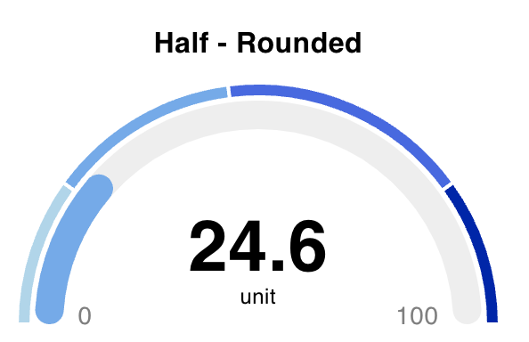 Example of a Half Gauge, showing a rounded arc.
Half Gauge - Needle
| Type | Style | Suffix | Size (Gauge) | Size (Gap) | Size (Segments) |
|---|---|---|---|---|---|
| Half Gauge | Needle | % | 0 | 0 | 32 |
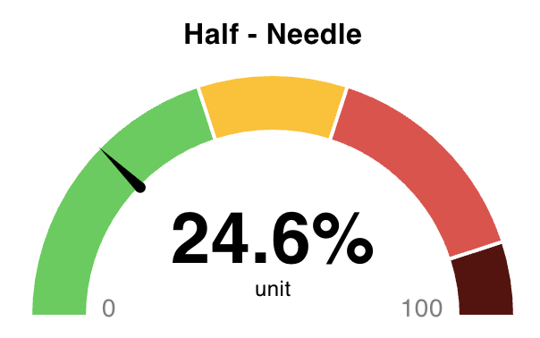 Example of a Half Gauge, showing a needle with segments-only.
3/4 Gauge - Rounded
| Type | Style | Size (Gauge) | Size (Gap) | Size (Segments) |
|---|---|---|---|---|
| 3/4 Gauge | Rounded | 16 | 0 | 0 |
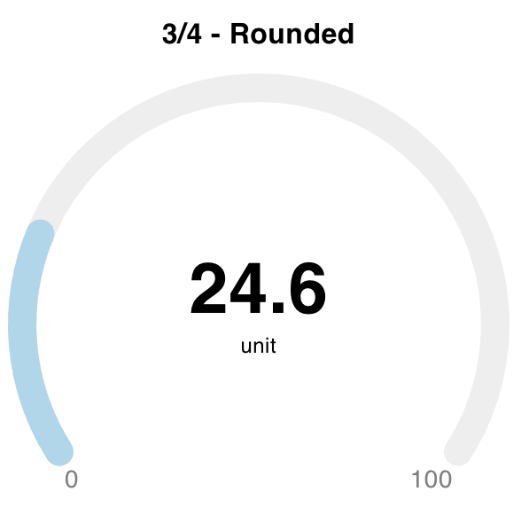 Example of a 3/4 Gauge, showing a rounded arc with no segments.
3/4 Gauge - Needle
| Type | Style | Size (Gauge) | Size (Gap) | Size (Segments) |
|---|---|---|---|---|
| 3/4 Gauge | Needle | 32 | 2 | 6 |
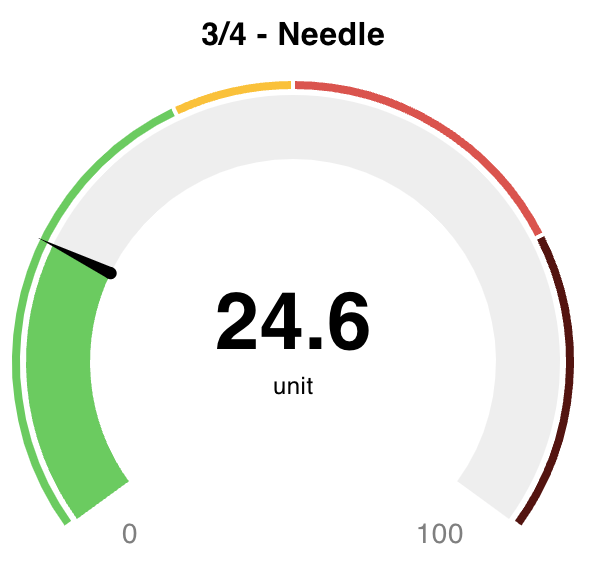 Example of a 3/4 Gauge, showing a needle with segments and an arc.
Tile
| Type | Label |
|---|---|
| Tile | My Tile |
 Examples of some Tile Gauges
 Examples of Tile gauges with the 'Always Show Label' option enabled
Battery Added In: v1.15.0
| Type |
|---|
| Battery |
 Examples of some horizontal Battery Gauges
Water Tank Added In: v1.15.0
| Type |
|---|
| Water Tank |
 Examples of some Water Tank gauges
When switching to a "Water Tank" type, the segments will be overridden with the following values:
[{
    color: '#A8F5FF',
    from: 0
}, {
    color: '#55DBEC',
    from: 15
}, {
    color: '#53B4FD',
    from: 35
}, {
    color: '#2397D1',
    from: 50
}]
Overriding CSS
The gauge can be styled further by adding custom CSS to the ui_template node. Some useful classes that are available for styling include:
.nrdb-ui-gauge-value span- The value in the middle of the gauge.nrdb-ui-gauge-value label- The unit label.nrdb-ui-gauge-value i- The icon.nrdb-ui-gauge-icon-only i- Available when a gauge has an icon but no "unit" label.nrdb-ui-gauge #limits- The containing<g>element that wraps min/max<text>elements
