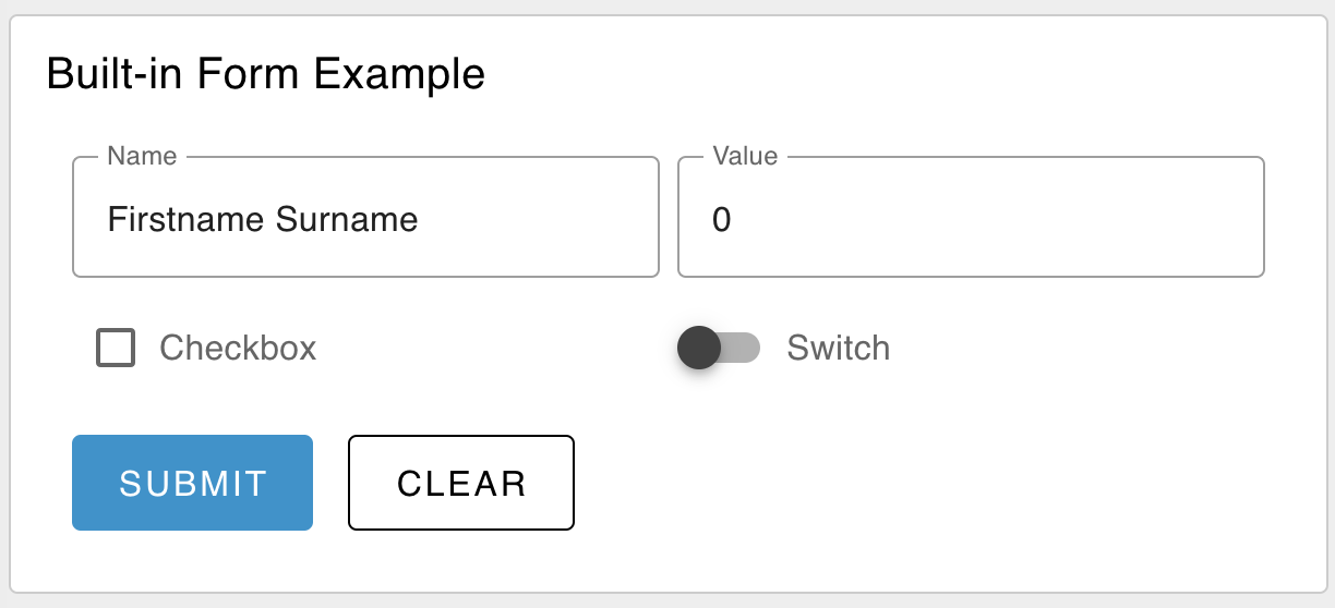
Adds a form to user interface which helps to collect multiple value from the user on submit button click as an object in msg.payload.
Properties
| Prop | Dynamic | Description |
|---|---|---|
| Group | Defines which group of the UI Dashboard this widget will render in. | |
| Size | Controls the width of the button with respect to the parent group. Maximum value is the width of the group. | |
| Label | ✓ | A label shown before the form rows. |
| Options | ✓ | A list of the rows presented in the form. Each row has the following properties:
|
| Buttons | The text shown on each of the form's buttons. If "cancel" text is left empty, then no cancel button will be shown. | |
| Two Columns | Will render the form as a two-column layout. | |
| Reset on Submit | If checked, the form will be reset to an empty state after the form is submitted. | |
| Topic | Defines how to compute the topic, included in the `msg` object, when the form is submitted. | |
| Dropdown Options | ✓ | This list can define options for multiple dropdown/select field in a single form. |
Dynamic Properties
Dynamic properties are those that can be overriden at runtime by sending a particular msg to the node.
Where appropriate, the underlying values set within Node-RED will be overriden by the values set in the received messages.
| Prop | Payload | Structures | Example Values |
|---|---|---|---|
| Label | msg.ui_update.label | String | |
| Options | msg.ui_update.options | Array<Object> | |
| Dropdown Options | msg.ui_update.dropdownOptions | Array<{ dropdown: <string>, key: <string>, label: <string> }> | |
| Class | msg.class | String |
Populating Form Data
If you want to set defaults, or pre-fill values in your form, you can do so by passing a msg.payload value. This value should be an object, where each key represents the key of a form element, and the value represents the default value for that element.
Foe example, if you want to pre-fill a form with a "text" field, with a name, "first_name", you can pass the following msg:
msg.payload = {
    "first_name": "John"
}
Defining Form Elements (Options)
If you want to override the configuration for your ui-form, and provide details of your elements after your Node-RED flow has been deployed, you can do so by passing a msg.ui_update.options value. This value should be an array of objects, where each object represents a form element. Each object should have the following properties:
Element: Text
{
    "type": "text",
    "label": "Name",
    "key": "name",
    "required": true
}
Element: Multiline
{
    "type": "multiline",
    "label": "Name",
    "key": "name",
    "required": true,
    "rows": 4
}
Element: Password
{
    "type": "password",
    "label": "Password",
    "key": "password",
    "required": true
}
Element: Email
{
    "type": "email",
    "label": "E-Mail Address",
    "key": "email",
    "required": true
}
Element: Number
{
    "type": "number",
    "label": "Age",
    "key": "age",
    "required": true
}
Element: Checkbox
{
    "type": "checkbox",
    "label": "Subscribe to Newsletter",
    "key": "newsletter"
}
Element: Switch
{
    "type": "switch",
    "label": "Enable Notifications",
    "key": "notifications"
}
Element: Date
{
    "type": "date",
    "label": "Date of Birth",
    "key": "dob",
    "required": true
}
Element: Time
{
    "type": "time",
    "label": "Time of Birth",
    "key": "tob",
    "required": true
}
Element: Dropdown
{
    "type": "dropdown",
    "label": "Dropdown",
    "key": "selection"
}
Defining Dropdown Options
If you want to override the configuration for your ui-form, and provide details of your dropdown options after your Node-RED flow has been deployed, you can do so by passing a msg.ui_update.dropdownOptions value. This value should be an array of objects, where each object represents a dropdown element. Each object should have the following properties:
[{
    "dropdown": "Dropdown Name",
    "value": "1",
    "label": "Option 1"
}]
Example
 Example of a rendered form in a Dashboard.
