Provides configuration options to create the following chart types:
Properties
| Prop | Dynamic | Description |
|---|---|---|
| Group | Defines which group of the UI Dashboard this widget will render in. | |
| Size | Controls the width of the button with respect to the parent group. Maximum value is the width of the group. | |
| Label | The text shown within the button. | |
| Class | The text shown within the button. | |
| Chart Type | Line | Bar | Scatter | |
| Show Legend | Defines whether or not a legend is shown between the title and the chart. Each label is driven by msg.topic. | |
| Action | ✓ | Controls how new data is added to a chart. It will either "append", keeping existing data, or "replace", removing existing data, before adding any newly provided data points. |
| Point Shape | Define the shape of the point shown in Scatter & Line charts. | |
| Point Radius | Define the radius (in pixels) of each point rendered onto a Scatter or Line chart. | |
| X-Axis Type | Timescale | Linear | Categorical | |
| X-Axis Format | {HH}:{mm}:{ss} | {HH}:{mm} | {yyyy}-{M}-{d} | {d}/{M} | {ee} {HH}:{mm} | Custom | Auto Defines how the values are displayed on the axis, when X-Axis type is 'timescale'. See here for an overview of the available format types. | |
| X-Axis Limit | Any data that is before the specific time limit (for time charts) or where there are more data points than the limit specified will be removed from the chart. The time based limit may be disabled by setting the value to 0. | |
| Properties | Series: Controls how you want to set the Series of data stream into this widget. The default is msg.topic, where separate topics will render to a new line/bar in their respective plots. X: Defines which data to use when rendering the x-value of any data point. Y: Defines how to render the y-value of any data point. | |
| Text Color | Option to override Chart.Js default color for text. At the moment it overrides the text color for Chart Title, Ticks Text, Axis Title and Legend Text It is possible to return to Chart.Js defaults by using the checkbox Use ChartJs Default Text Colors | |
| Grid Line Color | Option to override Chart.Js default color for Grid Lines and Axis Border. It is possible to return to Chart.Js defaults by using the checkbox Use ChartJs Default Grid Colors |
Dynamic Properties
Dynamic properties are those that can be overriden at runtime by sending a particular msg to the node.
Where appropriate, the underlying values set within Node-RED will be overriden by the values set in the received messages.
| Prop | Payload | Structures | Example Values |
|---|---|---|---|
| Class | msg.class | String | |
| Action | msg.action | String | replace|append |
| Chart Options | msg.ui_update.chartOptions | Object |
Building Charts
In FlowFuse Dashboard, the ui-chart offers a simple way to render data in a variety of chart types. The chart is configurable to tailor to your data.
To map your data to the chart, the most important properties to configure are:
 Example key mapping config for UI Chart
- Series: Controls how you want to group your data. On a line chart, different series result in different lines for example. On a bar chart, different series result in different bars for a single x-value (stacked or grouped side-by-side).
- X: Defines where to read the value to plot on the x-axis. This can be read from the
msgobject, as akeyon an object, or generate a newtimestampfor each data point being received to the node. - Y: Define where to read the value to plot on the y-axis. This can be read as a property on the
msgobject, or as akeyon objects in an array of data.
The next most important properties to configure are the "Chart Type" and "X-Axis Type".
- Chart Type: Choose between a Line, Scatter, or Bar chart.
- X-Axis Type: Choose between a "Timescale" (for time-based data), "Linear" (for numerical data), or "Categorical" (for non-numeric data). You'll notice that some x-axis types are only available for certain chart types.
Line Charts
Timeseries Data
In this example we wire a Slider to our Chart to plot its output over time:
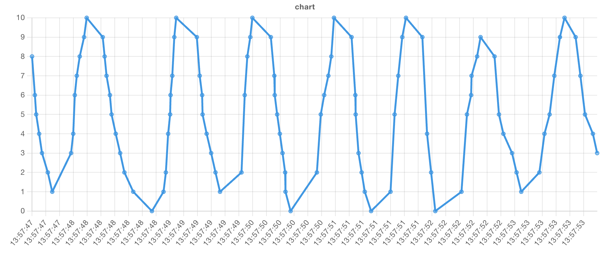 Example of a rendered Line Chart with a "time" x-axis.
A very common use case of Node-RED is to process timeseries data, such as sensor readings. In this case, you would set the following:
| Property | Value |
|---|---|
| Chart Type | Line |
| X-Axis Type | Timescale |
The value for the x property would then be one of two things:
- If your data is a simple numerical value, you can leave this blank, and the chart will automatically use the current date/time.
- If your data is an object, you can provide the key of the timestamp in your data, e.g.
{"myTime": 1743608192522}would set the "X" property to the typekeyand the valuemyTime.
Then, the last piece of the puzzle to set the y property would be one of two options:
- If your data is a simple numerical value, you can leave this blank, and the chart will automatically use the value of
msg.payload. - If your data is an object, you can provide the key of the value in your data, e.g.
{"myTime": 1743608192522, "myValue": 123}would set the "Y" property to the typekeyand the valuemyValue.
Note: Timestamps must be in milliseconds (ms). This follows the JavaScript standard for representing time as the number of milliseconds elapsed since the Unix epoch (January 1, 1970, 00:00:00 UTC).
Formatting Timestamps
You can set a formatting option on the x-axis when using timeseries data. Included, as defaults, are:
{HH}:{mm}:{ss}: e.g. 12:00:00{HH}:{mm}: e.g. 12:00{yyyy}-{M}-{d}: e.g. 2020-01-01{d}/{M}: e.g. 01/01{ee} {HH}:{mm}: e.g. Sun 12:00
You can also choose "Custom" option and provide your own formatting string, using the following tokens:
| Group | Template | Value (EN) |
|---|---|---|
| Year | {yyyy} | e.g. 2020, 2021, ... |
{yy} | 00-99 | |
| Quarter | {Q} | 1, 2, 3, 4 |
| Month | {MMMM} | e.g. January, February, ... |
{MMM} | e.g. Jan, Feb, ... | |
{MM} | 01-12 | |
{M} | 1-12 | |
| Day of Month | {dd} | 01-31 |
{d} | 1-31 | |
| Day of Week | {eeee} | Sunday, Monday, Tuesday, Wednesday, Thursday, Friday, Saturday |
{ee} | Sun, Mon, Tues, Wed, Thu, Fri, Sat | |
{e} | 1-54 | |
| Hour | {HH} | 00-23 |
{H} | 0-23 | |
{hh} | 01-12 | |
{h} | 1-12 | |
| Minute | {mm} | 00-59 |
{m} | 0-59 | |
| Second | {ss} | 00-59 |
{s} | 0-59 | |
| Millisecond | {SSS} | 000-999 |
{S} | 0-999 |
The above table is taken from the eCharts documentation.
For any versions below, and including, 1.26.0, FlowFuse Dashboard used ChartJS for formatting timestamps. This has been migrated to eCharts in 1.27.0. For documentation on ChartJS timestamps, see the ChartJS documentation.
Interpolation Methods for Line Charts
Interpolation defines how the line is drawn between data points on a line chart. In Dashboard, you can choose between several interpolation methods to suit your data visualization needs:
- Linear: Draws a straight line between each data point. Best for continuous datasets with smooth transitions.
- Step: Creates a stepped line between points, where the value jumps abruptly to the next point. This method is ideal for visualizing data that changes in discrete steps, such as states or thresholds.
- Bezier: Produces a smooth curve with slight tension between points, creating a more aesthetically pleasing line. Useful for datasets where a smooth transition is important.
- Cubic: Draws a cubic curve for even more smoothing between data points, providing a rounded visual representation.
- Cubic-Mono: Similar to cubic, but with an additional constraint that ensures the curve maintains a monotonic behavior. This means it avoids overshooting between points, making it more stable.
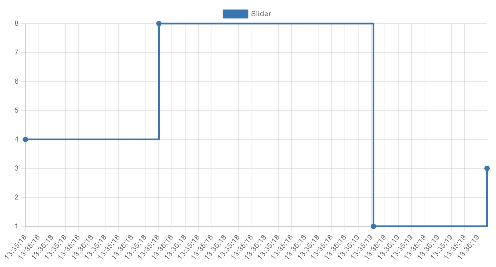 Example Line Chart with stepped interpolation
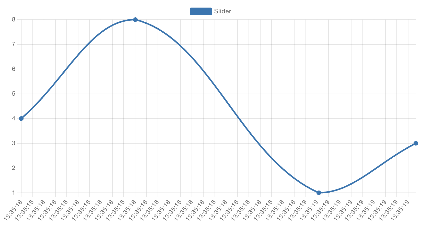 Example Line Chart with bezier interpolation
Multiple Lines
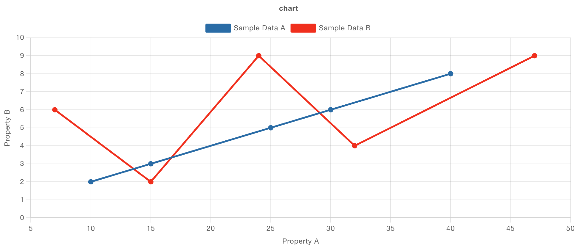 Example Line Chart with multiple lines
You can group data together into multiple lines using the Series property. A common use case here is to use msg.topic, where each message sent to the chart will be assigned to a different line based on the msg.topic value. Alternatively, you can set this to key and provide a key in your data to group by.
If you want a single piece of data to plot multiple lines, you can set the Series property to JSON, and then provide an array of keys (e.g. ["key1", "key2"]), which will plot a data point for each key provided, from a single data point.
Scatter Charts
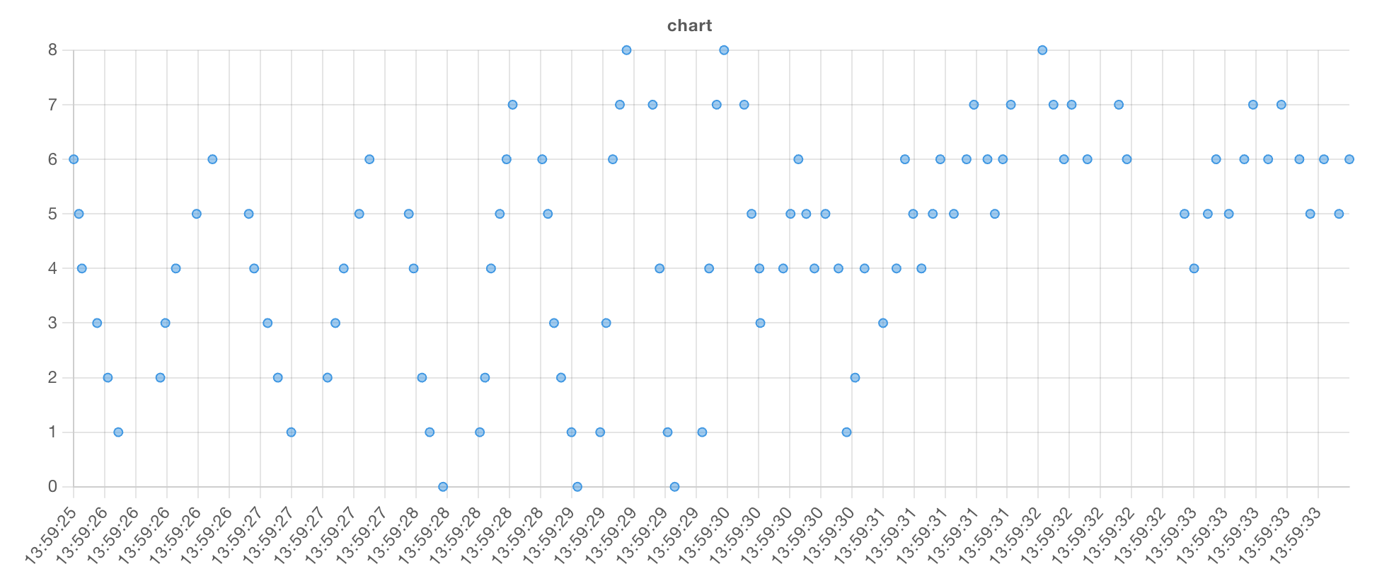 Example of a rendered Scatter Plot with a "time" x-axis.
We can also use "Series" to group points. Let's take an example with the following data set:
[
    { "series": "A", "x": 5, "y": 84 },
    { "series": "A", "x": 9, "y": 10 },
    { "series": "A", "x": 11, "y": 70 },
    { "series": "B", "x": 12, "y": 28 },
    { "series": "B", "x": 15, "y": 35 },
    { "series": "B", "x": 26, "y": 42 },
    { "series": "C", "x": 20, "y": 12 },
    { "series": "C", "x": 24, "y": 54 },
    { "series": "C", "x": 27, "y": 60 },
    { "series": "C", "x": 30, "y": 66 }]
In our flow, we'd have:
With the following configuration:
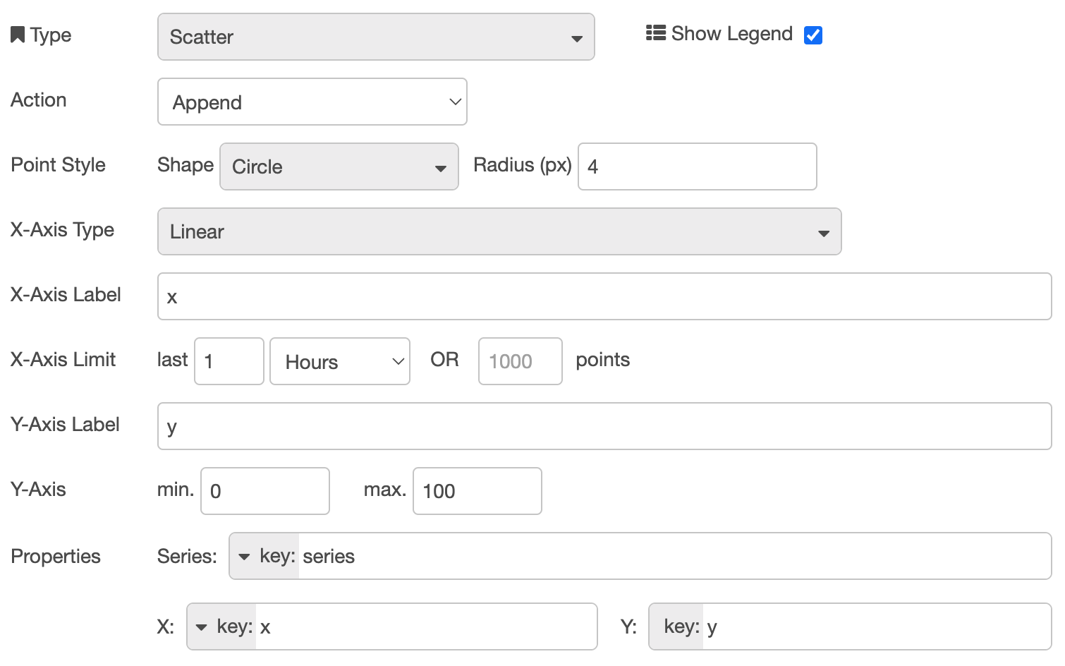
Which results in:
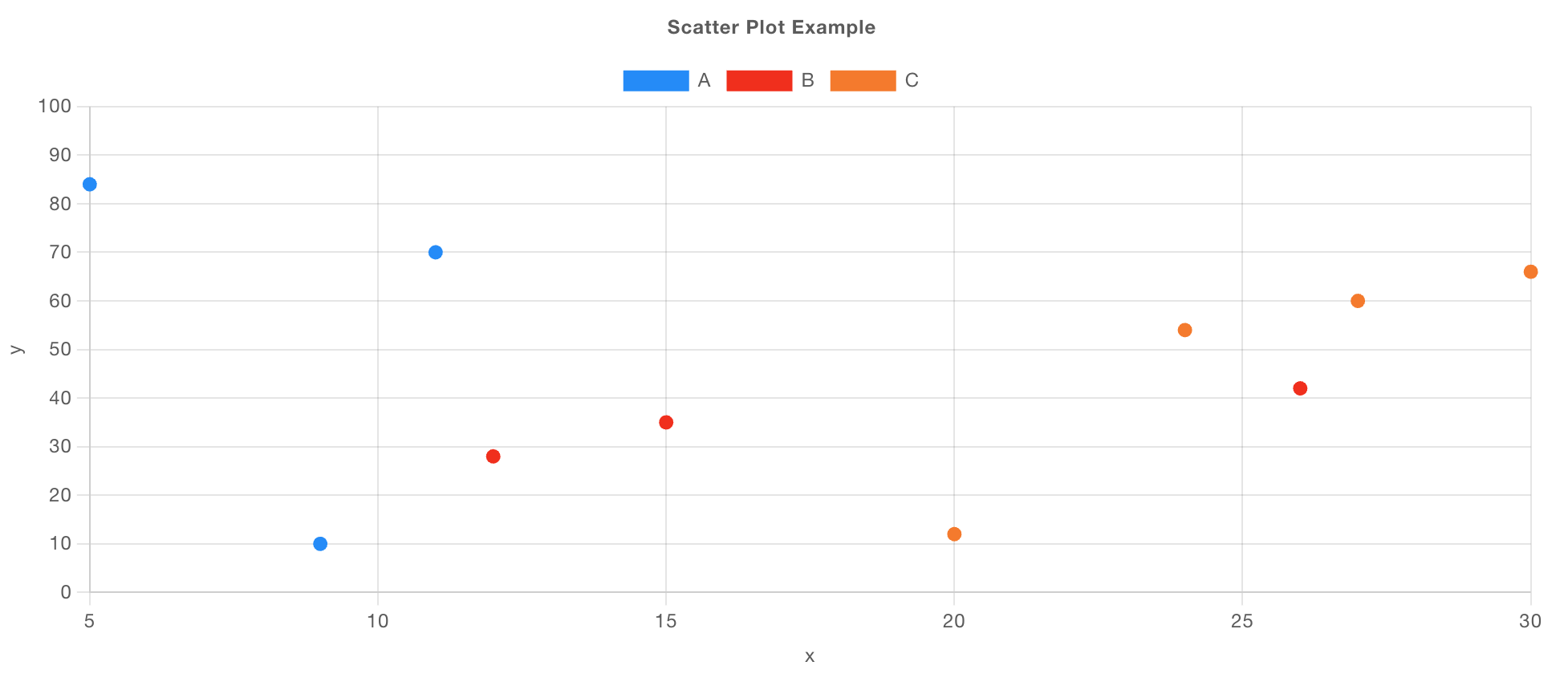 Example of a rendered Scatter Plot with a "Linear" x-axis, and data grouped into "Series".
Bar Charts
Currently, we only support "Category" x-axis types for Bar Charts. This means that the x-axis values will be a string, and the y-axis will be a numerical value.
Let's take an example of loading data for the Star Wars API:
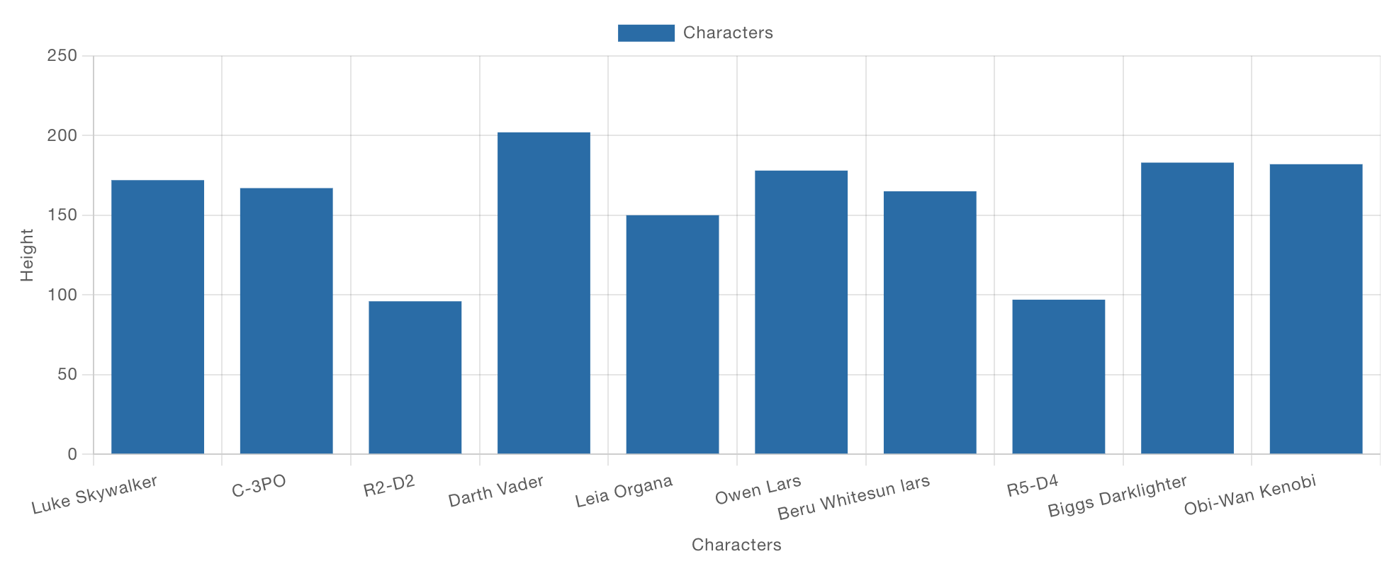 Example of a Bar Chart showing character "height" data
If we take a look at the configuration for this chart:

We could easily modify the "Y" property to plot a different value, without needing to modify our data.
Grouped Bars - Financial Data Example
Here we have an example of some financial data:
[
    { "year": 2021, "Q1": 115, "Q2": 207, "Q3": 198, "Q4": 163 },
    { "year": 2022, "Q1": 170, "Q2": 200, "Q3": 230, "Q4": 210 },
    { "year": 2023, "Q1": 86, "Q2": 140, "Q3": 180, "Q4": 138 }
]
Bar charts will automatically group data by common x-axis values, but maintain separate bars for each series. When you select a "Bar" chart, then you can choose the "Group By" option to be "Side-by-Side" or "Stacks".
Default behavior for a Bar Chart is to group content "Side-by-Side".
In our chart config we can define:
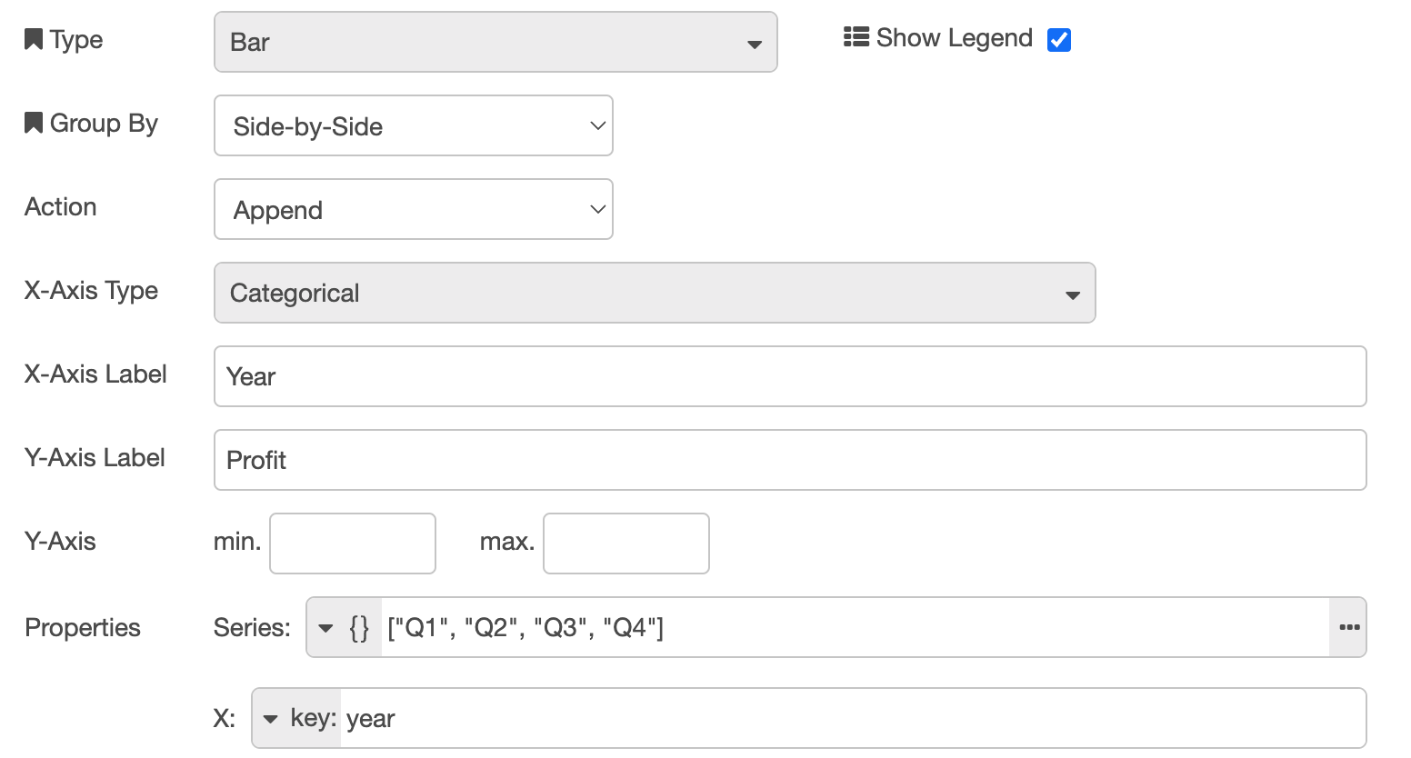 Configuration for of a Bar Chart showing financial data, grouped by year
where we have defined "Series" as a type JSON because we want to render multiple bars for each data point, in this case, one for each quarter:
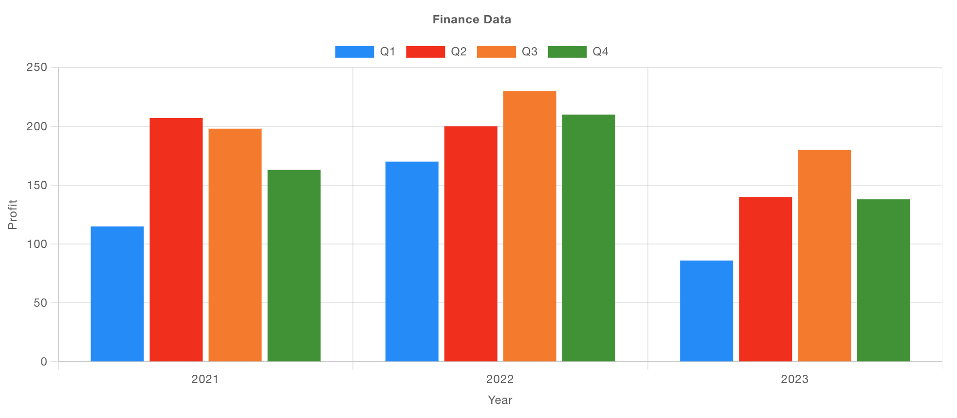 Example of a Bar Chart showing financial data, grouped by year
If we switch over the "Group By" option to be "Stacks", we'd see:
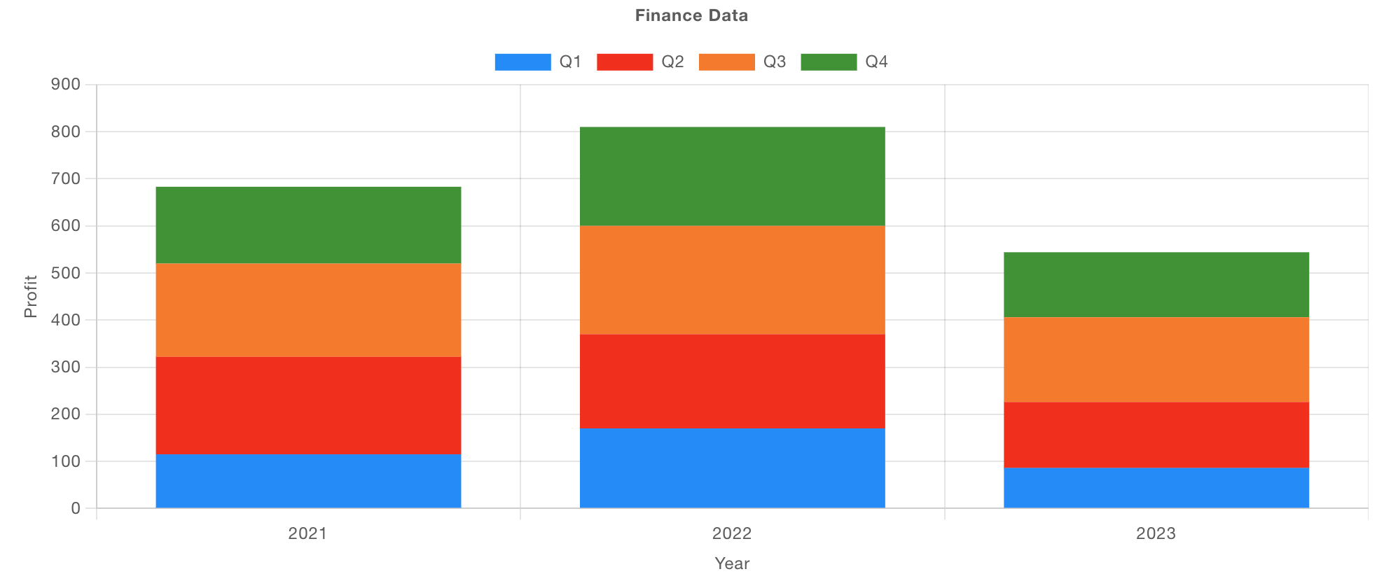 Example of a Bar Chart showing the same data, but stacked
Grouped Bars - Election Data Example
Here we have a piece of data for each candidate, for each year, which details the number of "Votes" that candidate won.
[
    { "candidate": "Dave", "year": 2019, "votes": 100 },
    { "candidate": "Sarah", "year": 2019, "votes": 90 },
    { "candidate": "Chris", "year": 2019, "votes": 160 },
    { "candidate": "Lucy", "year": 2019, "votes": 125 },
    { "candidate": "Dave", "year": 2024, "votes": 20 },
    { "candidate": "Sarah", "year": 2024, "votes": 170 },
    { "candidate": "Chris", "year": 2024, "votes": 150 },
    { "candidate": "Lucy", "year": 2024, "votes": 60 }
]
We have a couple of different ways we could group this data, firstly, we have a series for each "Year" and the x-value defined as the "candidate":
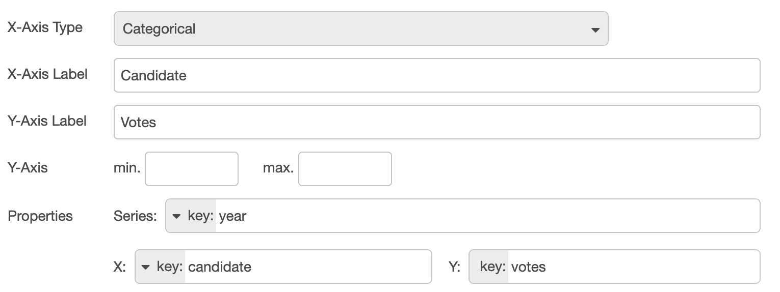 Configuration for a Bar Chart showing election data, grouped by candidate, and a series for each year
resulting in:
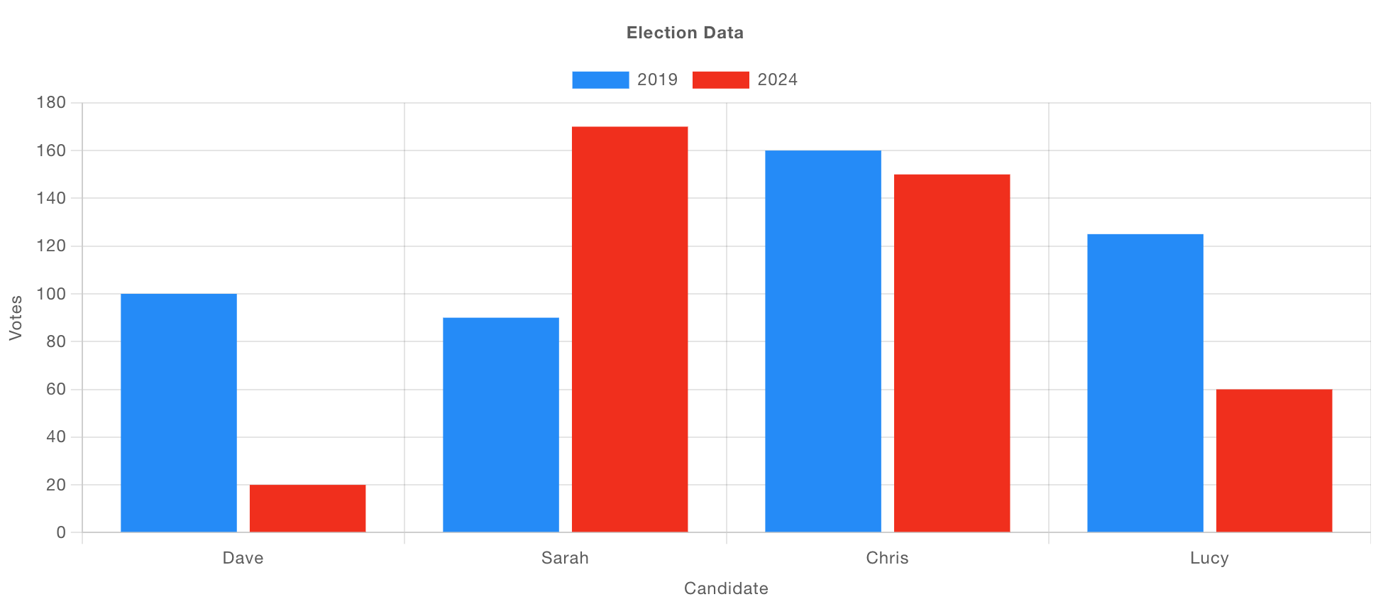 Example of a Bar Chart showing election data, grouped by candidate, and a series for each year
Alternatively, we could have a series per candidate, and then the x-value defined as the "year":
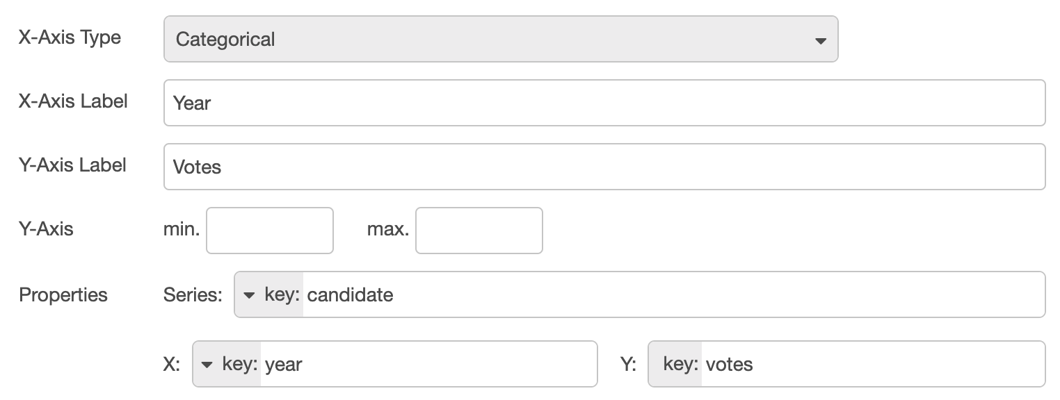 Configuration for a Bar Chart showing election data, grouped by year, and a series for each candidate
resulting in:
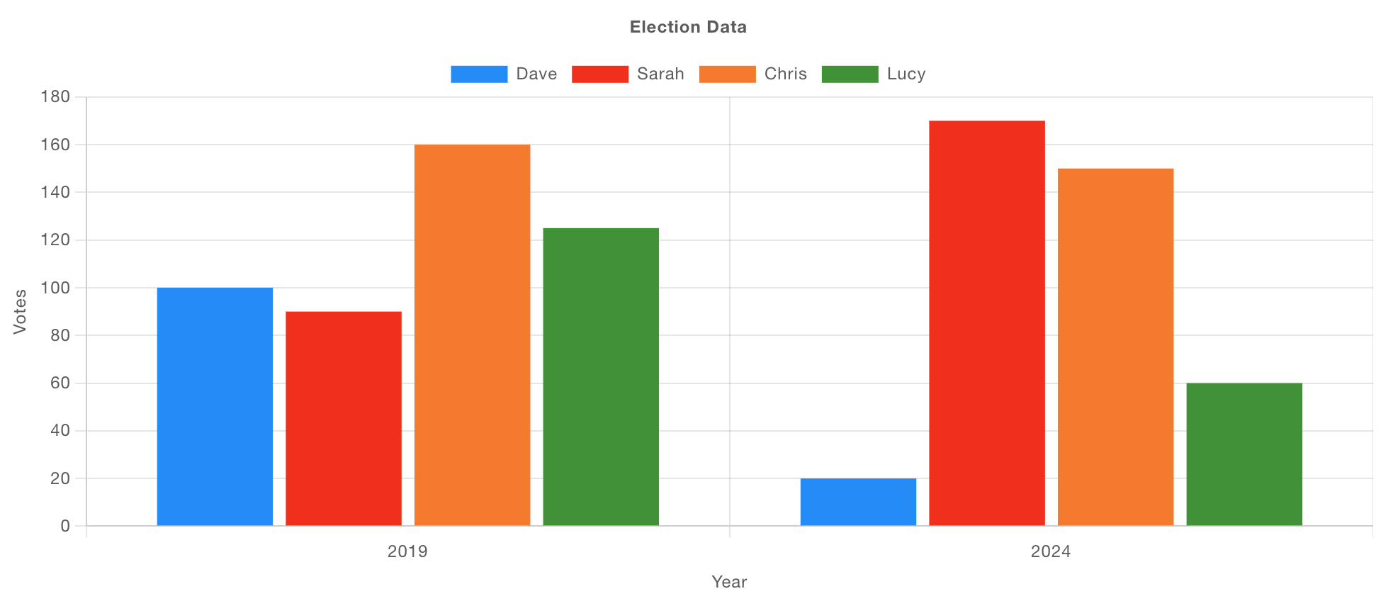
Pie/Doughnut Charts
These chart types use "Radial" axes. The "Series" property is used to define the layer that the particular data is rendered in - multiple series result in nested pie/doughnut charts.
The "X" value defines the key within a single "Series", and the "Y" property should point to the numerical value that dictates the size of a given segment.
Let's take a look at a couple of examples:
With a sample data set such as:
[
    { "year": 2021, "quarter": "Q1", "earnings": 115 },
    { "year": 2021, "quarter": "Q2", "earnings": 120 },
    { "year": 2021, "quarter": "Q3", "earnings": 100 },
    { "year": 2021, "quarter": "Q4", "earnings": 180 }
]
we can configure our chart to render a Pie or Doughnut chart like so:

which results in the following, where for the "Doughnut" chart it has two "Series" worth of data:
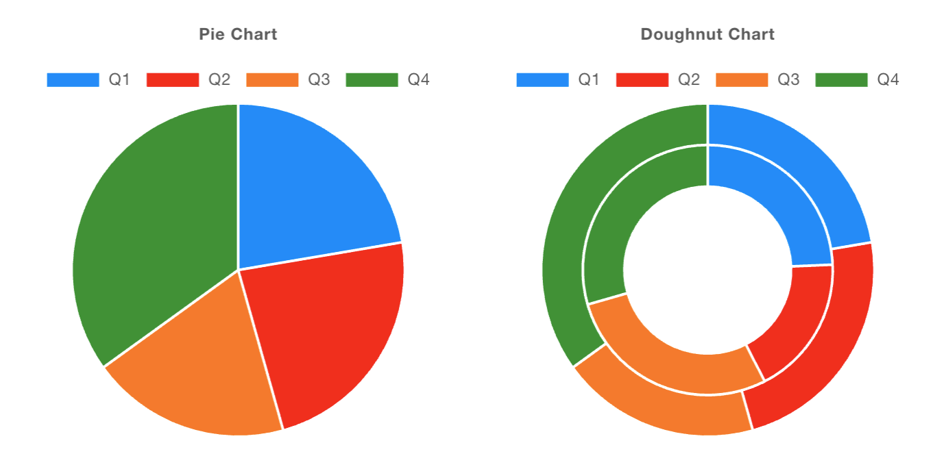 Example of Pie and Doughnut Charts
Histograms
Histograms are unique in that they do not just plot the data provided to them. Instead, they calculate and keep track of frequencies of messages received, grouped by the "X" and "Series" properties.
Bins
If you want to render numerical data on the x-axis, then you should use the "Bins" x-axis type. This will allow you to define the range of values that should be grouped together, and how many "bins" your range should be split into.
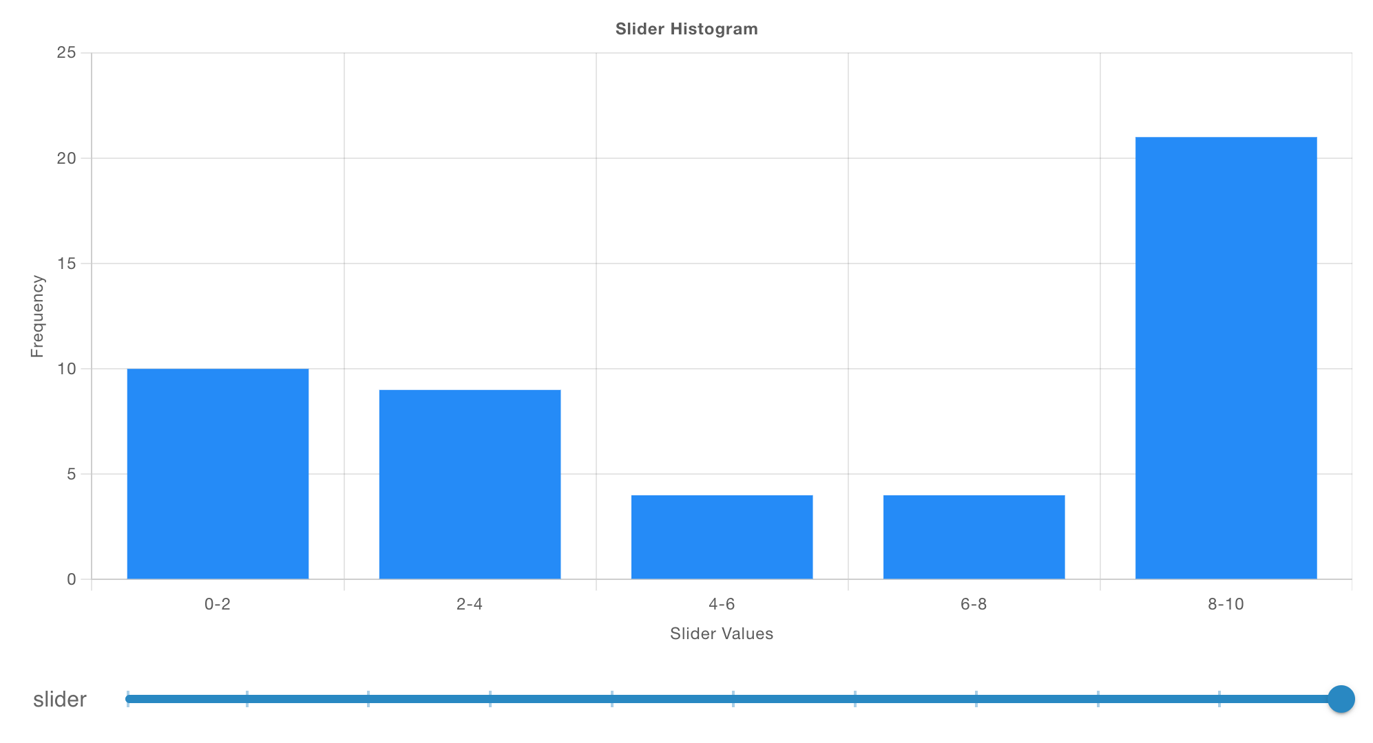
Here, we have a slider that injects a payload into the chart everytime it is moved, with numbers being split into 5 bins between 0 and 10.
Categorical
If instead, you have fixed string or categorical values for your x-axis, you should use the "Categorical" x-axis type. This will group data by the x-axis value, and then calculate the frequency of each value.
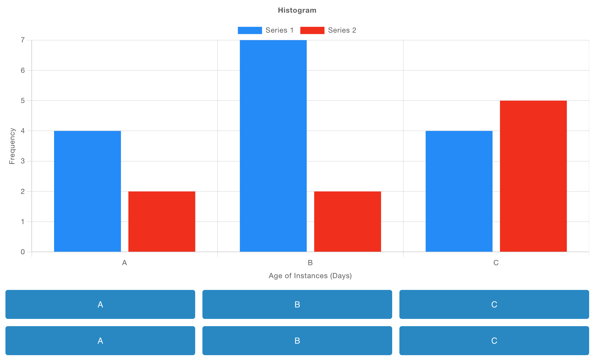
Here, each button emits a payload matching a given letter (the x-axis value), and the chart calculates the frequency of each letter received. Additionally, we have the first row of buttons belonging to the "Series 1", and the second row of buttons belonging to the "Series 2", defined through msg.topic.
Grouping into Series
We can also add an extra dimension of data to our Histogram with "Series".
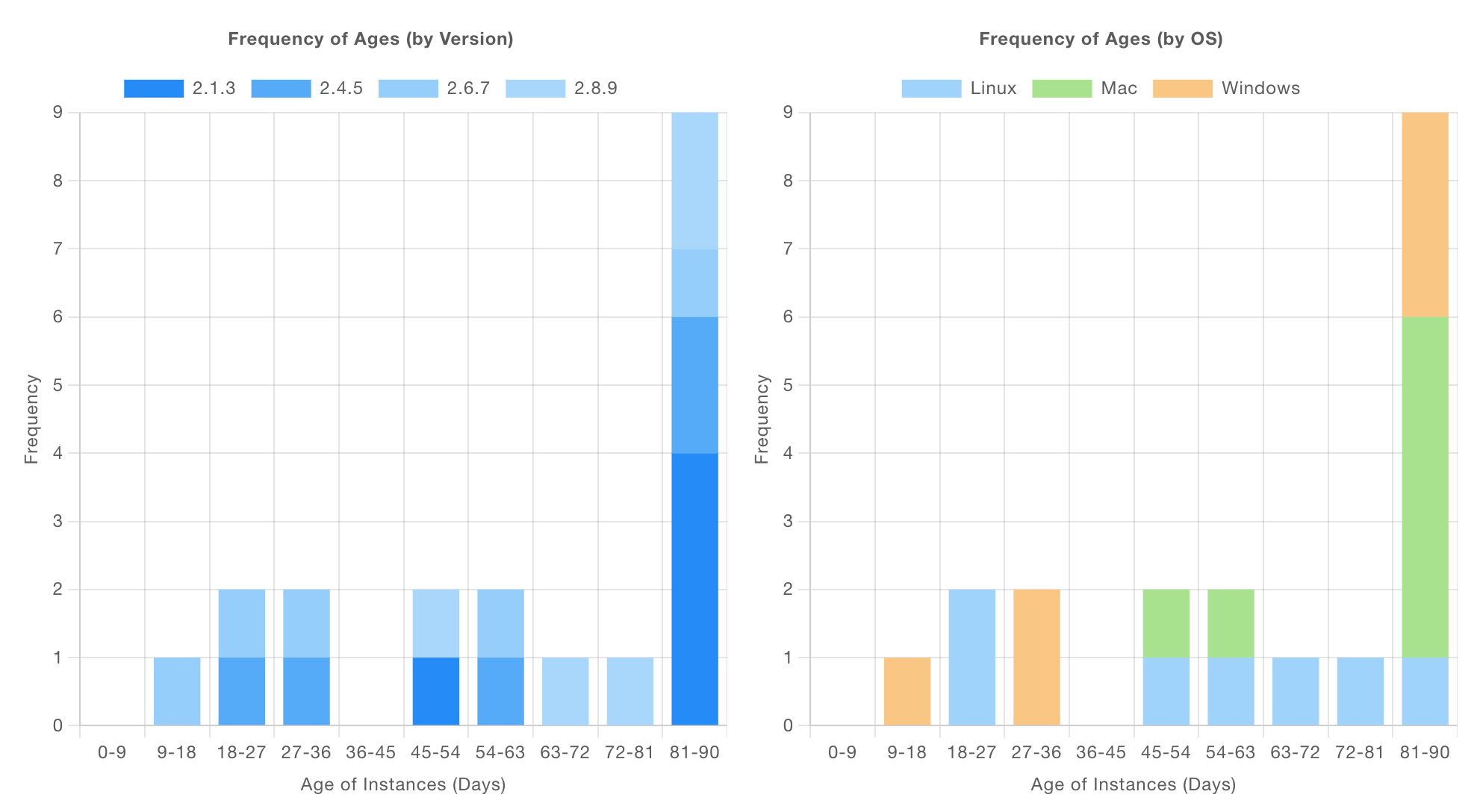 Screenshot showing two Histograms rendering the same data source, but with different series
Here, we have a sample data set which details licenses for software running for n days. Each license details the operating system (os), which version of the software it is running, and whether or not it is a paid-for license.
Our two side-by-side charts show the same frequency data (with bins for the age on the x-axis), but one breaks it down by version and the other by os.
Controls
Removing Data
"Append" or "Replace" Added In: v0.11.3
The "Action" property on the chart allows you to control whether you:
- Append: Any new data provided will be added to the existing data on the chart.
- Replace: Any existing data will first be removed, then new data will be added.
If you ever want to override the property on a message-by-message basis, you can also do this by including a msg.action property, which will override the default behaviour. For example:
msg = {
    "action": "append",
    "payload": 1
}
would append this data point to the chart, leaving existing data, even if the underlying chart has been configured to always "Replace".
Clear All Data
Alternatively, you can remove all data from a chart at any time by sending a msg.payload of [] to the node. Most commonly, this is done by wiring a ui-button to the ui-chart node and configuring the button to send a JSON payload with a value of [].
Nested Data
It is a common use case that you would have data structured as JSON, and want to plot some of it e.g:
msg = {
    "payload": {
        "id": "Dataset 1",
        "value": 3,
        "nested": {
            "value": 1
        }
    }
}
Here, we can utilize the "Properties" series, x and y to define which values we want to plot on the chart. To access the relevant data point here you can use the key: type and use dot-notation, e.g: nested.value.
Live Data
If you're producing "live" data (from sensors for example), you do not need to define how the x property should be plotted. Instead, you can leave this blank and the chart will automatically calculate the current date/time.
This works equally well if you use Object formatted data, e.g.
msg = {
    "topic": "Sensor A"
    "payload": {
        "value": 3
    }
}
where you could set the y property to key:value. The x value, if left blank in the configuration would be calculated as the current date/time.
Chart Customisation
eCharts have a rich set of configuration options, of which we only expose a small subsection via the Node-RED configuration. If you want to further customise the appearance of your chart, direct access to the underlying eCharts options objects can be obtained by using msg.ui_update.chartOptions. Any of the options defined in the eCharts Documentation may be set. For example, to move the yAxis scale to the right hand side, change the title font size and drop the top of the grid area down, send the below via msg.ui_update:
{
    "chartOptions": {
        "yAxis": {
            "position": "right"
        },
        "grid": {
            "top": 90
        },
        "title": {
            "textStyle": {
                "fontSize": 20
            }
        }
    }
}
The changes are additive, so if it was also desired to move the bottom of the grid, after the above message was sent, then another msg.ui_update could be sent containing:
{
    "chartOptions": {
        "grid": {
            "bottom": 200
        }
    }
}
The options set earlier will remain in force. Generally a message containing msg.ui_update should contain no payload or other properties otherwise those will be interpreted as data to go on the chart.
Setting Series Colour
The settings for each series on the chart can also be set using msg.ui_update. Note that when adjusting settings for a series you must include all customised settings for all series, as each update to series configuration will replace any previous customisation to series. For example, for a line chart with two lines 'temperature' and 'humidity', to set the colour of the temperature line to red and humidity to green msg.ui_update could be sent containing
{
    "chartOptions": {
        "series": [
            {
                "name": "temperature",
                "type": "line",
                "lineStyle": {
                    "color": "red",
                },
                "itemStyle": {
                    "color": "red"
                },
            },
            {
                "name": "humidity",
                "type": "line",
                "lineStyle": {
                    "color": "rgb(0, 255, 0)"
                },
                "itemStyle": {
                    "color": "rgb(0, 255, 0)"
                },
            }
        ]
    }
}
Note that this sets the colour for the whole line. It cannot be used to change the colour for just a section of the line. Any such message should always contain the series name and type for each series.
Building Custom Charts
For even further customisataion such as rendering charts we don't yet support, you can use a UI Template node.
Currently, although not ideal, we do need to load the ChartJS library from a CDN, and then watch for the file to have been loaded before we can use it, as per the Loading External Dependencies details in the UI Template documentation.
Example: Static Data
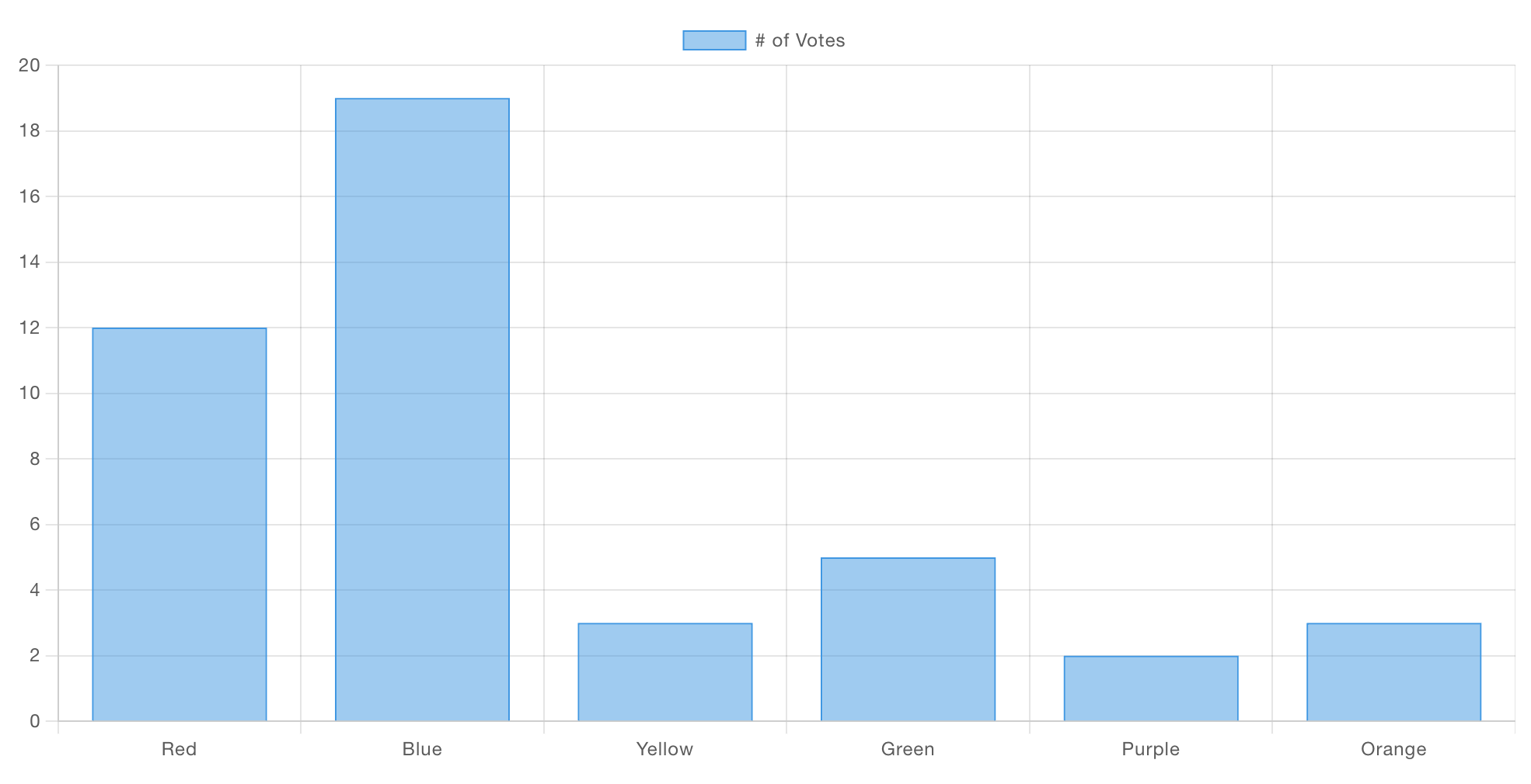
Here is the template code that will render this bar chart:
<template>
    <canvas ref="chart" />
</template>

<script src="https://cdn.jsdelivr.net/npm/chart.js"></script>

<script>
    export default {
        mounted() {
            // code here when the component is first loaded
            let interval = setInterval(() => {
                if (window.Chart) {
                    // Babylon.js is loaded, so we can now use it
                    clearInterval(interval);
                    this.draw()
                }
            }, 100);
        },
        methods: {
            draw () {
                const ctx = this.$refs.chart
                new Chart(ctx, {
                    type: 'bar',
                    data: {
                        labels: ['Red', 'Blue', 'Yellow', 'Green', 'Purple', 'Orange'],
                        datasets: [{
                            label: '# of Votes',
                            data: [12, 19, 3, 5, 2, 3],
                            borderWidth: 1
                        }]
                    },
                    options: {
                        scales: {
                            y: {
                                beginAtZero: true
                            }
                        }
                    }
                });
            }
        }
    }
</script>
Example: Plotting Incoming Data
It's unlikely, as per the first example, that we just want to render static data - this is Node-RED after all. So as a quick example, we can also wire this example to a ui-slider for a quick demo, here's a flow that can get you started:
and what it'll look like when rendered to the Dashboard:
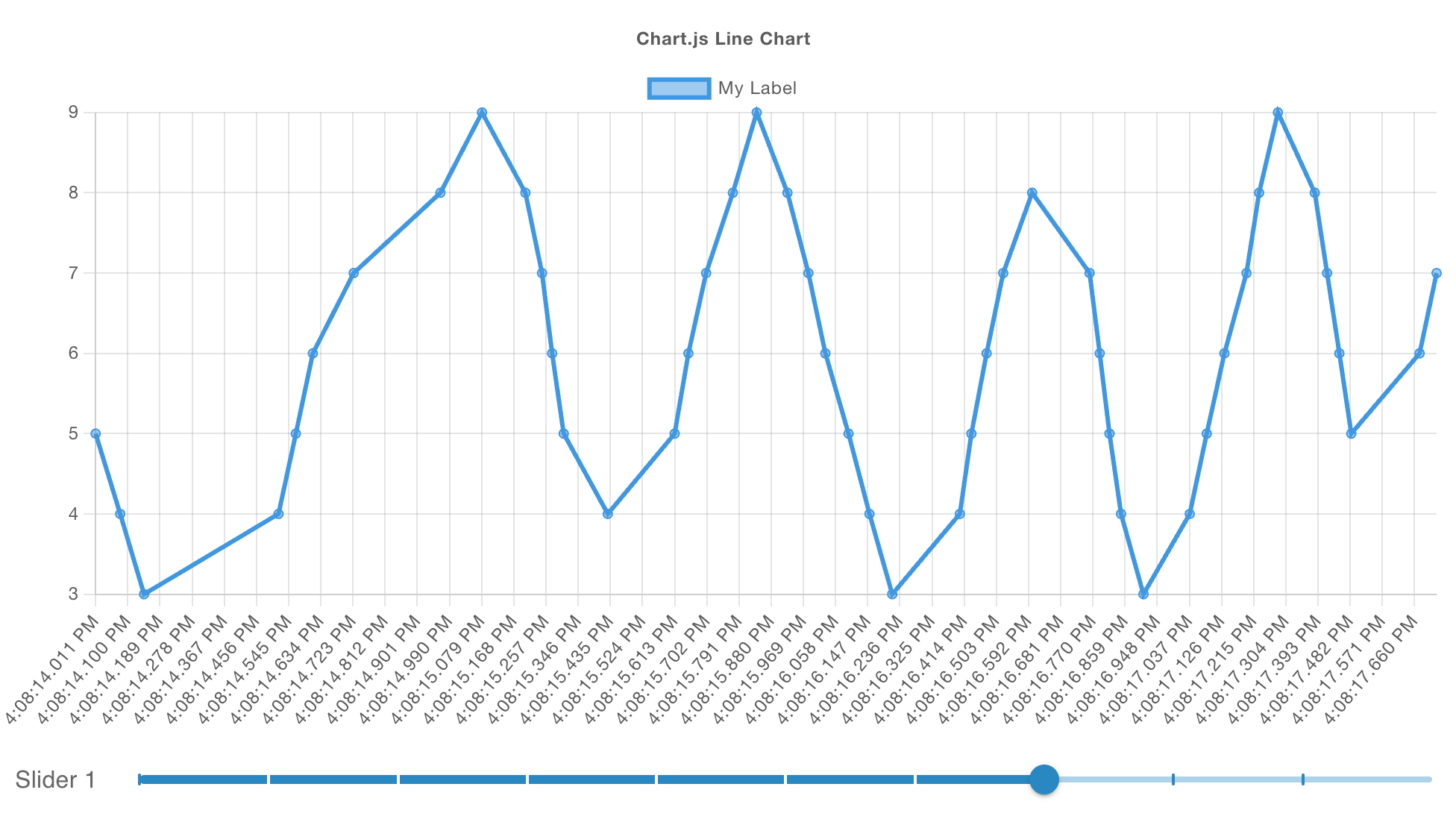
Taking a deep-dive into the contents of the ui-template for this chart, we can see:
<template>
    <canvas ref="chart" />
</template>

<script src="https://cdn.jsdelivr.net/npm/chart.js"></script>

<script>
    export default {
        mounted() {
            // register a listener for incoming data
            this.$socket.on('msg-input:' + this.id, this.onInput)

            // check with ChartJS has loaded
            let interval = setInterval(() => {
                if (window.Chart) {
                    // clear the check for ChartJS
                    clearInterval(interval);
                    // draw our initial chart
                    this.draw()
                }
            }, 100);
        },
        methods: {
            draw () {
                // get reference to the <canvas /> element
                const ctx = this.$refs.chart

                // Render the chart
                const chart = new Chart(ctx, {
                    type: 'line',
                    data: {
                        datasets: [{
                            label: "My Label",  // label for the single line we'll render
                            data: []            // start with no data
                        }]
                    },
                    options: {
                        animation: false, // don't run the animation for incoming data
                        responsive: true, // ensure we auto-resize the content
                        scales: {
                            x: {
                                type: 'time' // in this example, we're rendering timestamps
                            }
                        },
                        parsing: {
                            xAxisKey: 'time', // the property to render on the x-axis
                            yAxisKey: 'value' // the property to render on the y-axis
                        },
                        plugins: {
                            legend: {
                                position: 'top',
                            },
                            title: {
                                display: true,
                                text: 'Chart.js Line Chart'
                            }
                        }
                    },
                });
                // make this available to all elements of the component
                this.chart = chart
            },
            onInput (msg) {
                // add a new data point ot our existing dataset
                this.chart.data.datasets[0].data.push({
                    time: (new Date()).getTime(),
                    value: msg.payload
                })
                // ensure the chart re-renders
                this.chart.update()
            }
        }
    }
</script>
Example: Categorising Data
Let's take a more complex example, where we can render a chart type that we don't currently support in core Dashboard, a Polar Area Chart.
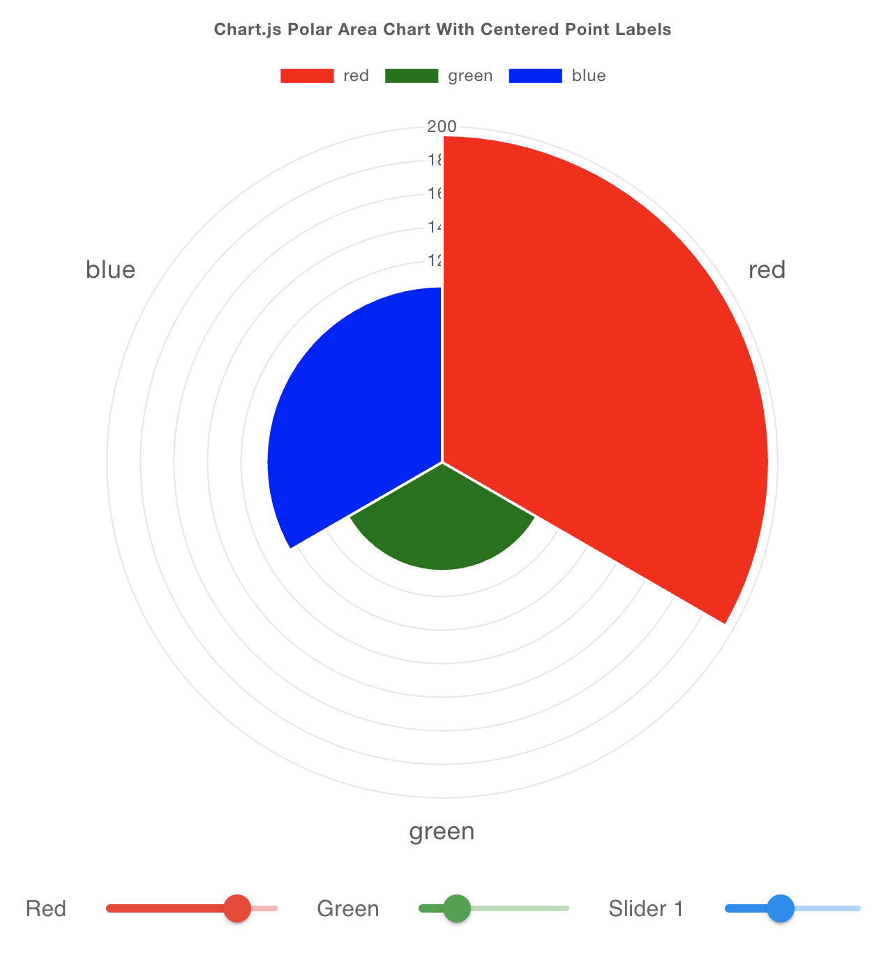
This example is adapted from this example from the ChartJS documentation
In this example, we wire multiple ui-sliders, each defining a msg.topic of a different color, into our custom chart:
A deep-dive into the contents of the ui-template shows:
<template>
    <canvas ref="chart" />
</template>

<script src="https://cdn.jsdelivr.net/npm/chart.js"></script>

<script>
    export default {
        mounted() {
            // register a listener for incoming data
            this.$socket.on('msg-input:' + this.id, this.onInput)

            // code here when the component is first loaded
            let interval = setInterval(() => {
                if (window.Chart) {
                    // Babylon.js is loaded, so we can now use it
                    clearInterval(interval);
                    this.draw()
                }
            }, 100);
        },
        methods: {
            draw () {
                const ctx = this.$refs.chart
                const data = {
                    labels: [],
                    datasets: [{
                        label: 'Colors',
                        data: [],
                        backgroundColor: []
                    }]
                }

                // Render the chart
                const chart = new Chart(ctx, {
                    type: 'polarArea',
                    data: data,
                    options: {
                        responsive: true,
                        scales: {
                            r: {
                                pointLabels: {
                                    display: true,
                                    centerPointLabels: true,
                                    font: {
                                        size: 18
                                    }
                                }
                            }
                            },
                            plugins: {
                            legend: {
                                position: 'top',
                            },
                            title: {
                                display: true,
                                text: 'Chart.js Polar Area Chart With Centered Point Labels'
                            }
                        }
                    },
                });
                this.chart = chart
            },
            onInput (msg) {
                // in this example, our topics will be colors
                const color = msg.topic

                // have we seen this color before?
                const index = this.chart.data.labels.indexOf(color)

                if (index === -1) {
                    console.log('new color', color)
                    // add new dataset for this topic
                    this.chart.data.labels.push(color)
                    this.chart.data.datasets[0].data.push(msg.payload)
                    this.chart.data.datasets[0].backgroundColor.push(color)
                } else {
                    // we've already got data for this color, update the value
                    this.chart.data.datasets[0].data[index] = msg.payload
                }

                // ensure the chart re-renders
                this.chart.update()
            }
        }
    }
</script>