Config: UI Theme ui-theme
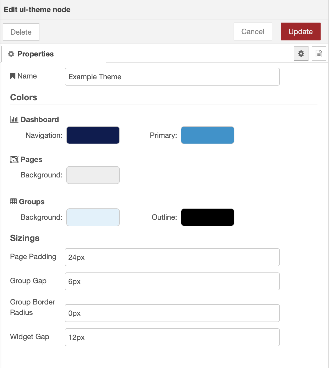
Each page can be assigned a theme, which will be used to render the page. The theme is a collection of colors that control the look and feel of the widgets.
Colors
| Prop | Description |
|---|---|
| Surface | Controls the color of the header and navigation side menus |
| Primary | Any interactive element is styled with this color, including buttons, sliders and focus state of input fields. |
| Pages - Background | The background color of the full page |
| Groups - Background | The background color of any groups rendered on the page |
| Groups - Outline | The color of the border of any groups rendered on the page |
Sizes
| Prop | Description |
|---|---|
| Row Height | How tall a single row (unit of height) should render in the Dashboard. Options here are Default (48px), Comfortable (36px) and Compact (32px). |
| Page Padding | The spacing that surrounds all of the groups on a page. Applicable for Grid & Fixed layouts and Notebook layouts where the screen width is narrower than 1024px.You can define the padding for each side of the page separately by using CSS Shorthand notation |
| Group Gap | The gap between each group in a layout. Default: 12px |
| Group Border Radius | The border radius of the surrounding of each group on a page. Default: 4px |
| Widget Gap | The gap between each widget within a group. Default: 12px |
Examples
Modified Colours & Spacing
Example Config of ui-theme in Node-RED:
Resulting Dashboard with the theme applied:

Colors here were chosen to make it easier to differentiate between the different groups rather than it being aesthetically pleasing.
Row Height
, Comfortable (Middle), Compact (Right) row height comparisons for a UI Table element") Default (Left), Comfortable (Middle), Compact (Right) row height comparisons for a UI Table element
Default (Left), Comfortable (Middle), Compact (Right) row height comparisons for a UI Table element
The Row Height controls how tall a single row (unit of height) should render in the Dashboard. Options here are Default (48px), Comfortable (36px) and Compact (32px).