Config: UI Page ui-page
Each page will be rendered in a navigation drawer within the UI, and can be accessed via the navigation bar at the top of the page. See Layouts for more information on how layouts work.
Properties
| Prop | Description |
|---|---|
| UI | The UI (ui-base) that this page will be added to. |
| Path | Extending the parent UI path, defines where this page renders |
| Icon | Which Material Designs Icon to use for the page. No need to include the mdi- prefix. |
| Theme | Which FlowFuse Dashboard theme to use for this page. You can customise your own too. |
| Layout | Which Layout Manager to render the widgets with |
| Default State |
Both of these can be overridden by the user at runtime using a |
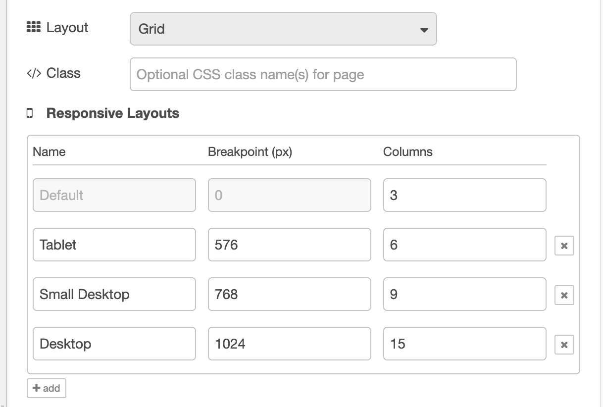
| Breakpoints | Configure the responsive breakpoints for your Dashboard, controlling how many columns render at different screen sizes. Not available for "Fixed" layouts. |
Breakpoints
 Screenshot showing the default breakpoints configuration
As detailed in the Layouts section of the documentation, most layout types in Dashboard utilise "breakpoints". Each breakpoint defines:
- A pixel value, i.e. when the breakpoint comes into effect
- A columns value, i.e. how many columns should be rendered at this breakpoint
The more columns you have, the more groups and widgets you can fit side-by-side in your page. After this, new content will render to a new row.
Note that configurable breakpoints are not available for "Fixed" layouts as that does not use the column approach to rendering groups.
The default breakpoints are:
Mobile
- Breakpoint: < 576px
- Columns: 3
Medium
- Breakpoint: > 576px
- Columns: 6
Tablet
- Breakpoint: 768px
- Columns: 9
Desktop
- Breakpoint: 1024px
- Columns: 12
