Config: UI Group ui-group
Each group is rendered within a ui-page as part of a Layout. Each layout will differ in how those groups are rendered, but fundamentally, a group is a collection of widgets, and generally has a label to categorise the contents of a single group.
Properties
| Prop | Description |
|---|---|
| Name | Descriptive name for this group, will show in the Node-RED Editor and as a label in the Dashboard. |
| Page | The Page (ui-page) that this group will render on. |
| Type | Controls whether the group appears as a default group or as a dialog, which needs to be triggered manually using ui-control. You can choose between 'Default' and 'Dialog' types. |
| Size | The width and height of the group. Height will always be reinforced by this value, the height is generally a minimum height, and will extend to fit its content. |
| Class | Any custom CSS classes you wish to add to the Group. |
| Default State |
Both of these can be overridden by the user at runtime using a |
Type
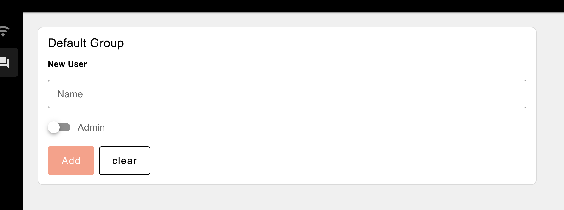
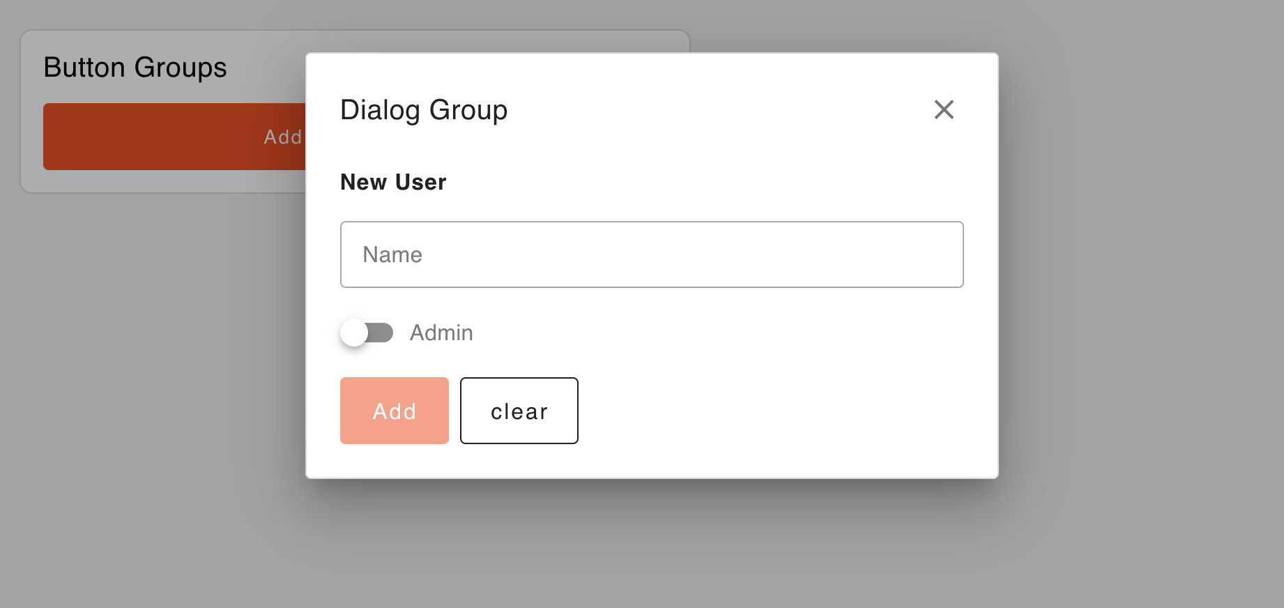
Defines how the group will be displayed. Either as a regular (Default) group or as a Dialog group. A 'Default' group is visible by default, while a 'Dialog' group must be triggered manually using the ui-control node (see documentation). You can choose between these two options based on your layout needs.
Default Groups
 Example of how the type 'Default' option looks
Dialog Groups
 Example of how the type 'Dialog' option looks
