Config: UI Base ui-base
Properties
| Prop | Description |
|---|---|
| Path | The endpoint proceeding the host of Node-RED where your UI will be accessible |
| App Icon | Allows you to set a custom icon for your application. Provide the URL to the App Icon, which will be displayed as the app icon and in the browser tab. |
| Include Page Path in Label | The side navigation lists all available Pages for the Dashboard. By default, this will just show the page name, but this option allows you to also show the page's path. |
| Side Navigation Style | The style the side navigation menu should use (default, fixed, icon, temporary, none) |
Application Icon Added In: v1.18.0
The Application Icon feature allows you to set a custom icon for your FlowFuse Dashboard. This icon is used in the browser tab and when installing the dashboard as a Progressive Web Application (PWA). The image provided should be a square with dimensions between 192px and 512px. To set it up, provide a URL to an image in the App Icon field, enhancing branding and user recognition.
To configure the Application Icon feature in FlowFuse Dashboard, follow these steps:
- Open the Edit ui-base node settings.
- In the App Icon field, enter the URL of the image you want to use as your app icon. Ensure the image is square, with dimensions between 192px and 512px.
- This icon will be displayed in the browser tab and when the dashboard is installed as a Progressive Web App (PWA).
- Click Update to save the changes.
![]() Screenshot of the UI Base configuration options_
Screenshot of the UI Base configuration options_
![]() Example of how the 'App Icon' looks on a browser tab
Example of how the 'App Icon' looks on a browser tab
![]() Example of how the 'App Icon' appears when installed onto an iPhone
Example of how the 'App Icon' appears when installed onto an iPhone
Allow Install Added In: v1.23.0
It is possible to install any FlowFuse Dashboard applications as a Progressive Web App onto a desktop or mobile device, giving the appearance and user-experience of a native mobile application. You can read more about that functionality here.
The "Allow Install" option provides the capability to enable/disable the option to "Install" your Dashboard as an application. If you are using FlowFuse authentication, this is not recommended, as the PWA workers cache content separate from authentication sessions.
Header Style Options Added In: v1.10.0
Title Bar - Default
The title bar will appear as the first element, and scroll with the content, meaning that on longer pages, the title bar will not be visible when the page is scrolled.
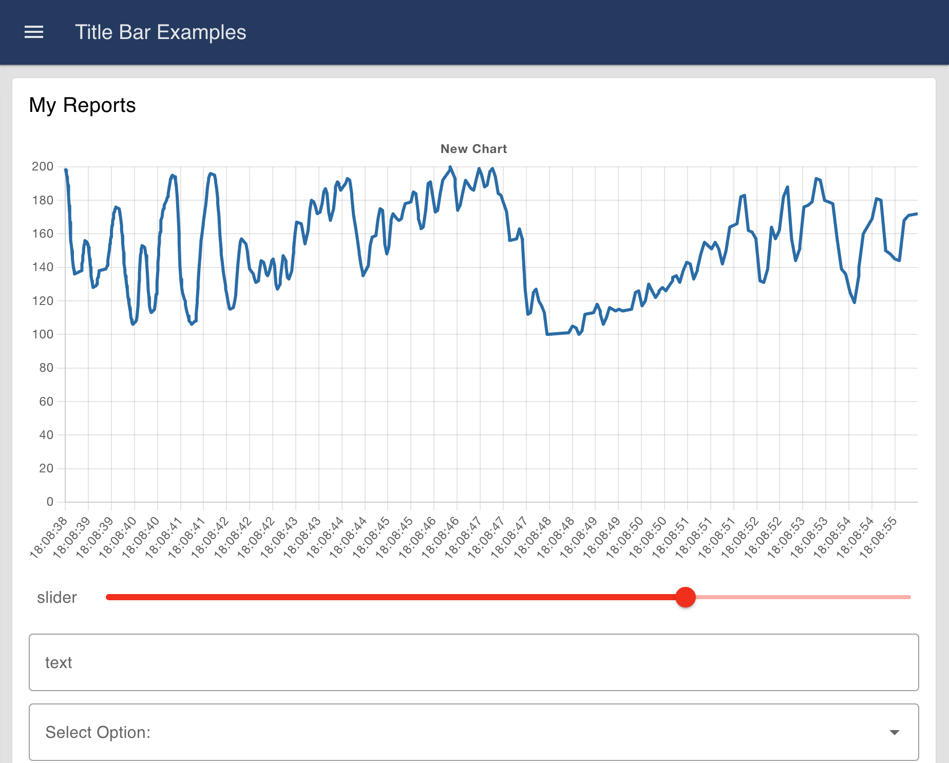 Example of how the 'Default' option looks
Title Bar - Fixed
The title bar will always be visible, even when the page is scrolled. This is useful for when you want to always have access to the title bar, regardless of the page's length.
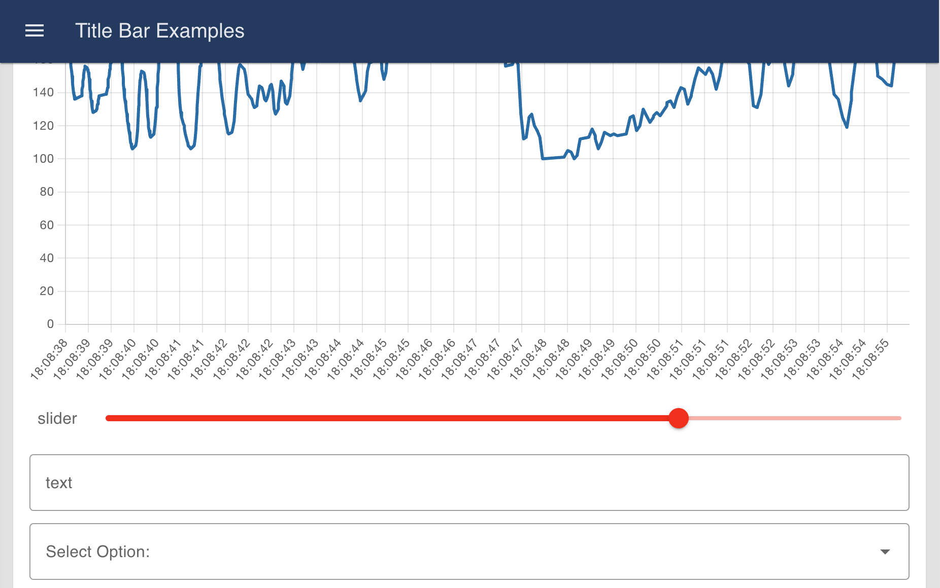 Example of how the 'Fixed' option looks
Title Bar - Hidden
The title bar is not visible at all. Note that it is still possible to see the navigation menu in this state by choosing the Fixed option.
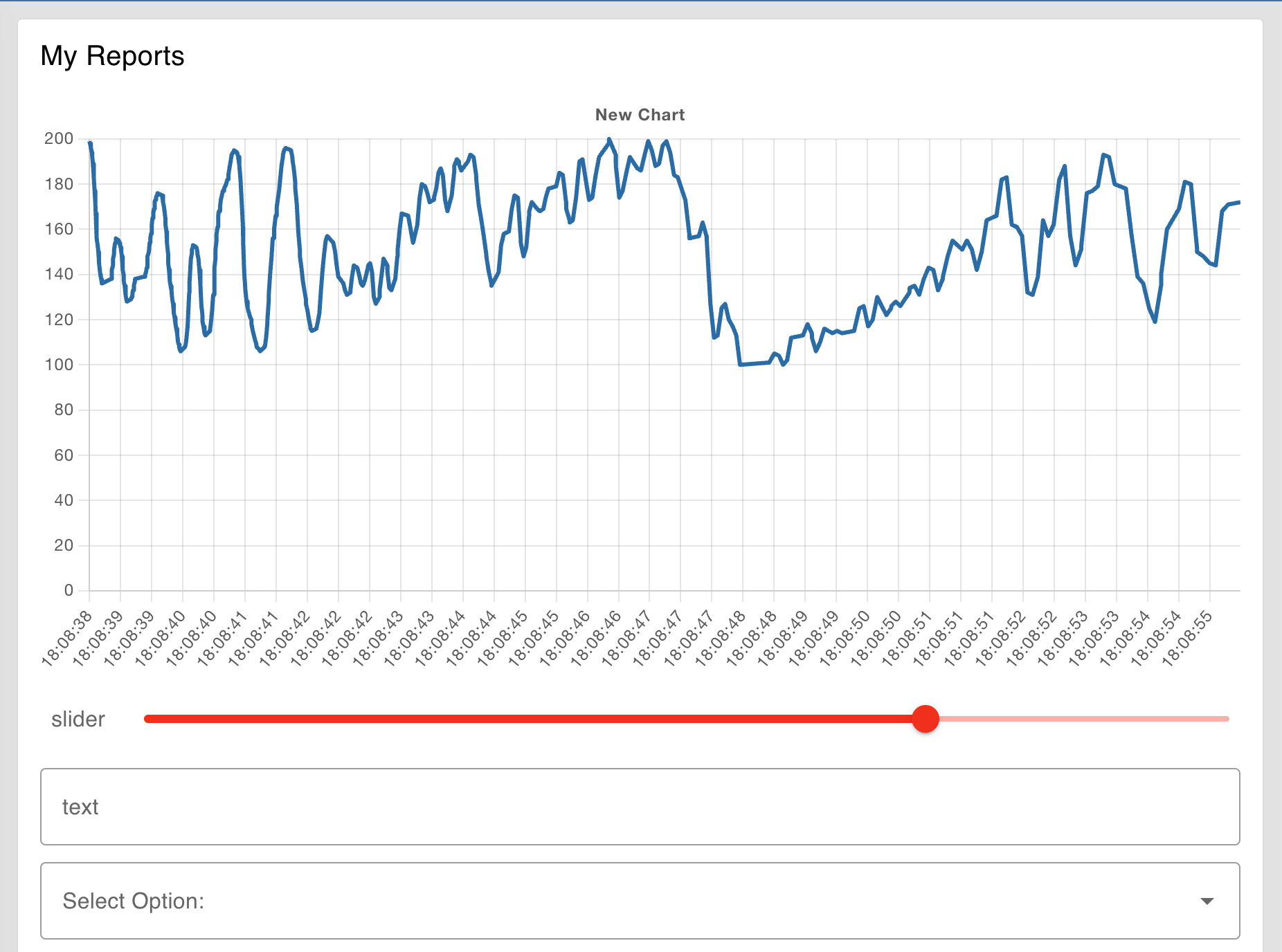 Example of how the 'Hidden' option looks
Header Content Options Added In: v1.10.0
Defines the text that is shown in the main page title.
Page Name
This will show the active page's name. Between each page change, this will be updated to reflect the new page's name.
Dashboard Name
This will use the Dashboard's name, and be consistent across all pages in your application.
Dashboard Name (Page Name)
This will combine the previous two options, and display both the Dashboard name and Page name, with the latter inside brackets.
None
There will be no text-based title shown. Often used in partnership with Teleports in order to customise the content in this section, e.g. including logos.
Navigation Style Options Added In: v1.2.0
Navigation - Collapsing (default)
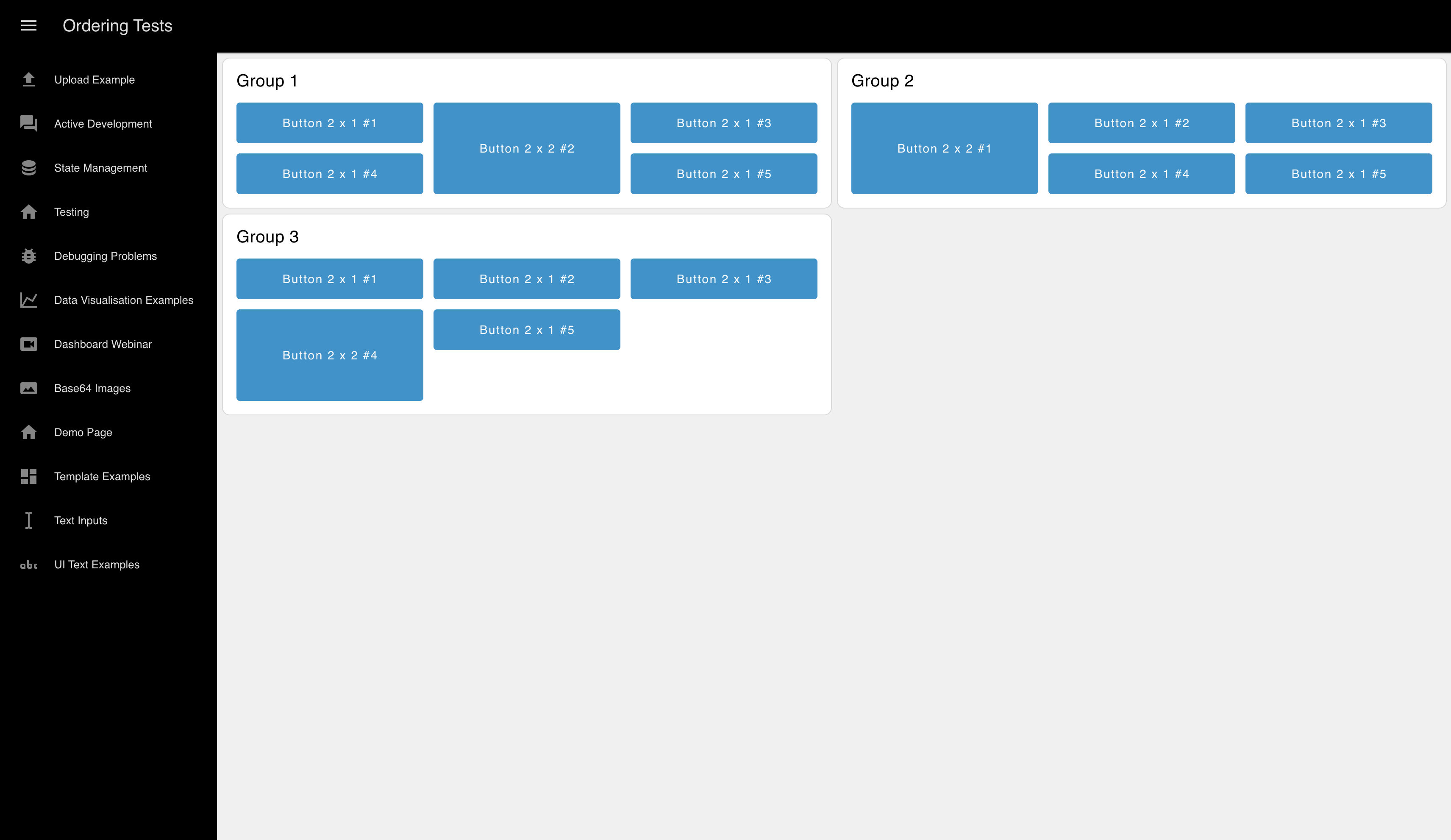
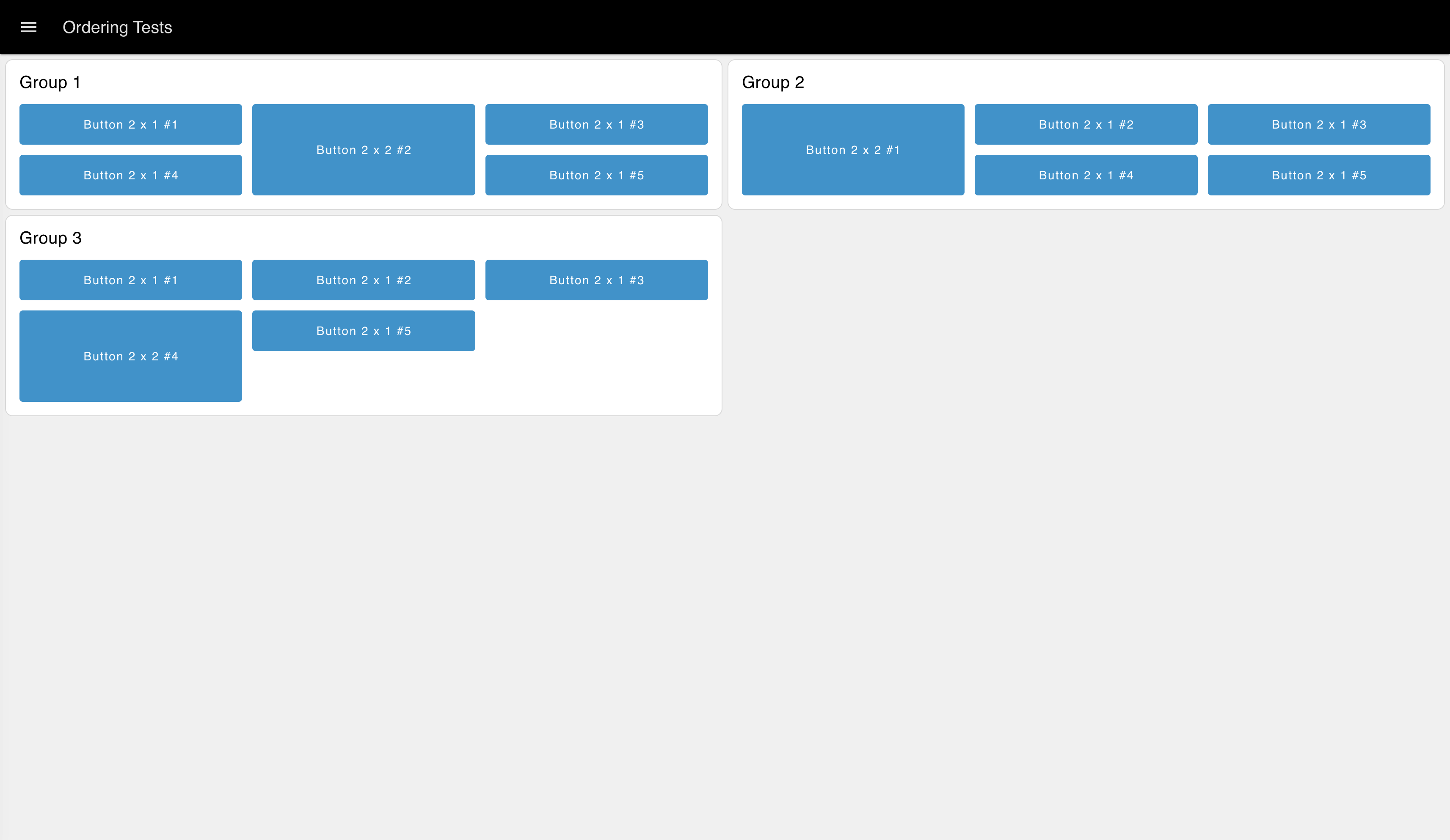
This open will shift the entire content of the Dashboard when opened, and not be visible at all when closed.
Navigation - Fixed
 Example of how the 'Fixed' option looks at all times
Will always remain open. At our mobile breakpoint (768px), this value is overridden, and an "Appear Over" option is used. Note that at mobile-scale (screen width less than 768px), then the Fixed layout will revert back to the "Default" option.
Navigation - Collapse to Icons
Similar to "Collapsing" when opened, but when closed, the icons for each page still show.

Navigation - Appear over Content
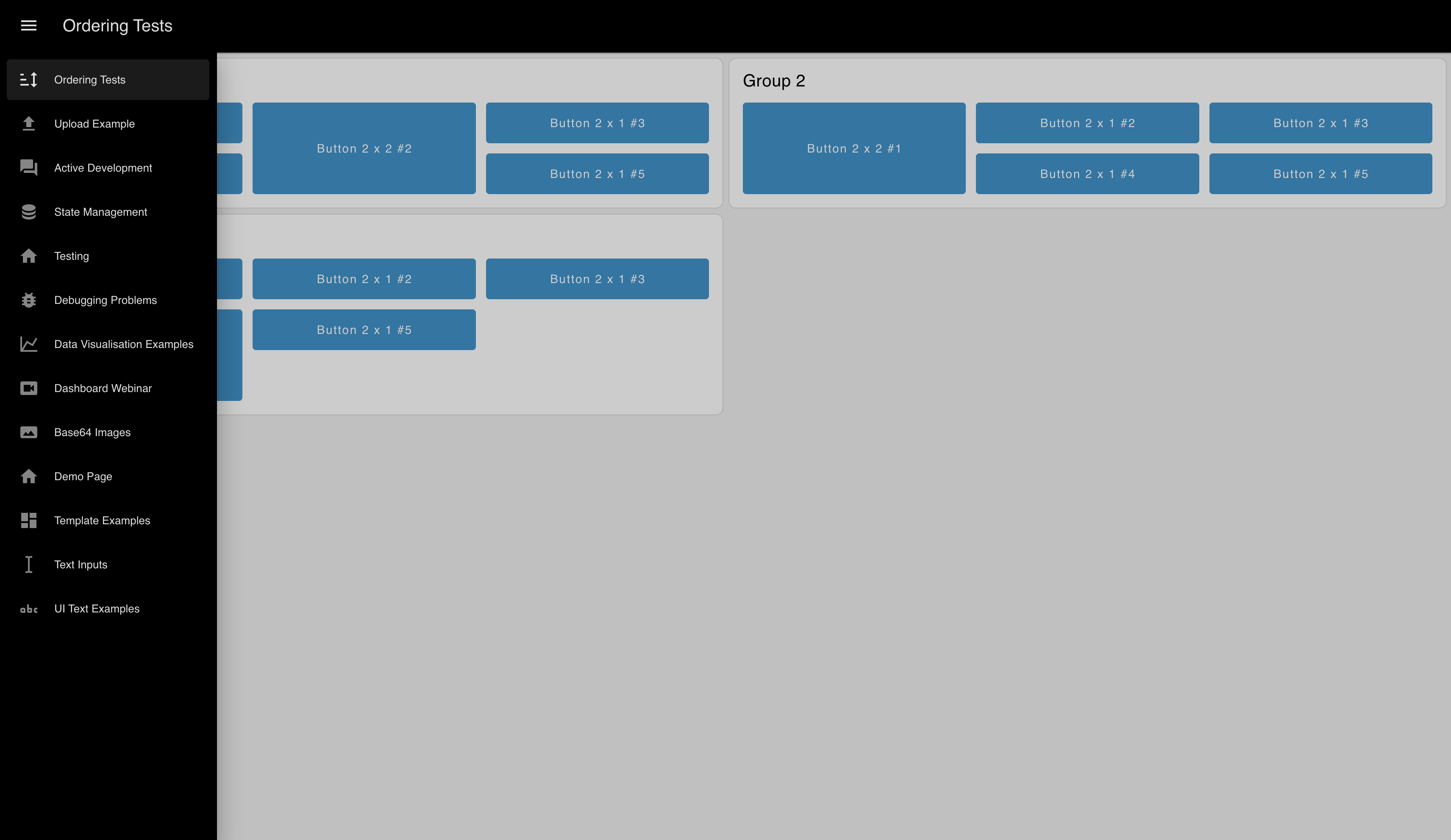

Not visible when closed, and when open, will appear over the Dashboard content, without shifting it.
Navigation - Always Hide
 Example of how the 'Always Hide' option looks
The sidebar will not be visible under any circumstances. All pages are still accessible via their direct links or a ui-control node.
